Using Symmetry in Logo Design: What Style is Right for Your Brand?
Believe it or not, the balance of your logo design says a lot about your company.
Design speaks volumes. It elicits a response from potential customers, telling them who you are and what you do. The right design layout, paired with the right colors and style, can make a powerful impression on your audience.
There are many styles and design formats that can be used to create a visual representation of your brand in the form of a logo. Choosing the right type of logo will come down to a number of factors that vary based on your brand characteristics, industry, and audience.
Symmetrical logos can offer balance and a professional look for your logo. Find out if a symmetrical logo is right for your brand.
What are Symmetrical Logos?
Symmetry means reflecting or mirroring one half of the design to the other half. This means that both sides look the same. When it comes to logo design, symmetry may include the full design or a section of the design.
There is something extremely satisfying about a design being symmetrical. Some experts believe the brain is drawn to the order and repetition symmetry provides, and this is especially true in design.
A symmetrical design could be the right logo for your company if you want to depict a dependable brand. There are many different types of symmetrical logos and popular brands that have successfully used them.
Types of Symmetrical Logos
If you are considering a symmetrical logo design, there are different ways to approach it. Here are four types of symmetrical logos and some of the most popular brands with logos that fall under that design category.
If a logo can be split in half and both halves are the same, then the logo is reflectional. If you were to fold a reflectional design on vertically, it would be a mirror image. These are often some of the most simple logo designs, but they can have a huge impact.
McDonalds: The famous golden arches of this fast-food joint are evenly paired and stand out as a monogram to represent the “’m’ in McDonald’s.
Motorola: Another ‘m’ monogram logo, Motorola’s symmetrical letter shows mirror-image mountaintop-like arches encased in a circle.
Airbnb: The design is a combination of four symbols: A location icon, an upside-down heart, and a person reaching out.
Redbull: Two bulls fighting in front of a setting sun is how this energy drink’s logo represents the brand’s vigor and power.
If you were to rotate the logo, it would look exactly the same each rotation. Think of a hexagon or a starfish- no matter which way you turn it, it will always look the same.
Walmart: The six spokes of the Walmart spark are all evenly spaced and identical, creating the rotational symmetry of the mark.
Target: The symbol of the bullseye target literally represents the loved retail store’s name. A simple circle is incased in an outer ring, creating an icon that is the same no matter how you turn it.
BP: The flower symbolizes nature and energy for the gas company. Despite its many points in white, yellow, light green and green, the image is perfectly symmetrical at all angles.
Chrysler: The Chrysler star in the pentagon shield doesn’t have the full rotational symmetry as the other examples, but it still counts. The symmetry isn’t exact at every point of the rotation, but multiple points of symmetry do exist in this logo.
Translational symmetry isn’t an exact reflection that can be divided like the first two examples, but it does offer a repeating design element. Translational symmetry is when one design element in the logo is moved to another area without changing its symmetric properties.
Audi: The silver rings of this car brand are the same four repeating shapes that create its interlocking chain logo.
PBS: Public Broadcasting Station’s logo has three repeating profile shapes that sit in a circular emblem. The design is simple and recognizable with a clear message of consistency in programming for a wide audience.
Exxon Mobile: The natural gas company uses the repeating ‘x’ for an eye-catching example of translational symmetry logotype.
Olympics: The five repeating Olympic rings stand for the five major parts of the world participating in the events when the Olympic logo was designed in 1913.
This is the least common kind of logo symmetry because it is slightly more complex. Glide-reflection symmetry means taking half of the image and flipping it to create a reverse symmetry on the opposite side and moving it forward so those reflections don’t align.
For example, if you flipped one of the bulls in the Red Bull logo upside down and hanging below the horizontal line the other bull was standing on, you would have a glide-reflection instead of reflection symmetry.
Feetsutra Shoes: One of the best examples of glide-reflection symmetry is in footprints. Each footprint is reflected and moving forward, creating an inversed symmetry pattern.
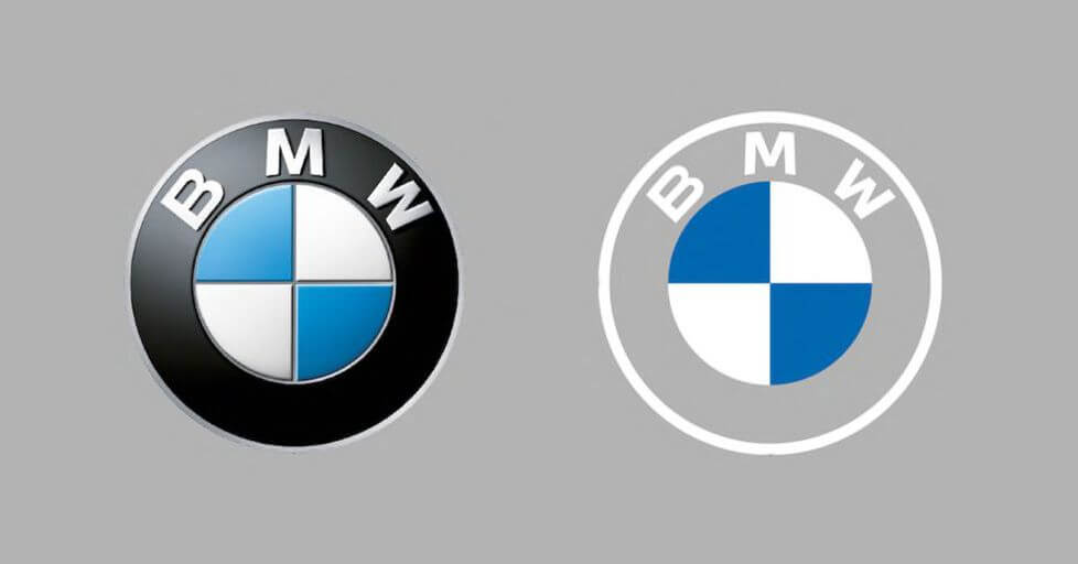
BMW: While the shape of the BMW logo is rotational symmetry, the coloring is flipped. This makes the BMW logo a glide-reflection symmetry where blue is on top in one half of the logo and on the bottom in the other half.
Hyundai: The italicized ‘h’ in an oval for the Hyundai logo is at an angle, making it an inverse reflection if you split the logo vertically or horizontally. In this example, the movement forward is connected creating a fluid shape.
Benefits of a Symmetrical Logo Design

Many people are naturally attracted to symmetrical design because it has a sense of balance. A symmetrical logo can offer several visual benefits:
Balanced doesn’t mean stagnant. A reflective symmetry will have a solid balance, while rotational symmetry or glide reflection symmetry simulates the appearance of fluid motion in your design.
Visually balanced designs are also aesthetically pleasing. They make sense to our minds, so we find them beautiful and appealing. Use symmetry to draw attention to your design by making it easy for your audience to connect with it.
Symmetrical design makes sense to the mind on a subconscious level. This allows it to feel like a logical design choice, making your company look grounded.
The balance of symmetrical design feels comfortable and peaceful, which naturally establishes a basic form of trust. Because symmetrical design seems trustworthy, it is used a lot by brands in the engineering, trading, and auto industries.
Symmetrical designs (especially reflection symmetry and translational symmetry) provide a predictable pattern of design. The matching sides or repeating patterns of symmetrical design allow the brain to relax.
The above benefits of a symmetrical design ultimately result in a sense of stability. When your brand showcases stability, people are more willing to follow those feelings of trust and believe that the brand will follow through well into the future. People want to follow a brand that sticks around and remains constant. You can increase sales with the right design by encouraging confidence in your brand.
Could Logo Symmetry be Bad for my Brand?
Traits associated with symmetry may not suit every brand. While a symmetrical logo design is a great option for some, its styles might not be right for others. To understand if its right for you, define your brand characteristics before determining which approach will work best.
If your company is edgy or off-beat, symmetry may conflict with your branding because it will feel reliable and stable. An asymmetrical design may better serve brands that want to emulate an unpredictable approach.
It’s always important to design with your target audience in mind as well. Not all audiences relate to symmetrical designs. While younger audiences tend to like the more simplified designs for their straightforward appeal, older generations prefer a more traditional approach. Nature-loving audiences find symmetry often has a manufactured feel, so brands in nature-based industries may want to choose something asymmetrical as well.
If you are working to create the right logo design for your brand, our logo maker can help. Once you have taken the time to understand your brand’s needs, aesthetic, and audience, you will be able to start the design process.
This is the perfect way to test out symmetrical designs to see which one fit your brand. You can put in your company details, color palette, font preference, imagery, and more to generate logo options for your brand.
Ready to get started? Try our logo maker now for FREE!
The post Using Symmetry in Logo Design: What Style is Right for Your Brand? appeared first on Tailor Brands.
This content was originally published here.
