Keeping up with the latest logo design trends is an absolute must for designers everywhere, but if you don’t know what to look out for, it can be daunting. Many trends come and go over the years; being aware of the latest trends can help ensure your logo stands out.
While it’s better to make your logo future-proof, there’s not necessarily anything wrong with leaning into a design trend, provided it’s relevant to the brand’s values. That said, there are also several basic things that remain a priority regardless, like consistent brand colors and high-quality typography.
For anyone doing their best to help businesses navigate current trends, knowing the present logo design trends is essential. So, regardless of whether you’re a designer, business owner, or just a curious design observer, in this article, we’ll dive into everything you need to know about logo design trends in 2022.
Why Are Logo Design Trends Important?
Logo design trends shape how consumers look at brands and can affect public perception. For the most part, following design trends from the current decade can help to ensure that your designs look relevant. But besides this, designers should have an idea of what’s up and coming in the current year or the near future.
Top 9 Logo Design Trends to Look Out for in 2022
1. Experimenting with Lettering and Line Thickness
Experimenting with lettering and line thickness is a definite trend in 2022. Both can help your logos and brand stand out significantly from the crowd.
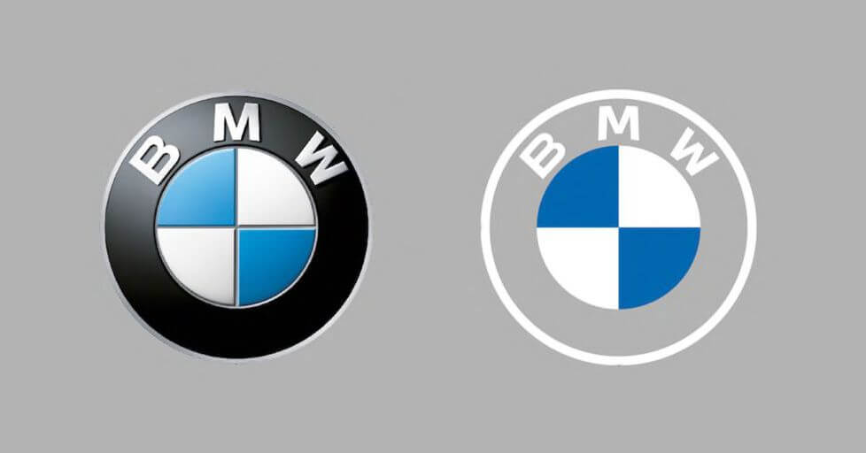
Making use of extended or narrow fonts or playing around with broad and thin strokes can help add a more modernist or contemporary look to your designs. While different looks are more suitable for some businesses than others, it definitely pays to explore and experiment.
2. Bright Colors
Although bright colors were pulled out of circulation in recent years and traded for muted and dull shades, this year has seen an uptick in brands incorporating more bright colors. Generally, bright colors help promote more impulsive shopper behavior and are better suited for those not looking for a very sophisticated look.
Planning your color palettes in relation to your brand goals is pivotal. While this may seem quite basic and depends on personal preference, the resurgence of bright colors is also a trending logo design choice.
3. Layering
Layering, the use of multiple layers in your branding and logos, can help to add a sense of depth and sophistication to your brand. One advantage of layering is that it works well for both minimalist and more complex design approaches.
Layering in your design can be in your lettering, monogram, or just used in general overlapping of graphic elements. However, when done incorrectly, there are many ways this can complicate or make your theme seem irrelevant to your design. For that reason, when implementing layering, it’s important to bear in mind your brand’s ideology and goals.
4. Natural Color Palettes
Besides bright colors trending, 2022 saw an uptick in natural colors, including browns, greens, yellows, and auburn reds.
While these colors may not seem as exciting, natural color palettes have always been effective for the more natural and home-based businesses. In that context, seeing these colors trending can indicate that the market at the moment responds to these colors.
Additionally, natural colors usually work well alongside more simple and minimalist designs.
5. Crisp and Minimalist Fonts
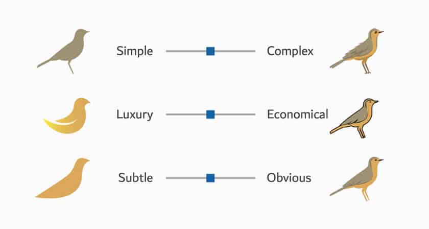
Working with clean serif and sans-serif fonts can definitely help add an element of sophistication to your brand. For designers looking to work consistently with a variety of brands, keeping your designs simple and minimalist can help to ensure consistent business.
When it comes to being simple, crisp and minimalist fonts help ensure a simple look for your designs. While this is not exactly a new trend in logo design trend, it is still a very relevant practice in modern logo design.
6. Static Motion and Glitch Aesthetics
This year saw a resurgence in motion and glitch aesthetics. Although this has been a trend over the past decade, in recent years, glitch fonts and logos seem to have garnered public interest. When it comes to usage and creation of fonts, implied motion or a glitch effect can help your design stand out.
With brands like TikTok and TransferWise as excellent examples, this is one trend that continues to stay relevant and looks good on all brand designs in 2022.
7. Gradients
Gradients are definitely a trend that’s been carried forward from last year. Gradients do a great job of creating contrast in brand colors and objects in a logo. While gradients may not be suitable for all brands, this logo design trend remains popular in 2022.
8. Making Use of Negative Space
When it comes to design, less is often more. So, it’s not surprising that making use of negative space is a trend that seems to be catching on in 2022. Negative space, when used correctly in design, helps reinforce a more sophisticated feel.
Furthermore, negative space helps designers add balance and finesse to a design that can otherwise look boring or dull. That said, this trend is not a completely new idea, with major brands like Fedex and NBC having used this concept in their logos for many years.
For designers that feel that their designs are lackluster, making use of negative space can definitely make a design look smart and well thought out.
9. Hand-Drawn Designs and Logos
Hand-drawn logos can help brands create a sense of authenticity and approachability. With several customers naturally inclined to try out new and unique brands and products, making use of hand-drawn fonts can definitely boost the chances of you standing out.
Other than this, making use of hand-drawn design elements in your marketing assets and creative material can help grow a loyal customer base. Mostly, brands that use hand-drawn designs feel more connected and genuine to the public eye. So, for designers looking to gain an edge in logo design, making use of hand-drawn designs can be a logo design trend to pay attention to in 2022.
What to Expect From 2022 Logo Design Trends
The year has a lot more in store, so paying attention to the logo design trends unfolding in 2022 can definitely help you improve your designs and the quality of your work. Besides this, keeping an eye on the more popular trends used by major brands is a great way to level up your brand.
Regardless of whether you are a brand designer, business owner, or anyone else, paying attention to branding trends both past and present can help you create a brand that stays relevant for years to come. Do you feel like this list helped you out? If you feel like we left anything out, feel free to let us know!
Frequently Asked Questions
What are logo design trends?
Logo design trends are the general practices being followed by popular demand for a certain period of time. The period of time a logo trend stays relevant may vary from a year to even several decades. However, trends can influence customer behavior.
Do colors used in the designs change from year to year?
Not completely. While the colors or shades used more often may vary from year to year, all colors stay relevant. Typically, however, the more sophisticated brands rely on darker shades, while the fun and more popular ones tend to drift towards the lighter ones.
What does static motion logo design mean?
Static motion logo design refers to objects or typography in the logo that are designed to seem as if they are moving or in motion. This can be in the form of alluding to movement in texture or through texture, or even through the use of blurring.
This content was originally published here.


