 An Oklahoma country star offering logo design advice? I didn’t think it was possible either.
Logo design has become a diluted exercise that’s become dumbed down to choosing somebody’s idea of the font-du-jour and choosing a design direction based on a path of least resistance, commonly in response to a “marketing committee” so it’s not tempted to engage in an endless (and unproductive) debate.

The end result is commonly something vanilla. Not authentic, fresh-picked vanilla. No. Bland and syrupy-tasting vanilla.
Even worse is when logo design has been brought down to the low level of “Which is prettiest?”
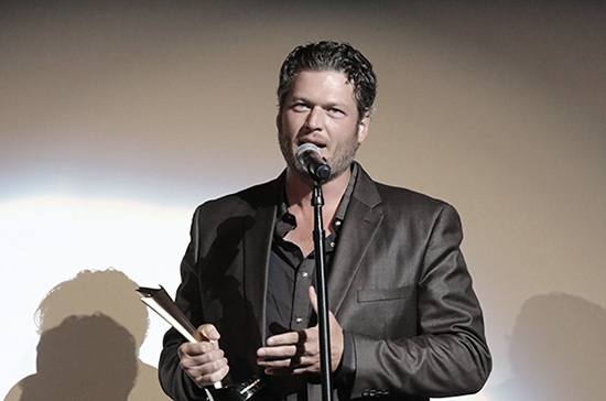
So who would have thought country music star Blake Shelton of The Voice would spill out a word of branding and logo wisdom while coaching one of his singers on the hit TV show, The Voice?
Logo Design is Neither Political
Nor Cosmetic, It’s Strategic
(Much Like the Steals Blake Shelton
Makes On The Voice)
Blake Shelton uttered to one of his singers in total frustration, “Too much icing! Not enough cake….”
Talk about nailing it.
So what is a strategy that can be applied to one’s logo and brand? My dictionary defines strategy as “a plan of action or policy designed to achieve a major or overall aim”: shifts in marketing strategy. This derives from stratos ‘army’ + agein ‘to lead.’
To lead an army, or in the case of a business, it’s to lead a coordinated team, company and its brand in a manner that is beneficial to the company in attaining a major overall aim. That means playing politics with some committee to satisfy their objectives would violate the goal of a strategy since those agendas (and the inevitable debates) frequently differ from the actual goals and needs of the company.
Logos need to work.
Logos need to serve the company and its reason for being.
Logos need to communicate.
Logos need to stop being vanilla-versions of committee-infused mediocrity.
What Clients Deserve Is
A Logo in the Right Key
Of Business Growth
It starts with the right name and well-conceived design to give each client the effective strategic advantage.
The right amounts of cake and icing…. That’s the goal of every brand.
Here are examples of logos that follow Blake Shelton’s wise words to give each client its own Voice. (I realized after writing this how important the names are to these solutions, something we spend a considerable amount of time developing for the brands we develop, which then allows the logo to be developed with a firm foundation upon which to design.)
For a rebellious coffee brand:
For an anti-aging skin care brand (for the full story, click here):
For a Napa Valley gourmet shortbread company (Learn how they increased sales 900% in two years here):
For a startup that configures steel and glass for the building and construction industry:
For a new mobile skin care service (their entire development case study can be found here):
For an INC 5000 tech company and its dramatic rebrand (the full story is here):
For a startup offering energy snacks and drinks (we developed the name and logo design). Below, see the color palette as part of the brand vocabulary:
For a new home care service (the full story and video can be found here):
Let the Battles Begin
Just ask yourself this, “Do we have more icing (superficial fluff) substituting for a strong solid foundation upon which to build (cake)?”
Sugar-coated crap is just that. It lacks sufficient depth to truly achieve business goals. It may offer a brief sugar high at the expense of a logo and brand that’s been allowed to be properly developed.
I never thought I’d get an insight into logo design from Blake Shelton of The Voice. (This NYC boy still sometimes needs a translator to understand all of his sentences with his thick Oklahoma twang.)
Glad I was there to hear it (and understand it) when it happened.
This content was originally published here.