It’s that time of year (already?!) when Pantone announces their “Colour of the Year”. The colour (or colours, as is the case this year) choice influences product development and purchasing decisions across multiple industries, including fashion, home furnishings, industrial design, packaging and graphic design. But this year, we feel it’s more than just that – as Pantone themselves say, this year’s choice is “A marriage of colour conveying a message of strength and hopefulness that is both enduring and uplifting.” We definitely all need some of that!
To arrive at the selection, Pantone’s colour experts at the Pantone Colour Institute spend the bulk of every year analysing new colour influences. This could come from the entertainment industry and film production, art collections and new artists, fashion, new technologies, materials and textures, all areas of design, the latest travel destinations and socio-economic conditions. It’s this thoughtful consideration and trend analysis which helps Pantone crown a new shade the next “Colour of the Year”.
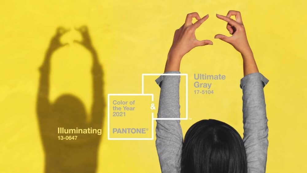
After 2020’s Pantone Colour of the Year – Classic Blue “Instilling calm, confidence, and connection”, Pantone has chosen colours with a completely different meaning for 2021. Let us introduce you to PANTONE 17-5104 Ultimate Gray + PANTONE 13-0647 Illuminating.
Pantone believes that these two colours will help people “fortify themselves with energy, clarity and hope” in a world that’s set to face increasing uncertainty, while “spirited and emboldening shades satisfy our quest for vitality”.
Ultimate Gray and Illuminating are two independent colours that underline how different elements come together to support one another. Pantone has described the pairing as “Practical and rock-solid but at the same time warming and optimistic, the union of PANTONE 17-5104 Ultimate Gray + PANTONE 13-0647 Illuminating is one of strength and positivity. It is a story of colour that encapsulates deeper feelings of thoughtfulness with the promise of something sunny and friendly.”
Yellow is the most luminous of all the colours of the spectrum – it’s bright, cheerful and warming. It’s the colour of happiness, optimism, enlightenment and creativity, sunshine and spring.
In colour psychology, grey represents neutrality and balance. It’s symbolic of solidness and dependability, providing a firm foundation and encouraging feelings of composure, steadiness and resilience.
Pantone’s trend forecasters explained they selected two colours because, “it became apparent that there was never going to be one colour that could express everything that needed to be expressed – that it was, instead, critical to have two independent colours that could come together.”
A combined message of happiness reinforced by fortitude, PANTONE 17-5104 Ultimate Gray + PANTONE 13-0647 Illuminating is aspirational and gives us hope.
Luke and Rian at Infiniti Graphics have been great to work with in the development of our new website. They listened to our brief and delivered beyond our expectations.
As the content will change regularly on our site, they have built the site with this in mind and given us training on how to make these changes. Thank you Luke and Rian, we are really pleased with our new site.
Luke and Rian have offered us a superb service, very reliable and happy to work at the pace our business required. With some very last minute changes and extras we decided we needed nothing was too much bother. I have found the whole process very easy and was reassured regularly throughout the process. We will certainly be working with Infiniti Graphics in the future.
Luke and Team! Thank you SO much for giving my promotional posters a refreshing injection of creativity! I wanted to frame them!!! You went completely over and above what I was expecting… Thank you so much! I am looking forward to our next project together!
Infiniti Graphics helped Thorlabs Ltd create a stylish, informative brochure for one of our programmes. The time and attention taken to ensure we had the design we were hoping for was incredible. Nothing was too much to ask! I would recommend Infiniti Graphics highly for their customer service, professionalism and fantastic designs. Thank you very much!
The Bishop Laney’s Charity trustees were seeking a local enthusiastic business to help with the sympathetic rebranding of their logo combined with a dynamic development of their website portal. The trustees are delighted with the revamp of their brand. We would have no hesitation in recommending this local developing business if you are considering similar upgrades to your image. It was a pleasure working with them.
Luke is a great guy, easy to get on with and really helpful. They have done an amazing job on my website that looks modern and very professional. I would recommend infinity graphics to anyone who is looking for a new website.
I highly recommend Infiniti Graphics. They are friendly, helpful and pay great attention to detail whether it is for our Logo, website or brochures.
Luke can work wonders and puts so much effort in to what he does. He is always on hand if we ever need help with the website and offers website training to our new staff members which is fantastic.
Upon changing our website under the instruction of Honda, i sourced Luke and Infiniti Graphics. I found Luke to be very knowledgeable and he was very keen to work with us on this project. It’s an ever changing beast and whenever i need changes made Luke and the team provide excellent speedy service. I would not hesitate to recommend Infiniti Graphics. Crown Garage our now proud to work in partnership with Infiniti Graphics.
It has been a pleasure working with Infiniti Graphics on the creation of our logo and website and we are really happy with the result. We have really felt part of the process as the website and brand have taken shape. The team have been receptive to ideas and meet challenges head on with a positive enthusiasm which has filtered through the entire project. We have no hesitation recommending these guys… thank you for so much for all your awesome work 🙂
Luke and the team created me an incredible graphic for some posters which were to be used to promote my upcoming charity gig! Their service is friendly and personable and their ability to create innovative and unique designs is evident in the final product. I cannot recommend these guys enough 🙂 Thanks again!
Luke & the Infiniti Graphics team were recommended to me and I’m delighted with the work that’s been done. Luke visited us & spent time understanding who we are & the logo he designed is fantastic, he understood our ethos, motivation & intentions. I would highly recommend Infiniti Graphics & look forward to next year when we’ll work on more graphics for our business.
Luke has designed me some new business cards and social media header images. He grasped exactly what I was looking for and I’m so pleased with the results. The whole process was really simple and smooth. He also helped me out at the last minute by setting up a photo shoot for some professional headshots and feedback from everyone has been great on those too. I wouldn’t hesitate to work with Luke and the team again and they’ll be my first port of call for any future graphic design work.
I have used Infiniti Graphics as a consultant, designer and supplier for a number of business projects at my Needingworth site, for Hanson Aggregates UK. I have found them extremely professional, helpful and very experienced; they were suitably competitive and speedy in their organisation of supply and delivery. I highly recommend the use of Infiniti Graphics.
Working as a Consultant to the global Biotechnology market, I have used Inifiniti Graphics for several of my clients projects. These have included defining new brands and logos through to mock user interfaces for the development of automated laboratory equipment. Luke and his team are highly professional and took the time to understand my needs, delivering striking graphical design at a really good value, on time! I would not hesitate to recommend them.
I have nothing but praise for Luke and the team. They created my website which has had many compliments and positive feedback. They have been very supportive since, particularly with someone who can be creative with flowers but whose brain is not wired with respect to managing a website!! I would highly recommend Infiniti Graphics.
This content was originally published here.


