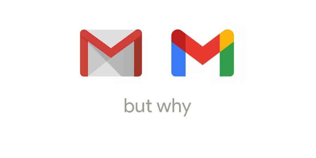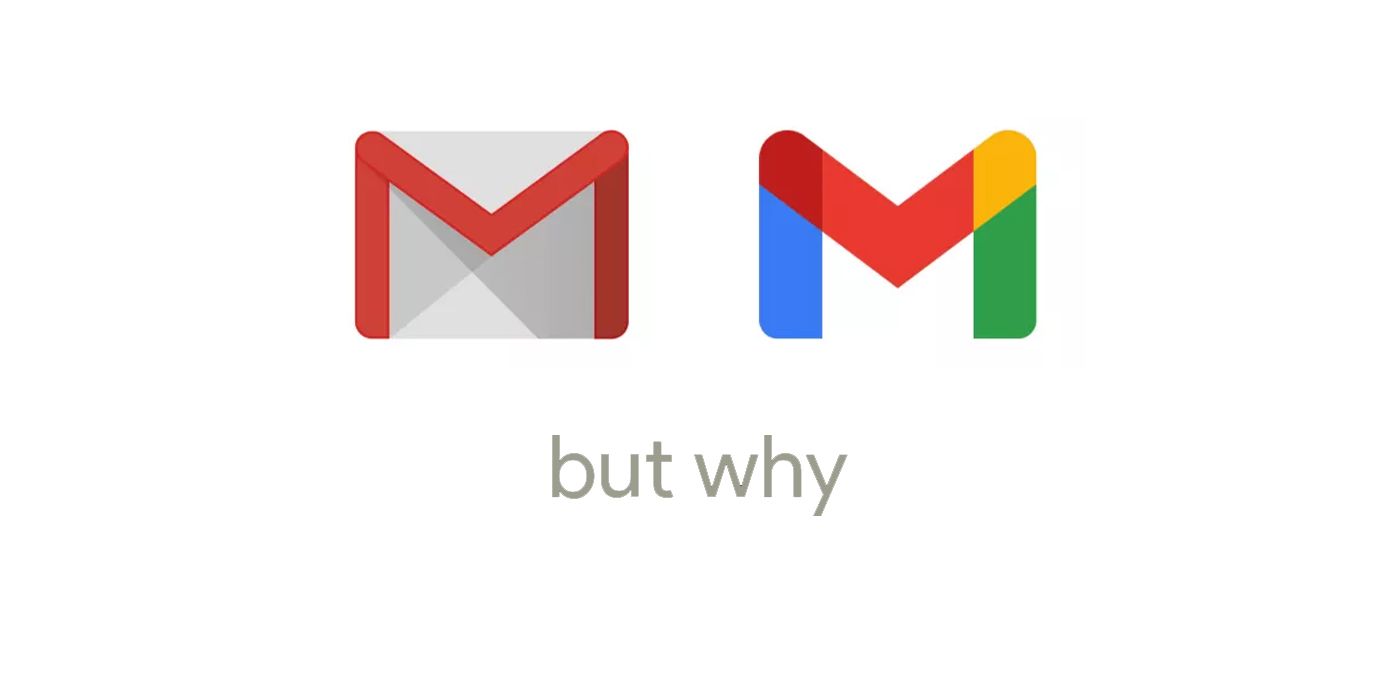
Google recently released the new logo and iconography for Gmail, while unintentionally becoming the butt of hundreds of Twitter and Reddit jokes. Any time a major company changes its logo or product design, the change upsets people and this time was no different. Fortunately, this alteration is both involuntary and relatively meaningless, so it’s easy to simply sit back and appreciate internet humor, rather than have to pick a side.
Since most reasonable people probably never thought too hard about the traditional Gmail logo was, here’s some background. The old logo appears at first glance to just be the letter “M” in red, against a white background. However, the subtle genius of it was that the background was actually an envelope, so the red “M” formed its sides and the triangular flap that folds down to seal a letter. The new logo is simply another “M” but each line segment comprising it has a color from Google’s usual branding scheme. There’s no clever envelope treatment.
This not-very-radical departure is certainly guilty of a lack of creativity, but it won’t impact how people use the service. Given the ubiquity of all things Google, it probably won’t have any effect on user numbers at all. However, that lack of impact has many people wondering if the change was necessary in the first place. The debate rages online, but the less-offended among us have taken this as an opportunity to fire up their meme engines, and the results are a gift to us all.
To get a quick grasp of the online world’s stance on the new Gmail icon, one need only travel to Google’s official support forums and see that the topic “Why is the new gmail logo so ugly? Did they lose a bet?” has hundreds of upvotes. For those who frequent platforms like Twitter and Reddit, the logo ire has transitioned into pure comedy. Twitter user and unconvincingly satirical anti-Google commentor @killedbygoogle captured the world’s sentiments in their new profile banner.
Sometimes, people detest new logo treatments just because they’re such a sudden, abrupt change to a facet of their daily lives. They can be disruptive and it hurts even more when they’re ugly, as indicated by Reddit poster u/EEE-memes:
If it’s possible to take a somewhat objective approach to this issue, one actual problem with the new logo is that it makes discerning between each of the many Google apps harder. The older icons were far more distinct.
In the end, of course, there’s always a Mark.
Source: Twitter
This content was originally published here.
