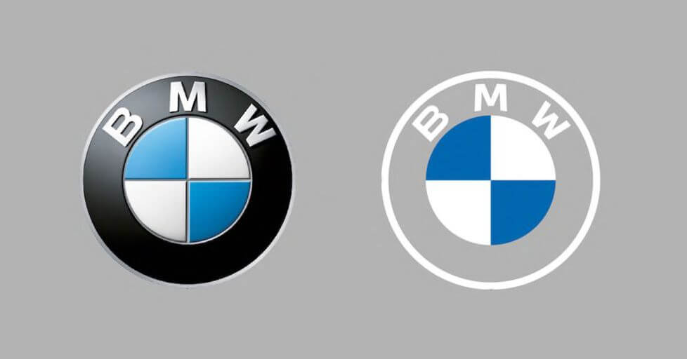
Creative leaders, brand builders and art directors are always looking for new and innovative approaches to design better and trendier logos for their clients from year to year. It is always important to break out of mind-prison boxes, eliminate the cliche, or simply destroy the rules, while keeping the basic aesthetic and typographic rules of creating designs. There one guide that remains and should be followed regardless the era:
The message and the basic style of the logo must be in line with the self-image of the brand.
The outline style is getting more and more popular every year and is gaining a lot of various usages because these logos are light and subtle and will also help you emphasize a modern look. Also, they have high readability, so can also be used as watermarks, icons, or bullet-point symbols. Finally, as they are simple, they are also easier to animate.
Here are a few examples of the newest logo design trends in 2022: outline design, vivid colours, and cartoon-type logos. Of course, many more trends could be mentioned, we just wanted to highlight the best of them.
One of the key elements of brand building is the colour set chosen to associate with a given brand name. We always want to be different and draw attention to the brand – creating an impression can be helped by picking the right colour scheme. The most effective trick to standing out from standard business logos is to use bold vibrant candy colours.
We live in the renaissance of cartoons – in movies, clothing designs, and logo trends as well. They are more popular than ever and come to life as lively and loveable logos for different business fields, not just for brands that target the youngest audiences.
Cartoon logos come in many forms: colorful and exciting shapes, various sizes, and detailed or draft styles.
The post Creative inspiration: logo design trends today appeared first on Hammer Agency.
This content was originally published here.


