Client: Waima Environmental, Auckland
Brief: To create new brand for Waima Environmental – an infrastructure company that recycles water.
When one of our existing clients approached us to create a new logo for a new subsidiary company – the direction we wanted to take became clear very quickly.
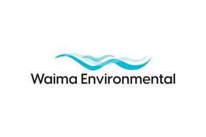
Waima Environmental recycles water; and waima translates from Te Reo to clean water. The picture of clear, flowing water came to us and we wanted to explore this to create their new brand.
The logo icon is made using three organic shapes overlapping to represent flowing water. This is an important element in the design, as movement is a vital element
in clean water. The transparent effect of the centre water line speaks to the clear nature of the water, and the shapes also show a ‘W’ for the first letter in ‘Waima’.
The colour for the logo was inspired by the Blue Pools near Wanaka. The water is so clean & pure, it has an almost surreal blue quality to it.
As the logo may need to be printed in a single colour on clothing, onto pipes and other things where the overlapping elements will get lost, we also created a different versions where the centre line is removed.
The logo needed to appeal to governmental and corporate markets and have an environmental feel. For typography, we chose a simple font that has round letter-forms
that mimic nature elements, while still being bold, professional and conveying a serious, corporate and considered feel.
Crisp white backgrounds for the logo, alongside colour block areas create a professional look for marketing collateral. For letterheads, invoices and other business documents, the client will use the colour logo on white. The brand icon can be blown up to fill big spaces to create a bold graphical mark.
This content was originally published here.


