Abstract Logo Design Inspiration & Top 10 Examples
Abstract logo designs have been popular for startups, but large organisations have recently begun adopting them.
This is no ordinary art as it involves using graphics software to create them.
The images require you to think critically about a contemplative meaning because they are unreal and don’t have a literal meaning.
This departure from reality or literal representation can be complete, partial or slight, leaving you wondering what the logo represents.
The logos that are done perfectly are simple, clean and easy to remember.
Not surprisingly, both the traditional media of visual arts and contemporary art have been influenced by abstract art.
Artists are now left with a huge challenge to create unique and creative logos for brands.
It makes it easier for customers to remember brands with such logos as it’s difficult to forget a precise solid shape they had seen somewhere.
This post will share with you some of the abstract logo design inspiration.
The best part about abstract logo design is that you don’t have to use only real-world images or objects.
This makes it flexible for you to say precisely what your company represents.
How to create an abstract logo design

If you intend to use an abstract logo, it means that either your products or services will be represented by an abstract symbol or even an icon.
When creating an abstract logo design, refining the logo until you are satisfied that it has the right message for your customers is crucial.
Therefore, you will need attention to detail because people will relate the logo to your company and brand.
So, it should never be vague or confusing to understand if you want to leave a lasting impression.
Notably, the logo should never have too many details as this will spoil its design when printed at different resolutions.
Instead, ensure that a logo designer is available who can guide you on how to use fonts, shapes, and colours.
There is a lot of trial and error with these types of logos, but here are some tips on what you should do when designing your abstract logos.
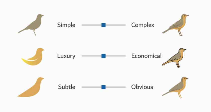
Your abstract logo design should be simple, but it has to show the right mood and tone.
It should be able to give your audience some thoughts about what the symbol or icon represents.
The image must be clear so that people should get curious about what the brand is all about.
The logo should be worth remembering by ensuring that it’s exclusive and attractive.
Research is essential to ensure that the logo design represents your brand well.
The logo should also convey the targeted customers’ message to its audience, reflecting your thoughts.
The logo should be versatile so that various media platforms can use it.
Colouring is essential to make the logo appealing and to increase brand awareness.
Colours have a strong visual perception, so ensure that you choose the right ones.
Types of Abstract Logos
There are different types of abstract design logos, and you should select the one that suits your line of business.
These logos are used all over the world because they have characteristics that give identity to your company.
It doesn’t matter what products or services you offer; you need unique and professional abstract logos to establish your brand, good online content, and a reliable website.
Here are the types of abstract logo designs that you’ll come across.
Solid Shapes
Brands that communicate to their customers about precision, which includes technology businesses or coaching services.
Abstract logos with a solid shape are suitable to emphasise such brands.
You can use bright blue colours on the logo to catch customers’ attention.
Anyone who glances at this logo will not forget it, primarily if used with the black and white colour schemes that improve the solid shapes.
Overall, the logo will provide a unique brand personality associated with the company.
Symmetrical Patterns
Abstract symmetrical patterns are usually focused on taking the centre aspect.
For this reason, they are ideal for companies that assist customers in becoming balanced in their lives or those who want to take a central aspect.
This way, customers will think of you as someone professional.
Consider those looking for meditation, health, and wellness; they will seek something with a soft and subdued earth tone.
This is why soft tones are suitable for symmetrical patterns, and you should always use them if your company wants to attract more clients.
Various industries use symmetrical patterns, such as manufacturing, construction, and real estate.
Abstract Line Logos
Abstract line logos are also famous among different companies, as they provide a unique style to the organisation.
They also catch the customers’ attention quickly because they depict feelings and concepts instead of reality and literal things.
The line artwork works well for companies or people involved in networks, electronics, and architecture.
Illustrative abstract logos

An excellent illustrative abstract logo should leave a lasting impression in your customer’s mind.
When they see it, the logo should stay in the mind of people who will keep trying to figure out its meaning and the reason for creating the logo.
To create a logo that has a visual impact, illustrative abstract logos attempt to provide visually more powerful shapes than the original.
You can use this logo if you desire to have a logo which is aesthetically strong to portray your brand.
The logo just requires a single item, such as an animal.
Multiple abstract logo designs
Some abstract logos use several design techniques to communicate with people on a single message.
This involves pairing different designs, such as line design, with symmetry art.
You can even use solid lines to pair with illustration art.
In so doing, several techniques can create the right image of your brand that shows its personality.
Top 10 Abstract Logo Design Examples
1 – Reebok
The symbol that defines the brand for Reebok is not just an abstract representation of the Union Jack. It has been designed to represent the brand’s heritage and core values. This combination of legacy and progress also represents a trinity of physical, mental, and social well-being. This is how the brand aims to provide people worldwide with products that enhance their lives.
The logo of the brand has been slightly redesigned. Now the logo is composed of a black version of the original emblem, executed in a monochromatic palette, adding a sense of power and distinction to the whole image.
2 – Dropbox

While the Dropbox service was initially intended only as a way to store documents and other files, it’s now grown into much more. The service offers a free version and paid plans for more significant amounts of storage space. The Dropbox application is available for Windows, OS X, iOS, and Android, and you can download the app from the official website. The program syncs files on all your devices and can back up your data automatically, which makes it a handy tool for keeping your important files safe and secure.
The Dropbox logo is a simple yet bold and confident logo. It is also executed in a familiar font, which makes it easy to recognise. It is also similar to the Neue Helvetica family of fonts, looking modern and timeless.
3 – Mitsubishi
Mitsubishi is one of Japan’s largest car manufacturers. It was founded in 1872 by Yasuo Iwasaki and today is a part of the Renault-Nissan-Mitsubishi Alliance, which is one of the world’s largest car-producing groups.
The Mitsubishi logo is a combination of the two crests: the three rhombi for the founder’s family, Iwasaki, and the shape of three oak leaves, a crest of the Tosa Clan, who were the first employers of Yataro Iwasaki.
This is a straightforward approach. The Mitsubishi visual identity is well known across the world. They are recognised for their red colour, which represents passion, power, and energy.
4 – Nike
With a market capitalisation of $32 billion, Nike is the second-largest sporting goods company in the world, behind Adidas.
Nike’s first two decades were marked by constant change. During the late 1970s and early 1980s, the company struggled to compete with archrival Adidas, whose name Nike was forced to adopt to prevent being confused with a German manufacturer of similar shoes.
However, in 1987, Nike’s fortunes changed dramatically. It brought out a pair of running shoes that were more comfortable and better fitting than any of its competitors, Nike Air. And soon, the company was riding a wave of popularity in a sport that had been largely ignored. The company’s stock value soared when Nike began putting the Swoosh on the outsoles of its shoes. In 1991, Nike paid its founder Phil Knight a then-unheard-of $150 million to become CEO.
The Nike logo is a famous logo that we can find on all kinds of products, including clothes, shoes, and even computers. When it comes to web icons, they are usually designed in a monochrome palette, looking progressive and minimal.
5 – BP

The British multinational oil and gas company BP has had a lot of ups and downs over the years. The logo, launched in the 1980s, has changed from a simple black-and-white wordmark to a vibrant and meaningful symbol.
Recently, the logo has been modified to reflect its new name, Beyond Petroleum. The company is now focused on developing sustainable energy and clean technology. It’s also looking to explore new business areas and invest in renewable energy.
The BP logo history was marked by experimentation with the company’s colour palette. In 1947, the basic scheme consisted of black and white, although they changed the shade of black from time to time. The company was quite fond of bright shades in the 1990s, which they then augmented with a new colour in 2000.
6 – AT&T

Of the two largest telecommunications providers, AT&T stands out for choosing a light blue colour as its logo. The company from the top ten of the Fortune 500 list has its logo composed of a stylised sphere in a bright blue and white colour scheme, with swirling lines. In addition, the graphic emblem is sometimes accompanied by a simple, straight logotype, set in the uppercase of a modern geometric sans-serif typeface in black or dark grey. The shade of blue used for the AT&T badge is light and fresh, evoking a sense of progressiveness.
7 – Lacoste
Lacoste is a leading French brand of luxury sports clothing and accessories. René Lacoste founded it in 1933, and the company’s name is derived from his family name. The Lacoste brothers acquired a former factory to produce tennis shirts. The brand quickly became popular with the public. Lacoste’s success led to the expansion of its operation into other categories. In 1946, the company released their first women’s apparel line. In 1955, they launched their first shoes and, in 1959, their first fragrance. In 1998, they added sunglasses, leather goods, watches, and eyeglasses.
The crocodile grew even smaller in 2011, the inscription getting larger. The letters changed their typeface to a thinner and stricter one, with their rounded edges replaced by straight cuts, which add a sense of seriousness and dedication, along with timelessness and reliability.
8 – Instagram
Instagram is a photo and video-sharing social media site. It was created by Kevin Systrom and Mike Krieger and launched in October 2010. Within a few months, Instagram had become one of the most popular and fastest-growing social media platforms.
The overhaul of the Instagram badge in 2018 introduced a redesigned version of the company’s iconic image. As with the logo, the team tried to keep the essence of the old logo and refined it into a more modern design. All the same, the new badge is not just a re-working of the older version. It includes a colour palette, but all the shades are lighter. The background gradients were also refined, with the background now featuring a white outline with a coloured square. The main elements of the badge remained unchanged — there’s the circle in the middle, the white dot in the top right, and a square in the bottom left.
9 – YouTube
YouTube is the largest video hosting service in the world. YouTube was founded in 2005 when Google bought the site. Today, it has over a billion active users and around half of all Internet users.
It is a common practice to use the initials of the company’s name in the . Many companies use a combination of two words, so it’s not surprising that many people use the initials of the company name in the company name. The YouTube logotype changed in July 2017, and this was when the logo we know today came to be. This new logotype consists of two letters: “Y” and “T,” both capitalised, written in black on a white background, on the right of a red emblem. The new emblem features the exact shape of a softened horizontal rectangle, but instead of the lettering, there is a white triangle pointing to the right and resembling the “Play” button.
10 – TikTok

TikTok is a social media app that allows users to create short videos and share them online. It’s available in 155 countries and 75 languages. The app was founded in China and named Douyin, meaning “playful cat” in Chinese.
As the name suggests, they targeted the original version of the app at users in China. However, the service was expanded globally and became known as TikTok.
The visual identity of the social media TikTok is unknown, but the logo he created in 2016 has undergone almost no changes over the years of the platform’s existence. The logo we can see today is almost the same as the original version.
Final thoughts
Abstract logo design has plenty of room for you to play around with.
You will have a chance to design a logo that communicates your ideas, values, and what your brand wants to communicate with your customers.
The best abstract design logo should show creativity by representing your idea correctly, and it should catch the attention of your customers.
The message you are trying to send should be unique enough for the audience to understand it.
It’s also essential to ensure that the logo raises curiosity to seduce people to try to know about the logo and the company.
If your abstract logo design doesn’t leave a lasting impression, you must return to the drawing board.
These logos are intended to leave a lasting impression so that your customers should never forget about your brand once they take a look at it.
The post Abstract Logo Design Inspiration & Top 10 Examples is by Stuart and appeared first on Inkbot Design.
This content was originally published here.
