You may not often think about your logo, especially when you have so many pets to take care of. You might not have even updated your logo since first creating it. Yet, as any experienced veterinary marketing agency will tell you, your logo is a visual representation of your business. It’s often the first thing that people see when they search for your business online or visit your location in person. Here are a few reasons why the design of your logo is important to your veterinary practice.
Grabbing the Attention of Clients
If you’re just one in a sea of veterinarians in your area, you need to make sure your logo will get others’ attention. Your logo needs to be eye-catching and quickly relay to your potential clients what your company is about. If possible, you should also incorporate what your company prioritizes into the logo so that customers will have an idea of what you offer before they even walk through your doorway.
For example, if you specialize in treating reptiles in addition to mammals, your logo might include two types of pets to make sure that message is given to new customers. The name of your business should be in a clear font so it can be easily read. Your design team can test the logo on several people to make sure it’s easy to understand.
Creating Your Brand Identity
As mentioned, your logo is often the first thing that people see about your practice. It might be the profile picture on your social media profiles or in the top left corner of your website. It may even be the street sign that people see when driving down the highway. Because it has an impact on the first impression you make, your logo is a big part of your brand. This will affect the way that clients — both potential and returning — view your business. They might take you less seriously if you use elements that may be seen as less professional, like a neon color or a font that is seen as “old”. Talk with your logo design company about the tone that you would like to convey about your business.
This can be done in conjunction with the development of your website. You’ll want to choose something unique and individual, but not so obscure that it’s hard for people to identify. Something identifiable. The veterinary marketing agency you hire will help you develop a design that represents your practice while being effective in encapsulating your brand as a whole.
Choosing Colors and Fonts
Once you have tackled brand identity, think about the elements that make up a logo — the size, shape, font, and color. For a veterinary practice, you may not have to worry too much about size. The font style & size in your logo should be such that it can be read from the road and also easily re-sized for marketing materials. The other few elements are where the tough decisions can come in.
The color of your logo should match with the colors used in your practice if at all possible — i.e. they should match your brand standard. If you use a navy blue for seating and upholstery, you might do well to match those. That way, your clients will connect that particular shade of blue with your office, and you’ll create recognition between your brand online and in person. You’ll also want to think about how colors are applied, making sure your logo is legible in the color selected.
Be mindful when choosing the font. Some fonts can be tricky to resize and translate onto different mediums. Choosing a simple font will allow the rest of the design to do the work. If a font is too curly or sharp, it may make customers feel unwelcome or confused about the services you offer. Talk to your logo design team about what types of fonts elicit what feelings from your audience.
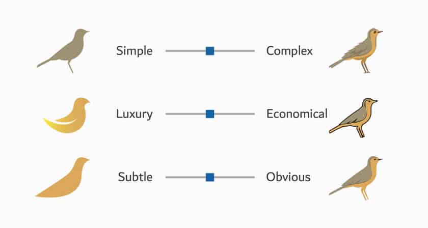
Keep the shape simple, or it will run into the same problems that the font can. Stick with simple, not overly-complicated shapes, to keep the eye focused on the actual content of the logo. More creativity can be put into the design with your team, but the actual shape of the logo should be relatively simple.
Making it Memorable
Having a logo that’s too plain or too similar to others won’t help you create brand recognition online. The goal here is to help customers be able to immediately identify your logo with your practice. People on the street may forget the name of your business, but they will likely remember the look of a memorable, unique logo.
If they can remember the logo, they’ll be able to reference it to other people. Instead of using your practice name, they can say “that vet with the German Shepherd and the rabbit on their sign.” This is a great example of how word-of-mouth can help your business. A memorable design will help people create a connection with you and something else in their vocabulary. Talk to your logo designing company about what you want people to say about your logo.
Separating From the Competitors
Try not to look at other competitors for ideas. While this might sound counterintuitive, you don’t want to have a logo that is too similar to another veterinarian in your area. Similarities can cause a lot of brand confusion. Your logo needs to represent your brand and your brand only. An experienced logo design team will have a lot of questions about what you want your logo to say. Here are some examples:
- What images represent your practice?
- What is a quick description of your services?
- What is different about your practice?
- What are three adjectives that describe your practice?
These questions can help a logo designing team ascertain what will best represent your practice. They can use this information to then check against competitors to make sure that your design will be unique.
Using the Five Principles of Logo Design
Now that you have a design in place, it’s time to check it against some general guidelines used in the logo designing process. Make sure your logo design is:
- Simple: Your logo should not be too complicated for people to understand. You want brand recognition at a glance.
- Timeless: Don’t use anything that references a certain period or location. Your logo should be understood in all contexts.
- Appropriate: Keep the logo focused on your services and practice. Don’t get hung up on one detail that is not necessarily the intent of your practice.
- Versatile: Your logo should fit seamlessly on a website, a social media post, and a sign hanging outside your office. Take a look at it in various forms before giving final approval.
- Memorable: We’ve covered this one, but we’ll talk about it again. Your logo design should be at the forefront of your clients’ brains!
Using these tips will ensure that you come out with a balanced product. Something too simple can also not be memorable. Something too versatile might not be specific enough to your practice. Working with an experienced veterinary marketing company should solve all these little issues.
The design of your logo is what brings customers into your office and onto your website. You should be positive that the design of your logo and website gives potential clients the desire to come back. A positively-reviewed website design company like ViziSites can help you achieve this. Talk to our representatives today about how your logo design can be improved and bring you more clients.
The post Why Your Veterinarian Logo Design Matters appeared first on .
This content was originally published here.


