Flat logos were originally referred to as flat designs. Flat design, influenced by Swiss Style and Bauhaus, initially appeared in the 1990s. Swiss Style promoted a return to design basics, whereas Bauhaus aimed to combine aesthetic and practicality. The Bauhaus and Swiss Style movements had an impact on art and architecture, respectively, whilst flat design had an impact on web design in the digital era.
Several standards must be met by your logo. It must be distinctive, eye-catching, and one-of-a-kind, and it must reflect the heart of your business while being future-proof. A flat logo design is a style liked by many successful brands. Let’s look more closely at the flat design and why it can be a suitable fit for your logo. Need a logo design company in New York? Contact Språk Design.
What Is a Flat Logo?

A flat logo is a two-dimensional, simple design that emphasizes silhouettes over highlights, shadows, or other superfluous elements. Instagram, Spotify, Netflix, Apple, and many globally renowned brands have almost definitely used a flat logo at some time or the other.
Flat logo designs do not include textures, gradients, shadows, and other such embellishments. This design appeals to a wide spectrum of people due to its general simplicity and minimalism.
Flat designs use text, simple shapes, strong typefaces, and vibrant colors to make designs appear more appealing in the lack of embellishment.
Characteristics of a Flat Logo
Simple Typography:
The flat logo’s typography is clean and straightforward. Many people prefer sans serif fonts and limit the number of typefaces used on a single project to two. Sans serif fonts are among the most popular because of their simple and clean typography. When the fonts and text are basic and straightforward, flat logos function best.
Contrast:
A visual comparison of two things is referred to as a contrast. Contrast improves our brain’s identification of sight in various situations. The most common sort of contrast used in the various hues of your logo’s color palette is the contrast between dark and light colors. Contrast with color hue opposites, saturation, shape, texture, and typeface combinations are some of the aspects used in the construction of a flat logo.
Clear, Geometric Shapes:
The most common shapes found in flat designs are clean and geometric forms. Circles, ovals, and rectangles are the most prevalent shapes. Certain people appreciate forms with circular edges, although they are less common than ones with squared-off edges. Triangles are the most commonly used geometric form in logo design.
Bright, Solid Colors:
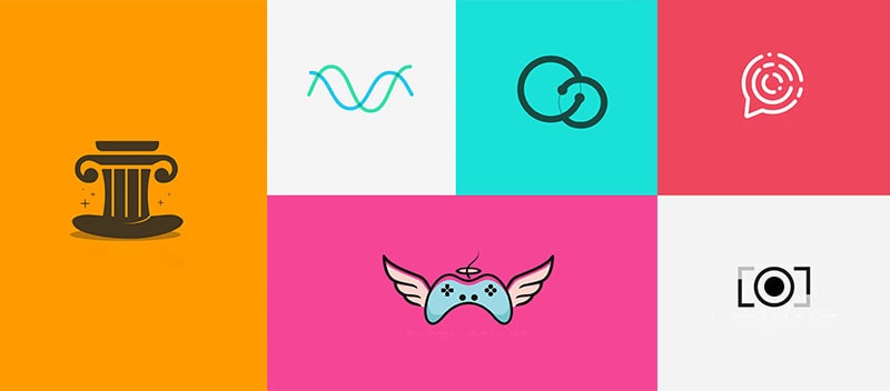
Flat logo design removes visual elements like shading, gradient colors, and texture in favor of stark, solid colors. The most popular colors are those that are bright and dazzling. This does not, however, stop you from utilizing a variety of colors in your logo. Flat UI colors have some amazing examples.
Partner with the best logo design agency with a portfolio of great flat logo design work to be able to create top-quality designs.
Six Key Benefits of a Flat Logo Design
Clear, Instantly Readable:
A flat logo should be readable and recognized in all sizes. If you can’t recognize a brand at any size or distance, it’s not well-made. That’s all there is to it. Even when scaled down to fit into a half-inch square, a brand should be recognizable.
Similarly, if you recognize it while straining your eyes to view it, it usually passes the “readability” test. “Clean space” refers to the amount of space required for a logo on all sides, regardless of where it is used. A custom logo design company helps you create amazing but clear, clean designs that improve your brand recognition.
Scalable:
A logo must be adaptable to both small and big sizes (printed on a pen or shown on a mobile device) (for instance, a billboard or an IMAX cinema screen). Customers must be able to recognize it right away and remember it for a long time.
A scalable logo must make sense, look great, and be legible in any size, whether it’s printed on a small business card or a large billboard. Scaling down a logo with lots of details and information is tough. With the help of a custom logo design company, design a logo that is flexible, scalable, and adaptable to different platforms.
Flexible:
Because technology and, more importantly, how people interact with your company are always evolving, your corporate logo must be adaptive. A logo needs to be displayed on different mediums, surfaces, sizes, and settings in digital and print media. When creating a logo, it should be developed with flexibility in mind.
Logos are meant to be mobile and may be installed on any site where a firm has a presence. That is a component of branding. The main advantage of a flexible logo is that it allows for alterations and alternatives so that all the variations can be shown off in a clean and professional manner.
Simpler, Stronger UX:
Any reputed custom logo design company in New York would know that a simple UX makes a logo easy to quickly understand and remember.
An intricately-designed logo may appear impressive, but it will be more difficult for a buyer to become acquainted with it. On the contrary, with a flat logo, it is easier to focus and define a particular user’s experience.
A basic flat logo design with a solid user experience may generate trust by authenticating and retaining them. It tells potential clients who you are, what you do, and how you can assist them. It connects with those who are unfamiliar with your company or lack prior knowledge or experience.
Trendy, Upscale:
A flat logo design must be trendy in order to develop a strong identification; a trendy Flat Logo may clearly represent the brand message to the target audience.
An upscale flat logo design will definitely separate your brand or make it stand out, fostering increased brand recognition and loyalty. A logo should not only be fashionable, but it should also accurately express the company’s perspective. This is accomplished by using black and white (with a splash of color on occasion), which is one of the easiest and quickest ways to make something beautiful.
Cost-Effective:
A good logo is distinct, relevant, practical, visible, and simple in design, and it delivers the owner’s desired message properly. Hiring a professional logo designer may appear to be a waste of money, especially if your company is in its early stages; yet, developing a flat logo is not expensive.
Conclusion
The best logo design agency for you is the one that has a proven track record in developing fantastic logos that are both attractive and ageless. As we’ve seen, flat design’s clean, contemporary style works in a range of sectors. Find a custom logo design company in New York and discover how you can benefit from a flat logo design for new product or business launches.
Språk Design
Språk Design is one of the most well-known design organizations when it comes to aesthetic and branding design. We have extensive expertise in transforming your ideas into great designs.
Språk Design is a leading provider of logo and branding design services. We can assist you in creating an effective logo with trendy designs and customizing it according to your needs.
With Språk Design, create a high-quality logo at affordable rates. Our team of expert graphic designers creates all of our logo icons. Contact us for enhancing your brand designs!
The post Why Is a Flat Logo Design for You? appeared first on Spark Design.
This content was originally published here.