What Are the 10 Principles of Logo Design?
Regardless of whether you’re a graphic designer or a business owner, you should understand these 10 principles of logo design to connect with your audience.
The purpose of a logo is to connect with the audience and to produce something relatable and unforgettable.
When designing a logo, you can’t forget to do the research. It’s essential that you know your business, its’ audience and what makes you unique. This process of logo design is the same for every business. All you have to do is follow these 10 principles of logo design to create a unique and meaningful logo for your business.
In essence your logo design should help tell a story and deliver a message. Creating an outstanding logo that delivers value to your customers requires some knowledge and a careful design process. Shape your process by following these 10 principles of logo design.
1. Simplicity
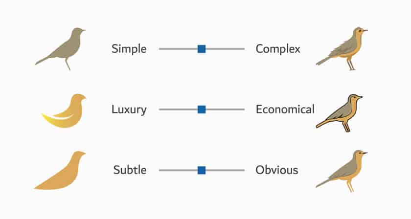
The logo should be immediately recognizable at a glimpse. Adjust for dimension and color variations. Great logos give something surprising and are one-of-a-kind without being overly complex.
Starbucks’ emblem is well-known all over the world. The history behind the Company’s logo distinguishes it from its contemporaries. Can you think of any internationally recognized coffee brand with identification as distinct as the Starbucks logo, where the story and ideals permeate the identity in a straightforward manner? The logo’s execution is clear and symmetrical, and its applicability to several purposes demonstrates how easy the visual representation is.
2. Unforgettable
A good logo should be memorable. Maintain a straightforward and suitable tone for the nature of the industry. The four circles of the well-known German car manufacturer have a deeper meaning than most people realize. More than just a sleek design, the 4-ring car logo depicts four companies that merged in the 1930s.
The companies, Horsch, Audi, Wanderer, and DKW combined to form the “Auto Union”. Part of creating an unforgettable logo is designing a logo that reflects a deeper meaning.
3. Evergreen
A good logo should be ageless and free of trends. It should be able to withstand the test of time.
What will your logo look like in ten years?
Drawing of proportions for Johnston’s roundel, circa 1925.
The London Underground emblem has stood the test of time. The identity is almost 100 years old and has achieved international iconic status; it is still in use today. You will notice that the best logos (the one’s you’re most familiar with) all have one thing in common — they haven’t changed that much over the years.
4. Flexible
Every logo will have to be utilized in many different sizes and colors. Your logo should be adaptable enough to display on everything from a pen to a jet. This significant physical scale in usage exemplifies how a brand must operate across a wide range of assets.
5. Suitable
A quality logo must be functional. Like I already mentioned, the logo must be suitable for the target audience. A logo for a toy store, for instance, may be colorful and lively in its implementation; but, the same would not be true for a legal office.
6. Originality
A one-of-a-kind logo necessitates a one-of-a-kind design approach. This is the stage in logo design when creativity meets a solid understanding of customer design. A qualified graphic designer can answer to your logo objectives while keeping all of these factors in mind and produce something genuinely unique.
7. Scalability
That being said, your logo needs to be scalable to any size. Can it be printed on a huge billboard and a little pen? Returning to the adaptation concept, we all know that the logo design should be scalable in order to represent your business anyplace.
A scalable logo must make logic for the user. Similarly, it should look good, and be decipherable at any size, whether it is printed on a small business card or a large poster. If your logo has too much detail, it will be difficult to scale down to a tiny size.
8. Balance & Proportion
People seem to find balanced designs to be beautiful. A well-balanced design will achieve a balance between the numerous aspects that comprise your logo.
The weight of each of the parts that comprise your logo is referred to as its proportion. From a practical standpoint, the proper dimensions will assist your logo to be complete and make sense.
Equally weighted pieces located on either side of a middle line balance symmetrical logos. Asymmetrical logos, on the other hand, can be balanced by utilizing opposite weights to produce a composition that is not even but yet maintains equilibrium.
9. Ingenuity
A logo must convey the individual personality of a corporate brand while hinting to the industry and the firm’s distinctive value proposition. When a logo embodies every one of these elements in a clever and basic graphic style, it rapidly connects with the audience and serves the branding objective.
Consider what the logo says about the company and the brand’s distinctive value proposition. Consider whether your logo aids in differentiating your business from the competitors. You must select a logo that successfully expresses your brand’s personality and emotion.
10. Aesthetics
Once you have a firm grasp on the company’s distinct brand identity and service offering, it is essential to convert this into appropriate design. A large number of design components must be combined in order for your concept to come to life. Every aspect is significant, from the font, colors, shapes, and pictures to the layout. Instead of attempting to shape all of these design aspects at once, it is necessary to tackle each component one at a time and develop the design step by step.
Before you choose the design components for your logo, think about the design aesthetic that would be best for your logo.
Avoid Logo Clichés
There is no shortage of logo creatives that produce some clichéd work that many firms all too quickly embrace into their business identity without success. Numerous logo design ideas have been utilized repeatedly by designers all across the world. Instead of communicating the company’s business brand value, these designs just create a cheap hallmark of the business’s brand.
While following this path for a logo design is a mistake you should avoid at all costs. Remember, there is a proven process and sound principles of logo design, and if you follow them — you’ll be ok.
Ready to Get Your Logo Designed?
You know what needs to be done — stick to these principles of logo design and you’ll get there. If you’re struggling with the design, or looking to add some unique creativity to your logo design, we can help.
If you’re ready to take on the challenge yourself, feel free to check out these other helpful posts dedicated to perfecting logo design.
This content was originally published here.


