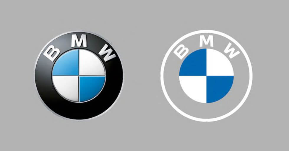
Vauxhall has unveiled a logo revamp that does away with its previous 3D effect in favour of a flat design fit for the digital age, following a wealth of car brands including BMW, Nissan and Toyota in ditching once-cherished details that are notoriously difficult to implement across digital touchpoints.
In its first major update in over ten years, the new logo features further tweaks – notably the absence of the griffin’s wing, which had been a prominent feature of the motif and formed part of the curved border in its previous incarnation.
The wordmark has also been altered, with rounded edges now replaced by a sharper, boxier typeface, and the colour palette has been updated – silver accents have been replaced by navy blue accompaniments to the red brand colour, in a bid to underline the “confidently British” nature of Vauxhall.

Vauxhall began to implement the new design across its digital channels over the summer, with the official unveiling coinciding with the news that it will be debuted on a new model in 2021, addressing some of the confusion that has arisen with other brands over whether the new digital-friendly logos will actually be used on cars.
“The bold yet simple redesigns reinforce Vauxhall’s position as a confidently British brand,” says Vauxhall Motors managing director Stephen Norman. “Constantly evolving and innovating, the brand continues to reinvent itself, with these most recent updates a reflection of Vauxhall’s commitment to ingenious design and modernisation. While retaining its most iconic elements, the contemporary, minimal aesthetic had been created to seamlessly match our forthcoming models.”
The post Vauxhall joins the Flat Pack with new logo design appeared first on Creative Review.
This content was originally published here.


