A logo is more than a pretty picture: it is a symbol that conveys traits about a business through visual communication. In other words, because logos cannot speak, the real magic happens in the mind. The psychology of logo design is a crucial factor in a logo’s success.
At the same time, this psychological aspect is exactly what makes logo design seem daunting. The average viewer is not actively scrutinizing every logo they see for meaning—instead, the logo has to break through their inattention to make that psychological connection. And logo designers already have enough to worry about between their design, drawing and software skills without adding behavioral science expertise to their workload.
Luckily, you don’t need an advanced degree to reap the benefits of psychology in logo design. All you need is an understanding of a few underlying principles, and we’ve put together this guide to cover the basics.
The message behind the logo
—
In order to use psychology in design communication, we should first review what it is that a logo communicates. The specifics will vary from brand to brand, but these are some general questions that a logo seeks to answer:
In addition to this, every brand will have its own specific traits that they wish to establish through its visual identity. These are born out of that brand’s mission statement, values and audience.
A logo is meant to communicate all of this information using only visual cues. But fortunately, a logo does not work in isolation. It is all part of a larger branding effort, which is why it is a good idea to brush up on your brand psychology.
Pattern recognition, our first key psychological principle, comes into play here. The human mind is wired to perceive and recall patterns, and it helps when those patterns are strategically encouraged. In the business world, a prospective customer will have repeated exposure to a brand (these are sometimes called touchpoints on the customer journey, and the logo is just one example). The more consistency they perceive in those encounters, the more those traits will sink in as belonging to the same branding pattern.
Logo psychology vs. buyer psychology
—
Buyer psychology is an important consideration for logo design, but it is distinct from logo psychology. Buyer psychology describes the decision-making process a person goes through to commit to a purchase. Essentially, the purpose of logo psychology is to influence buyer psychology.
There are two types of motivations behind a purchase: logical and emotional. On the logical side, the buying process involves the recognition of a problem, a search for information and solutions to the problem, and an evaluation of alternatives (comparing brands) culminating in a final decision. All of this can be affected by practical concerns such as money and physical location. What matters in the logical phase of the buying process is how discoverable the brand is and how persuasively that brand can position itself as the solution to the problem.
The emotional motivations in a buying process are much harder to pin down, but more often than not, they tend to overrule logic. Buyers might choose products based on the relatability of the brand, whether they feel included among the brand’s customers, and what kind of general reputation it has with other people. The emotional side is where logo psychology comes into play.
So how does a logo connect with a viewer’s emotions? To answer that, let’s zoom out and look at the psychological principles associated with design.
Psychology in the elements of logo design
—
Logo design involves using several components, known as the elements of design, that work together in a composition. These include color, fonts, shapes, imagery and more. Each of these elements has its own psychological associations you must consider when constructing a logo.
Symbolism
Symbols are imagistic references to specific objects or images that have meaning. Symbols typically depend on reference, making them intensely cultural. For example, the olive branch is a symbol for peace in the Western world because of Ancient Greek customs (even though we’ve forgotten those customs now, that just goes to show how powerful symbols are). For a logo, a symbol can act like an icon, providing a subtle visual metaphor for complex ideas.
Shape psychology
Everything from the individual lines of a logo to the entire silhouette is a shape. Given that overall shapes are what people usually perceive first (especially since the majority of people are not paying close attention to your logo), it is important to consider the various meanings shaps can have. Shapes will determine whether a logo feels heavy, dynamic, mechanical, stable and more.


Color psychology
The psychology of colors is responsible for some of our more visceral, emotional reactions. Think of how painted walls can immediately change the ambiance of a room, from somber to joyful. Likewise, because of evolution, some colors can decide whether a meal looks appetizing or poisonous. A logo design is typically restricted to three colors or less, and these are reused in various other contexts to reinforce brand identity.
Font psychology
The style of a font speaks a language beyond the words themselves. There are five major types of fonts—including serifs, sans serifs, script, handwritten, and decorative—and much like symbols, their psychological associations have much to do with their historical usage. But all the same, the style of font can make a logo name or tagline come across as traditional, hi-tech, elegant, or personal.
Psychology principles in logo design
—
It’s one thing to understand how the parts of a logo communicate. But the trick of a logo design is to bring all of these parts together into a singular, harmonious composition. Doing so means deciding on the brand message that you want your logo to convey and ensuring that each element you use reinforces that impression.
Psychology usually comes into play during the sketching phase of the logo design process. While sketching is in the literal sense the act of drawing, it is also a form of thinking. The designer is taking the information from the brief and coming up with potential concepts that will appeal to an audience while aligning with a brand. There are a number of psychology principles relating to human perception and behavior that can explain why some logo concepts feel right and others feel wrong.
Gestalt theory
Gestalt theory lays out how the human brain orders complex shapes. In logo design, the 6 gestalt principles help designers make sure that the design is being perceived the way that they intend and that they are maximizing the power of shapes. In other words, designers will have a hard time connecting with viewers on a psychological level if the overall form is confusing and distracting.


Dual-coding theory
Dual-coding theory asserts that we retain more information when it is presented visually as opposed to written. At the same time, ideas are conveyed most effectively when both are working together. Essentially, when we think of the most memorable logos, it is often the icon that comes to mind. But the actual text of the name and slogan (both in terms of styling and content) is also doing important work that cannot be neglected.
The paradox of choice
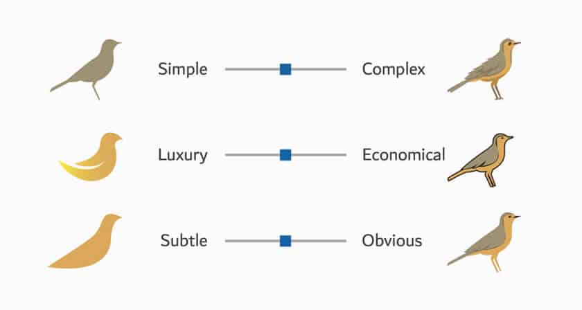
The paradox of choice refers largely to shopping, stating that too many options can actually paralyze the consumer. But in regards to logo design, it means that information overload can cause anxiety or confusion, even if the information being conveyed is accurate. In other words, this is why simplicity is a key logo design principle. Logos should focus on the most important brand impression they want to get across, and focus solely on evoking that.


Von Restorff effect
The Von Restorff effect states that people are more likely to remember the odd one out from the pack than they are a homogenous selection. When it comes to logo design, each industry is bound to have general logo trends that are common and ultimately generic. For example, many bank logos tend to convey security, and they are often blue for this reason or use iconography such as shields or buildings. While there is nothing wrong with tapping into that trait, a bank logo that does so more creatively is bound to sway potential consumers due to its novelty.
Logo psychology in practice
—
While a logo consists of a singular image, there is so much going on beneath the surface. The success of a logo design depends on part aesthetic taste, part artistic drawing skill, part strategic planning and part psychology.
But as complex as all of this sounds, psychology is actually what makes logo design easier. Psychology in logo design is like a guiding hand. Rather than guessing what will resonate with an audience, psychology gives us firm principles on which to ground our assumptions and plan accordingly. That’s why to get a great logo design, it’s important to make sure you’re working with a designer who knows what makes people tick.
Want to get the perfect logo for your business?
Work with our talented designers to make it happen
This content was originally published here.


