Products are made in the factory, but brands are created in the mind. – Walter Landor, Brand Designer.
In every designer’s career, they have at least committed one or two mistakes. And that’s alright since, from mistakes, we learn. We strive to become better and create better.
After all, design has a purpose. It’s what gives your business that attractiveness online.
But are there big brands that slipped during their design process?
Famous Brands with Flopped Logo Rebrands
Just because a brand is well-known and has become a household name, it does not mean that their logos didn’t go through some severe backlash.
Take into account that negative feedback of a logo comes from brand loyalists compared to people who have a weak affinity to the brand (Walsh, Winterich, Mittal, 2012). You can read more on the research here.
Thus, we present nine household brands that ruined their consumer’s brand commitment with a rebrand.
Have you ever heard of the marketing blunder of the 20th century? That title will always be Coca-Cola’s because of its 1985 rebrand.
At the time, Pepsi was their biggest competitor. For that very reason, the company’s logo became COKE accompanied by the formula of the drinks.
However, after three months upon launch, avid supporters of the old coca-cola logo and taste demanded that their preferred design come back.
Coca-Cola complied and continued to serve customers their favorite sweet drinks today.
Ever seen this old logo before?
If you didn’t, that’s because the company reverted to its former design. It was in 2010 when they launched the timid logo.
Compared to its predecessor, the impact of the visual fell back to the point that only 80 percent only noticed the logo changed. At least now, it’s back to its original logo–sleek and bold.
Like Coca-Cola, there was a mishap with their logo looking similar to their direct competitor: Yahoo!
To prove our point, the design of Google in October 1988 resembled Yahoo in terms of font and the exclamation point.
A year after the logo launch, Google’s designers removed the exclamation point, changed the hue, and removed the shade entirely.
We now see their logo as their minimalist rebrand of 2015. However, their logo is now more famous for its dynamic changes depending on the season.
One of the web browsers that emerged in the 1990s has started to decline in popularity. Thus, the company decided to rebrand itself and make its wordmark look like a URL.
Even if the company was proud of it, various critics said that the logo was outdated and heavy-handed. Sadly, they could not compete with the other giant browsers with this logo.
Shocker, isn’t it? But the mistake just shows that we, as a people, want to be equally represented.
Thus, many of the community disapproved of the simple, modern wordmark. It had nothing relating to science compared to the earlier design.
It looked like a meatball with space elements like the orbit, stars, a red ribbon, and blue background. Thankfully, between 1975 and 1992, they changed it back to the meatball emblem logo that identifies them.
And we finally get to Coca-Cola’s direct competitor. The logo sued to be just a circle with a white space wave dividing the red and blue.
But in 2008, they changed the negative space into something that supposedly shows a smile. However, the masses don’t get it. It looks like Pacman is looking up.
We don’t blame the viewers for the backlash this logo received. It takes a while for you to get it.
As a company under Pepsi, they have to get a rebrand. Sadly, people did not appreciate it.
An actual photo of what you would be getting inside the carton–orange juice–replaced the life-like orange. Tropicana changed the typography as well from sans serif to serif.
Thus, the statistics spoke for themselves. There was a 20 percent decrease in sales which prompted the reversal of the logo we know today.
The most controversial logo we have today. It even got the attention of the religious community that prompted the stay of the well-known logo today.
Starbucks did something much more controversial before the wordless, green hue of a logo we know today. In 2008, it decided to bring back the vintage logo for its vintage special.
It had a naked siren with prominent breasts and had the name of the drinks they serve surround it in an emblem-like logo. Christians worldwide expressed their distaste for the logo since children and teenagers would be seeing them upon entering the establishment.
Thus, in 2011 was the final rebrand logo of Starbucks–the wordless green hue of a visual we know today.
Lastly, we’ll be talking about Syfy, which used to be Sci-Fi, the channel’s wordmark logo change. With the rise of multiple tv networks, it was great to know that there was one dedicated to all the nerds out there.
Since SyFy’s rebranding in 2009, many did not appreciate it. The channel said they wanted to accommodate sci-fi, fantasy, paranormal, reality, mystery, and the like.
The minimalist logo with a Saturn beside the channel’s name is the modern wordmark we know today.
Now we know that even big brands make mistakes. Let’s stop you from making them with the list below.
9 Common Oversights When Designing
When a design is wrong, it can cost you thousands of dollars, especially when you decide what or who will create the visuals for your business.
But that’s not the only consequence you’ll be experiencing with a mistake-ridden logo. Since your logo is not communicating what you want to your market, you’ll lose to thousands of competitors.
You can’t stand out and attract consumers towards you. Thus, here are nine red flags for you to avoid.
1. Keep It Simple, Bruh
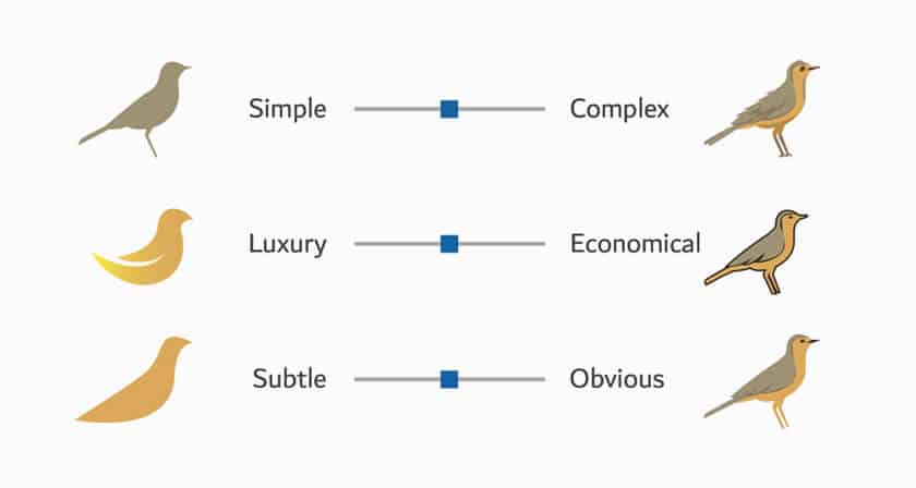
Have you noticed the trend with modern designs?
Less is more.
Gone were the days that you needed to have a more complex design to stand out. Before the invention of editing tools, everyone had to do it by hand.
You don’t have to do that anymore. Instead, imagine a logo that, when gazed upon, even bystanders would know who you are.
Transcend generations with your logo.
2. Gurl, That Color Does Not Go With The Logo
Elements in a logo are not complete without the perfect color.
Learn how to control color, to make it bend to your will. Use Color Psychology to your advantage and incite emotion from your market.
Aside from that, here are some color combos you can try for yourself:
Or you can learn the color theory yourself and make up your mix and match.
3. Don’t Get Lost in Translation
Make sure that you use the correct terminology when you are creating a design for your client. You have to be on the same page with them.
The communication between you two is improved, which aids you in the process itself.
Give your client a crash course on design terminology. The types of logos, typography, even the adjustment of color make sure they know everything.
4. Get Your Typography Straight
Typography deserves its bullet point since it helps in setting the mood of your logo. Serif for serious business while San Serif for a party feels.
Not only the type but size and location matter too. You could have the text circularly wrapped around an image, and it can give you an emblem type of logo.
Also, don’t forget your spacing. It’s crucial, especially if you want a different and understandable logo.
5. Dynamic is Vital
Your design has to look good on any merch and any platform. Logos aid you in your online presence and goal for brand awareness.
There are approximately 4.66 million active users on the internet (Statista). Shine with your logo. Make sure it looks clear and of quality, especially when put on a business card, tarp, or any kind of goods you want to sell to other people.
6. Bandwagon is Sooooo Old School
You might think that this bullet contradicts number 1, but really, it doesn’t. That’s because when you use a trending design, there’s a chance you’d look similar to your competitors.
Avoid that by creating your designs. Just remember, these are highly recommended and give you extra points for a unique design on all the user’s books.
7. Don’t Copy Paste, My Dude
Plagiarism is grounds for legal action. Avoid this but not use similar elements, typography, or business name for yourself.
You are your own business. Do not let another competition dictate otherwise. Learn your different types of logos.
Let your creative self out and uphold your standards with consistency. Exude that with your design.
8. Follow a Brief
For the seamless transaction between you and your client, the latter must provide the designer with instructions.
Thus, a logo brief comes to life. It contains:
The logo brief gives you a much more detailed way to complete your design process. It’s step by step since you can procure your materials while deciding how to do it and what to put in the logo itself.
9. Always Have a Plan
Even if you have a logo brief and you start deciding how you do everything above, you need a backup plan to back up that plan.
Do you get us?
Basically:
You Can Now Overcome Them!
Welp, congratulations on getting this far!
The more you know, indeed. From learning from famous logos to learning from design mistakes, you can now avoid these.
Make sure that you do your research and have the budget for your preferred software or designer. Are you contemplating which to use?
Don’t sweat. We’re here for you. You don’t need prior knowledge of design. Just visit our website. You can either hire a designer or create your logo.
Your choice, but whichever one you choose, you’ll do great!
Written by DesignCrowd on Friday, November 26, 2021
DesignCrowd is an online marketplace providing logo, website, print and graphic design services by providing access to freelance graphic designers and design studios around the world.
This content was originally published here.


