Let’s face it: There are website templates, and then there are website templates for photographers. As highly creative and visual folks, we can’t settle for anything less than sleek template designs. Website templates have the power to bring out the best in the work we do.
I’d been testing out a few website template resources for a couple of years. I tried to DIM (Do it Myself?) in an effort to make something that was impactful and sophisticated. What resulted? Hours of changes, never being satisfied with the result. Honestly, time is valuable. I wasted it – alot of it.
Finally, our business went through a rebrand. I decided to turn to the trusted design business I’d been admiring from afar for a while: Tonic. I haven’t looked back since. As a creative professional and photography business owner, there are many reasons I’ve decided to stick with Tonic over the years.
Keep reading to learn those reasons. You might just turn to the magic of Tonic templates for Showit, too!
Top 5 Reasons Photographers Should Choose Tonic Website Templates
As a photography business owner, I don’t take making decisions about my photography website lightly. I want my clients to have a memorable experience on our website. I want their journey to be as functional and beautiful as possible. With Tonic, you really can get the best of both worlds, and these are the reasons why.
Tonic is made with creative entrepreneurs in mind.
When you visit the Tonic website, it’s clear they know exactly who their audience is. Their designs are so intentionally stylish and really suit creative entrepreneurs who want to express and solidify their online presence.
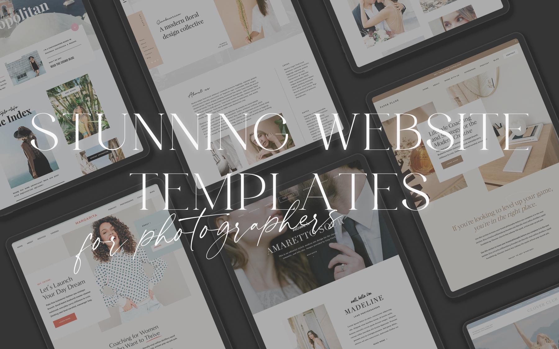
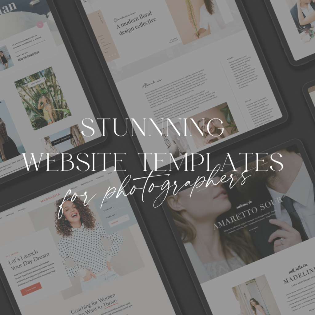
These are the Tonic templates we’ve purchased in the past. I’ve used them in different capacities, and have previously pulled elements from different templates when I feel we want to diversify our site layout.
All of Tonic’s designs have an intentional feel. Plus, the variety of designs means that you can find the right template for you depending on your brand style. Some other examples we love…
Tonic is completely customizable AND easy to use.
So many website template creators claim to be customizable, but as soon as you start using them you realize you’re hitting roadblock after roadblock trying to achieve the look you want. You won’t find that with Tonic—their templates really and truly are fully customizable.
It’s one thing to have your own template to fully personalize, but to be easy to use on top of that? Thank goodness. I’d way rather be editing, shooting, and connecting with clients than spending hours on end figuring out how to use my templates. It’s actually possible to start using these and designing your website quickly and easily. What more could you ask for?
Tonic template designs are absolutely stunning.
As photographers, we look for beauty in the world, and we all find it in our own unique ways. That’s why I can appreciate the variety of gorgeous templates Tonic has created. They’re totally eye-catching, and it’s not hard to find one that highlights your photography style effortlessly.
Tonic templates are a quick way to build a beautiful new site.
Finding the right designer for your business is a process that is easier said than done – but it must be done. Between connecting with this talent and making an official spot on their roster, however, building your new website takes time. Website templates can be great buffers between the time you want to jumpstart your site and a designer finalizing the branding process.
If you’re anything like me, you love capitalizing on getting things done when the mood strikes and the coffee’s hot. With Tonic website templates for photographers and creatives, there’s no more waiting around on others—you can simply get started when you feel ready. Just don’t foget to drink the coffee…
Tonic website designs are made to convert.
Having a beautiful website is important for photographers—but even more importantly, it needs to be efficient at helping you land more bookings. A great website will take your ideal client on a purposeful path through the site that ends with them contacting you. These templates are made with the creative entrepreneur’s goal in mind.
Tonic is a community built for creatives.
Perhaps the aspect of Tonic that I love most next to their drop-dead gorgeous, sleek web designs is that community vibe the company projects and protects. Jen and co are hands-on, hilarious, responsive, and consistently put out one of the only newsletters that has my eyes and full attention when it drops in the inbox.
Save 15% on a Tonic Website Template? Yes please!
If you’re ready to breathe fresh air into your website with customizable website templates for photographers, check out Tonic. Tonic templates are customizable, effective, and easy to use. They’re also beautiful and well-designed, which really helps give us creative folks yet another outlet to utilize.
Once you’ve found your perfect photography website template and you’re ready to purchase, don’t forget to use code LOVEANDWATER to save 15% off your templates, because they love us right back!
The post Stunning Website Templates for Photographers appeared first on Love + Water Photography.
This content was originally published here.


