UCONN prevailed over BUTLER in a real “dog fight” this evening in the NCAA National Basketball Championship Game in Houston.
Just for fun, since this is a design blog, let’s analyze the game’s logos:
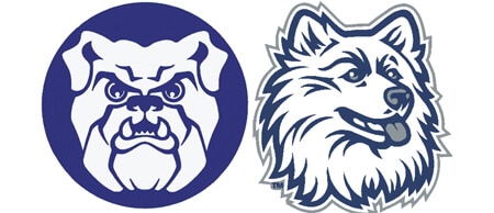
They have virtually the same colors, so there’s no distinction, no advantage, there. And they both have dogs as mascots. But BUTLER’s is a crude slobbering Bulldog while UCONN’s is a sweet fluffy Husky with his tongue peeking out. Real Huskies actually look quite intimidating. But not this logo. It’s completely tame. Is “tame” appropriate for a team logo design in a competitive sport? Does that inspire a competitive spirit?
BUTLER’s Bulldog is also an unrefined drawing which looks a bit unprofessional while UCONN’s Husky is a streamlined drawing which looks professionally drawn, if a bit sterile. The Bulldog is staring straight at the viewer, while the Husky wistfully gazes off to the right, no eye contact.
The Husky looks sweet and nurturing but the Bulldog looks aggressive.
In short, BUTLER’s Bulldog looks like it’s got some testosterone, while UCONN’s Husky looks neutered. Here’s the matchup:
Therefore it seems between the two designs, the MOST APPROPRIATE logo for a team mascot in a COMPETITIVE sport is clearly Butler. Crude and mean trump a sweet and refined logo design in a competitive scenario. It does not guarantee a win, but it can definitely add fuel to fan frenzy. And fan frenzy can propel an organization a long way beyond it’s actual capability. For example, during the season, who expected Butler to be in this final game?
You can leave a response, or trackback from your own site.
This content was originally published here.


