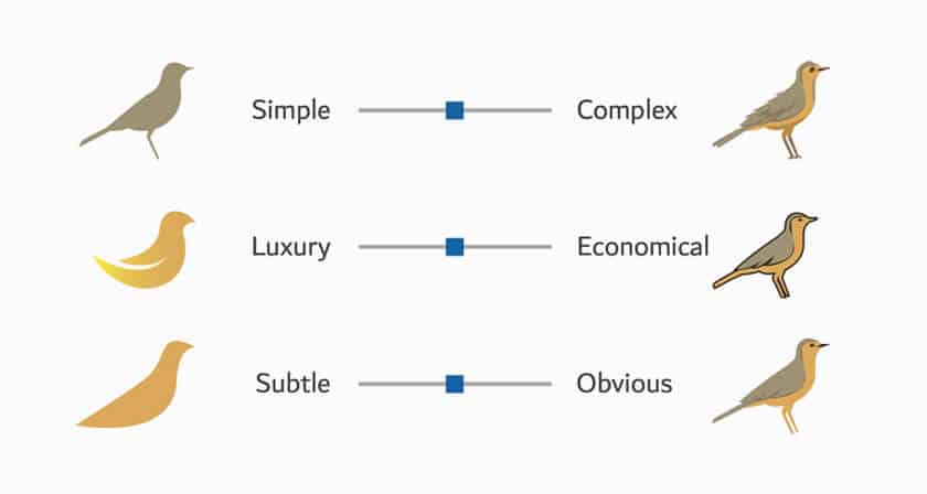
This Simple Chart Explains What Common Terms In A Logo Design Brief Mean
What do clients mean when they say their logo needs to be modern, luxurious, or subtle? Dubai-based logo designer Jefferson Pascual has created a handy This content was originally published here.
This Simple Chart Explains What Common Terms In A Logo Design Brief Mean Read More »

