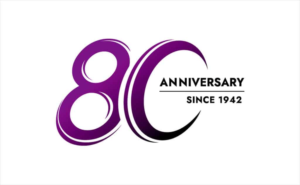
Tyre brand Nexen Tire has revealed a special anniversary logo ahead of the company’s 80th anniversary, which will be officially marked on May 1.
Through the end of the 2022 anniversary year, the new emblem will be used across the Korean brand’s marketing and communication touchpoints.
“The new commemorative emblem incorporates Nexen Tire’s legacy and history, symbolising the importance of the company’s long-term commitment to its consumers. The overall design of the emblem resembles a moving tyre, demonstrating Nexen Tire’s initiatives of meeting the different mobility needs of its consumers,” says the company.
“I’m honoured to introduce this commemorative emblem and kick off our 80th anniversary celebration,” further comments Nexen Tire’s global CEO, Travis Kang. “I am truly proud of what we have accomplished. The significance of this milestone demonstrates that our clients and workers value our efforts”.
Like the brand’s main Nexen symbol, the anniversary logo is also coloured purple, albeit with a gradient finish; the purple “implies nobility” according to the Yangsan-headquartered company.
Since being founded in 1942, Nexen Tire – whose name incidentally is a portmanteau of the words “next” and “century” – has gone on to become one of the world’s biggest tyre manufacturers.
It currently exports to 120 countries and some of its tyres even come fitted as standard on a number of car models made by major vehicle manufacturers such as Fiat, Chrysler, Mitsubishi, and Volkswagen, as well as being found as original equipment on more high-end, luxury models from marques like Porsche.
The company’s tyres have also picked up numerous design awards in recent years, including several gongs from the prestigious German-based iF Design Award.
Source: Nexen Tire
The post Nexen Tire Reveals Special 80th Anniversary Logo Design appeared first on Logo Designer.
This content was originally published here.


