Designing a website can be a daunting task. You have to create a layout, write text, find imagery, design it beautifully, and make sure the user experience is perfected. There are so many elements that go into creating, and it can feel overwhelming. To help this process run smoother, you can use Figma! Here are 5 ways Figma can help improve your website before you even start developing it:
1. Create a Wireframe Layout
Before you get started on any of the minor details, create a basic layout to get yourself oriented. By simply placing boxes and text on an artboard, you can quickly create a functional layout. Until you know what content you’d like to add to your mockup, you can simply use grey boxes for images, and Lorem Ipsum for text.
Creating a mockup of your website on Figma helps you make the minor tweaks and decisions that’ll help your site start off on the right foot.

2. Test Out Your Written Content
After you’ve created your mockup, it’s time to think about text! Figma can help you decide just how much written content you need and where it should go.
For example, if you have 4 values you want to include on your about page with three paragraphs each, it may look alright in your head. However, once you input it into Figma, you’ll notice it becomes very text heavy and overwhelming. By simply changing the paragraph size and layout, things become simpler and more visually appealing. Figma helps put your written content into perspective.

3. Test Out Imagery
Similarly, you can use Figma to test out the photos you’d like on your website. After placing imagery in your wireframe, you may realize the orientation is off. If you’re putting a landscape image next to a vertically long paragraph, it’ll look unbalanced. Changing the image orientation or finding a portrait photo can make a world of difference. After you’ve placed all your imagery into your mockup, you’ll have an amazing reference to help you build your site.

Figma comes with a variety of tools to help you create a beautiful design! It has a massive font library, an unlimited color wheel, and a pen tool to help create unique shapes. You can also upload or copy and paste design materials from outside resources.
After you’ve created a design that you’re happy with, Figma even lets you export any image or design asset so you can implement it directly into your website.

5. Prototype Your Design
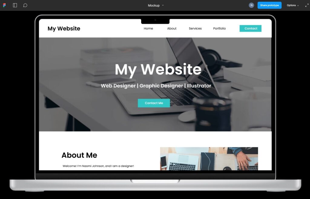
Last, but not least, you can test out User Experience directly on Figma. By utilizing Figma’s prototyping tools, you can create a fully functional mocked-up website. You can link buttons to pages, create hover over actions, set up your menu navigation, and much more.
After you’ve created your prototype, you can then share it with others to get their feedback. By viewing your figma file in presentation mode, they can click on the buttons you’ve prototyped and experience the website for themselves. At this point, you may discover some buttons are being unnoticed and need to be more prominent. Or a certain page doesn’t quite fit in with the rest of the website. Being able to test out your design can help you prepare for the site itself. Making changes to a mockup is much easier than to a finished website.

Try out Figma today to learn more about how it can help you prepare for your new website. If you need additional help, you are always welcome to our team of designers here at Big Red Jelly. We can’t wait to hear from you.
The post Murals, Wood Burning Art, Logo Design or UX/UI: No matter the medium, how you can empower your personal creativity to shine through appeared first on Big Red Jelly.
This content was originally published here.


