As we enter the New Year, it’s important to keep an eye on the latest logo design trends that are shaping the industry. Let’s dive into Logo Design Trends to Watch Out for in 2023: Stay Ahead of the Curve!
A logo is the visual representation of your brand identity, and it’s crucial to ensure that it’s up-to-date with current design standards to effectively communicate your brand’s message to your audience.
In this article, we will explore the past, present, and future of logo design trends, with a focus on the trends that are predicted to dominate the industry in 2023 and beyond. We’ll also provide expert insights and tips for incorporating these trends into your brand identity without losing your uniqueness.
Why Logo Design Trends Matter
A well-designed logo is the cornerstone of a brand’s identity. It’s the first thing that people see and can make a lasting impression. Logo design trends are constantly evolving, and it’s important to stay up-to-date with the latest design standards to ensure that your brand stands out from the competition.
By incorporating the latest logo design trends, you can showcase your brand’s innovation and creativity while also conveying your message effectively to your audience. Additionally, keeping up with the latest trends can help you stay ahead of the curve and position your brand as a leader in your industry.
What to Expect from This Logo Design Trends Article
In the following sections, we’ll discuss the past, present, and future of logo design trends. We’ll review the trends that have shaped the industry in the past, analyze the current trends that are dominating the industry, and predict the future trends that are likely to emerge in 2023 and beyond.
We’ll also provide expert insights on how to stay ahead of the curve by incorporating these trends into your brand identity without sacrificing your uniqueness. By the end of this article, you’ll have a solid understanding of the latest logo design trends and the tools and tips you need to keep your brand ahead of the competition.
Past Logo Design Trends Shaping the Future
As with any creative industry, logo design has seen many trends come and go over the years. Here, we’ll take a look at some of the logo design trends that have shaped the industry in the past and explore how they’ve influenced the designs we see today.
Past Trends: Logo Design Trends 2022 |Logo Design Trends 2021 | Logo Design Trends 2020| Logo Design Trends 2019 |
Black & White Logo Design
The black and white logo design trend is a classic approach to creating logos that has stood the test of time. This trend uses only black and white colors to create a clean, bold, and minimalist design.
It is a great choice for companies looking for a timeless and versatile logo that can be used across various platforms and media. The simplicity of this trend makes it easy to read, recognize, and remember, which is essential for building brand awareness and loyalty. Many brands, such as Nike, Chanel, and Apple, have used black and white logos to great effect over the years.
Monogram Logo Design
Monogram logo design, also known as lettermarks, is a popular trend in logo design where a company’s initials or name are stylized into a single unique symbol.
Monogram logos are simple yet impactful, making them a great choice for brands that want to convey sophistication and professionalism. Many companies have adopted monogram logos, including luxury fashion brands like Louis Vuitton and Chanel.
Vintage and Retro Logo Design
In recent years, we’ve seen a resurgence in vintage and retro designs. These designs take inspiration from the past, using old-fashioned typography, colour palettes, and imagery to evoke nostalgia and create a sense of authenticity. Some popular vintage and retro styles include Art Deco, 1950s Americana, and mid-century modern.
Logo Design Minimalism
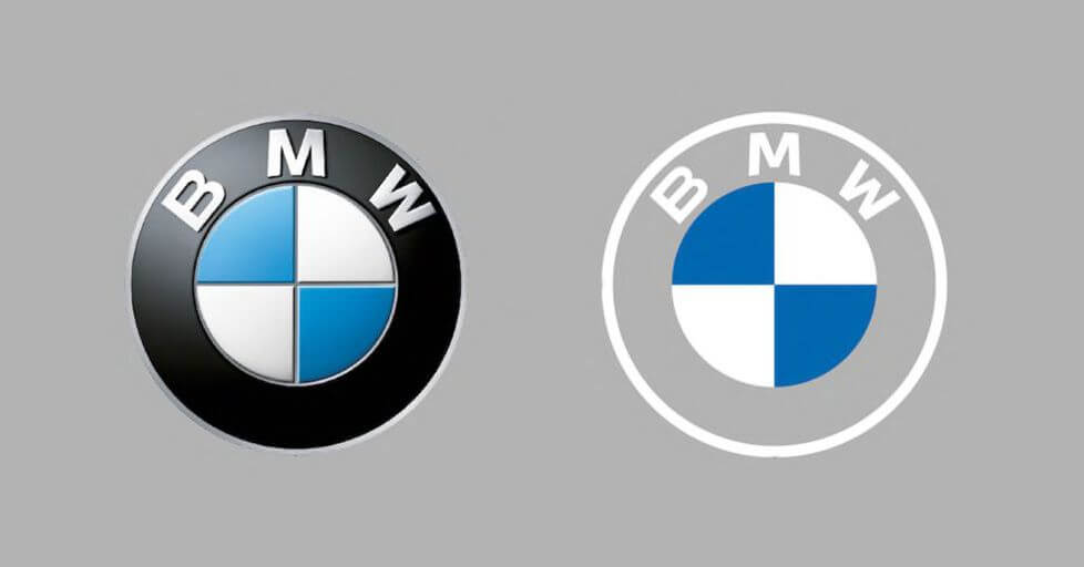
Minimalism has been a popular trend in logo design for several years now. The concept is simple: strip away any unnecessary elements, leaving only what’s essential. Minimalist logos are often monochromatic, with simple shapes and typography. They’re clean, modern, and can be highly effective in communicating a brand’s message.
Negative Space Logo Design
Negative space logo design is a technique where designers use the space around and between the elements of a logo to create a secondary image or message.
The idea behind negative space logo design is to create a visual illusion that there is more to the logo than what meets the eye. The negative space can be used to create a hidden image or message that is revealed only when the viewer takes a closer look.
This technique is not new, but it has gained popularity in recent years, as it allows designers to create a clean and minimalist design while still conveying a complex message.
Some of the most famous examples of negative space logo design include the FedEx logo, where the negative space between the “E” and the “X” creates an arrow, and the logo for the World Wildlife Fund, where the negative space forms the shape of a panda.
The Toblerone logo is another classic example of negative space usage in logo design. The iconic mountain shape in the centre of the logo is created by the negative space between two mountain peaks, forming a bear representing the Swiss Alps and the village Bern where Toblerone originated.
Gradient Logo Design
Gradient designs have been used in logo design for many years, but they’ve recently seen a resurgence in popularity. Gradient designs use two or more colours to create a smooth transition between shades.
They can be used to create depth, texture, and interest in a logo design, and they’re often used in combination with other design elements, such as typography or illustration.
Flat Logo Design
Flat design is a minimalist style that uses simple shapes and typography to create a clean, modern look. Flat designs often use bright, bold colours and minimalistic illustrations to create a sense of playfulness and approachability.
This style has been popularized by companies like Apple and Google and has been widely adopted by designers in recent years.
Hand-Drawn Logo Design
Hand-drawn designs are a popular trend that adds a personal touch to a logo design. These designs often use hand-drawn illustrations or lettering to create a sense of authenticity and uniqueness.
They can be highly effective in creating a friendly, approachable brand identity.
By understanding past logo design trends, we can gain insight into how the industry has evolved and how current trends are influenced by those that came before.
In the next section, we’ll explore the current logo design trends that’s shaping the industry today.
Current Popular Logo Design Trends in 2023
Logo design is an ever-evolving industry, with new trends emerging every year. Here are some of the current logo design trends that are shaping the industry in 2023:
Logo Design with Bold Typography and Standout Letters
Bold typography has been a popular trend in logo design for several years now, and it’s still going strong. This trend uses thick, sans-serif fonts to create a strong and impactful brand identity.
It’s often paired with bright colours or minimalistic illustrations to create a memorable and eye-catching logo design.
The standout letter trend in logo design is all about highlighting a single letter within the logo to make it the focal point. This approach can be effective in creating a memorable and unique brand identity.
By using creative typography, negative space, or other design elements, designers can make the letter stand out and capture the attention of the viewer.
Logos with Geometric Shapes
Geometric shapes have been a popular trend in logo design for several years now, and they’re still going strong. This trend uses simple geometric shapes, such as circles, triangles, and squares, to create a clean and modern look.
Geometric shapes can be highly effective in creating a sense of balance and symmetry in a logo design.
Icons with Lettermarks
Icons with lettermarks are a logo design trend that combines a lettermark with a small icon or symbol. This technique is gaining popularity as it offers a creative way to incorporate a graphic element into a logo without overshadowing the brand’s name.
Lettermarks with an icon are particularly effective for brands that have long or complex names as they offer a visual shortcut to represent the brand. Additionally, these logos can be more memorable and easier to recognize than simple lettermarks.
When designing an icon in a lettermark logo, it’s essential to ensure that the icon is simple and can be easily associated with the brand. For example, the FedEx logo features a simple arrow icon between the “E” and “X,” which represents speed and efficiency, two key values of the brand.
Overall, icons in lettermarks are a great way to create a unique and memorable logo that stands out from the competition. However, it’s important to ensure that the icon is relevant to the brand and doesn’t distract from the overall design of the logo.
Consider incorporating this trend into your logo design if it aligns with your brand’s values and identity. With the right execution, an icon with a lettermark logo can help your brand make a lasting impression on your target audience.
Glitch Effect Logo Design
Another logo design trend that’s gaining popularity is the glitch effect. This trend involves creating logos that have a digital distortion or “glitch” effect applied to them, making them look like they’re malfunctioning or breaking down.
The glitch effect can be achieved in many ways, such as using Photoshop filters or adding code to the logo’s SVG file. This effect can add a sense of edginess and modernity to a logo, making it stand out in a sea of more traditional designs.
Some examples of companies that have used the glitch effect in their logo design include Spotify, Twitch, and Amazon Prime Video.
However, it’s important to use the glitch effect strategically and not overdo it, as it can quickly become overwhelming and difficult to read.
When using the glitch effect, it’s important to consider the colour scheme, typography, and overall message of the logo. The glitch effect can be a great way to create a logo that’s both modern and memorable, but it should be used with caution and purpose.
Line Art Logo Design
Line art is a minimalist trend that uses simple, thin lines to create illustrations and typography. This trend has become increasingly popular in recent years, as it can be highly effective in creating a clean and modern look. Line art can be used to create intricate illustrations or to add a touch of elegance to typography.
Logos with Gradients
Gradients have been a popular trend in logo design for several years now, and they’re still going strong. This trend uses two or more colours to create a smooth transition between shades.
Gradients can be highly effective in creating depth and interest in a logo design, and they’re often used in combination with other design elements, such as typography or illustration.
Hand-Lettering Logo Design
Hand-lettering is a trend that adds a personal touch to a logo design. This trend uses hand-drawn lettering to create a unique and authentic brand identity. Hand-lettering can be highly effective in creating a friendly and approachable brand identity.
By staying up-to-date with the latest logo design trends, designers can create fresh and innovative designs that stand out from the competition. In the next section, we’ll explore how these trends are shaping the future of logo design.
Layered and Overlapping Logo Design
Another popular trend in logo design is the use of layered design elements. This technique involves overlaying multiple design elements on top of each other to create a complex and visually interesting logo.
Layered logo designs often incorporate different textures, colours, and shapes, resulting in a dynamic and unique visual identity. This trend has been gaining popularity in recent years, as it allows for a more layered and nuanced brand identity.
Some of the most successful brands have embraced the layered logo design trend, including Spotify, Airbnb, and Mastercard.
Future Logo Design Trends
Logo design is constantly evolving, and there are always new trends on the horizon. Here are some of the logo design trends that we expect to see in the future:
Logos with Abstract Shapes and Forms
In the future, we expect to see more abstract shapes and forms in logo design. This trend uses non-representational shapes and forms to create a unique and memorable brand identity.
Abstract logos can be highly effective in creating a sense of mystery and intrigue around a brand.
3D Logo Design
As technology advances, we expect to see more 3D designs in logo design. This trend uses three-dimensional elements to create a realistic and immersive brand identity.
3D logos can be highly effective in creating a sense of depth and dimension in a logo design.
Augmented Reality
Augmented reality is an exciting new trend in logo design that is expected to become more popular in the future. This trend uses technology to create interactive and immersive brand experiences.
Augmented reality logos can be highly effective in creating a strong emotional connection between a brand and its audience.
Minimalism in Logo Design
Minimalism has been a popular trend in logo design for several years now, and it’s not going anywhere. In the future, we expect to see even more minimalistic logo designs. This trend uses simple and clean designs to create a strong and impactful brand identity.
Dynamic Logos
Dynamic logos are logos that change and adapt over time. This trend uses technology to create logos that respond to different contexts and situations.
Dynamic logos can be highly effective in creating a sense of flexibility and adaptability in a brand.
By staying on top of the latest logo design trends, designers can create fresh and innovative designs that keep their clients ahead of the curve.
As we’ve seen in this article, logo design is constantly evolving, and there’s always something new on the horizon.
How to Stay Ahead of the Curve
Keeping up with logo design trends can be a challenge, but it’s crucial for businesses that want to stay relevant and competitive.
Here are some tips on how to stay ahead of the curve:
1. Research and Stay Informed
Make a habit of keeping up with the latest trends in logo design. Follow design blogs, subscribe to design newsletters, and read design publications regularly.
This will help you stay up-to-date on the latest design trends and get a sense of where the industry is heading.
2. Experiment and Take Risks
Don’t be afraid to try new things and take risks with your designs. Experiment with different colours, typography, and design styles to create unique and memorable logos that stand out from the crowd.
3. Embrace Minimalism
Minimalism has been a dominant trend in logo design for years and shows no sign of slowing down. Consider simplifying your designs by using clean lines, minimal colour palettes, and simple typography.
This approach can make your logo more versatile and adaptable to different media and platforms.
4. Understand Your Brand Identity
Your logo should reflect your brand identity, so it’s important to have a clear understanding of what your brand stands for. Take the time to define your brand values, personality, and voice, and use this information to inform your logo design choices.
5. Work with a Professional Logo Designer
If you’re not a designer yourself, consider working with a professional logo designer. They can help you create a logo that not only looks great but also effectively communicates your brand message and values. A good designer can also guide you on the latest logo design trends and how to incorporate them into your brand identity.
By following these tips, you can stay ahead of the curve in logo design and create logos that are not only visually appealing but also reflect your brand identity and values.
In conclusion, staying up-to-date with the latest logo design trends is crucial for businesses to remain competitive and relevant in today’s market.
As we have discussed in this article, the past, current, and future logo design trends are constantly evolving, with new styles and techniques emerging every year.
By keeping an eye on these trends and understanding their impact on consumer behaviour, businesses can create logos that not only look great but also resonate with their target audience.
However, it’s important to remember that trends are just one aspect of logo design, and businesses should prioritize creating a unique and timeless logo that reflects their brand’s values and identity.
In summary, the key to successful logo design is a combination of staying informed about the latest trends while also staying true to your brand’s identity. So, keep an open mind, experiment with different styles, and don’t be afraid to push boundaries to create a logo that truly stands out.
Join The Logo Community
We hope you enjoyed this article about Logo Design Trends to Watch Out for in 2023: Stay Ahead of the Curve. If you would like more personal tips, advice, insights, and access to our community threads and other goodies, join me in our community. You can comment directly on posts and have a discussion.
*TIP – We use and recommend DesignCuts for all your fonts, mockups and design bundles.
This content was originally published here.


