Listen to this blog post:
[hr]
I’ve done my fair share of logo designs over the years and there is one thing that crops up time after time: trying to fit everything into the logo.
What do I mean by everything?
Well, business owners tend to get fixated on the logo having to encompass the whole brand in this one little design element. And whilst I’d agree that the logo is an important piece of the brand jigsaw, it is just that: one piece of the puzzle and should be treated as such.
Lets look at a couple of well known examples:
[hr]
Nike
Nike’s mission statement is:
“To bring inspiration and innovation to every athlete* in the world.”
The legendary University of Oregon track and field coach, and Nike co-founder, Bill Bowerman said, “If you have a body, you are an athlete.”
Bowerman was a teacher who showed athletes the secrets to achievement. Nike invites you to experience all innovative and inspiring Nike products.
Source: http://help-en-us.nike.com/app/answers/detail/a_id/113/~/nike-mission-statement
I can imagine the initial design conversation going something like this:
“I want to incorporate this all into the design. I was thinking, maybe have a person running and include the strap line. Maybe a few different colours because we’re appealing to both sexes? How about some grass, because lots of people run on grass… no hang on, it’s other sports too. Do you think we should try to get all the different sport icons into the logo so people will know we do trainers for golfers, runners, tennis players etc?…” and so on…
Cue the designer pulling their hair out and wondering how best to steer the conversation round to creating something far more simple!
I’m sure you’ll agree that the logo has none of these elements, however has become an icon recognised across the globe and worn proudly on the bodies of millions of people… even tattooed onto them.
In fact, in many cases the logo is now simply the famous ‘swoosh’ and no words.
Can you see how the logo is in fact a very small part of the bigger Nike ‘brand’?
The logo is an identifying mark so we can see quickly, instantly even, businesses that we recognise and have built an internal reaction to: either one of love, hate or indifference.
Nike’s brand is not the logo, their brand is their sports wear and how people feel when they are wearing it. If their trainers were rubbish or their adverts uninspiring then we would not associate the things we do with their logo.
[hr]
Starbucks
Starbucks mission statement is:
“Our mission: to inspire and nurture the human spirit – one person, one cup and one neighborhood at a time.”
Source: http://www.starbucks.ca/about-us/company-information/mission-statement
Imagine a new coffee business approaching a logo designer, you’re going to be asked to create something that has a ‘feel’ of coffee about it. Maybe a coffee cup, a wisp of steam or some coffee beans?
Not with Starbucks. They chose the name based on a nautical character and one of the early creative peeps working on the logo searched through old marine archives until he found a 16th Century Nordic woodcut of a siren and they decided to go with that. Totally different from your average coffee shop.
Original is good! In fact, just a couple of years ago Starbucks decided to ditch the wording around the logo and simply have the siren, it is now so well known and so much associated with their brand values: good coffee served the same wherever you are in the world, that we don’t even need the words to know what it is. You’ll notice many of the brand giants following this same path.
There are SO many other examples I could give you where businesses have kept it simple when it comes to the logo.
I know, I know, it’s incredibly easy to get super excited when you’re getting started and to get swept up in the creation of it all. All these new things to think about and make happen, and you want it all NOW.
But I promise you. If you keep it simple it gives you far more scope to have fun with the other elements of your brand. Things like the colours, the words, the fonts, the images and so much more.
Give your poor little logo a break and let it do it’s job without all the added pressure of being your whole brand in one little design.
[hr]
To Summarise
Keep It Simple
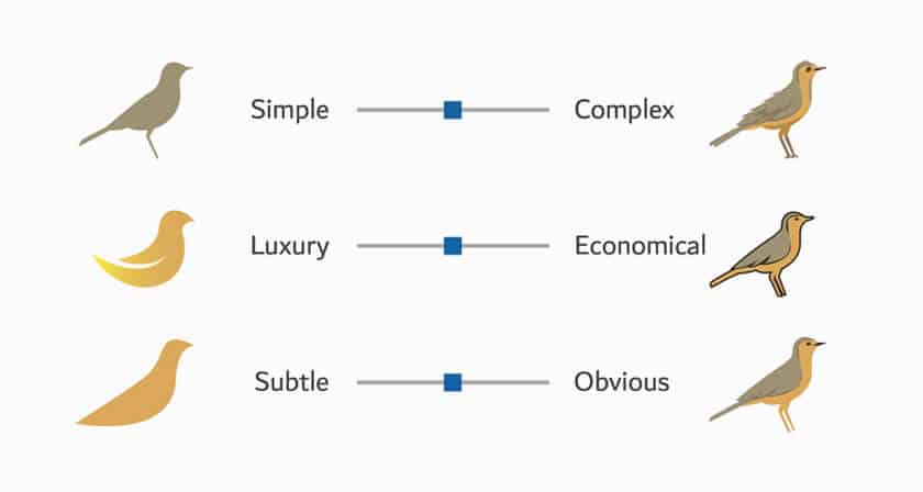
Honestly, keep it simple. I can’t say it enough. Some of my very favourite logos are hugely simple. Clever, but simple. Trying to get everything you can possibly imagine about your business into a logo design is not something you’ll be glad you did further down the road. Simple logos stand the test of time.
Take Your Time
When working with the designer for your logo I urge you to take your time. Allow at least 2 weeks for creation time and try to step back on the pressure button and enjoy the process. Sometimes it’s 100% perfect first try and in little time but often it requires tweaking to get just right.
Good Is Good
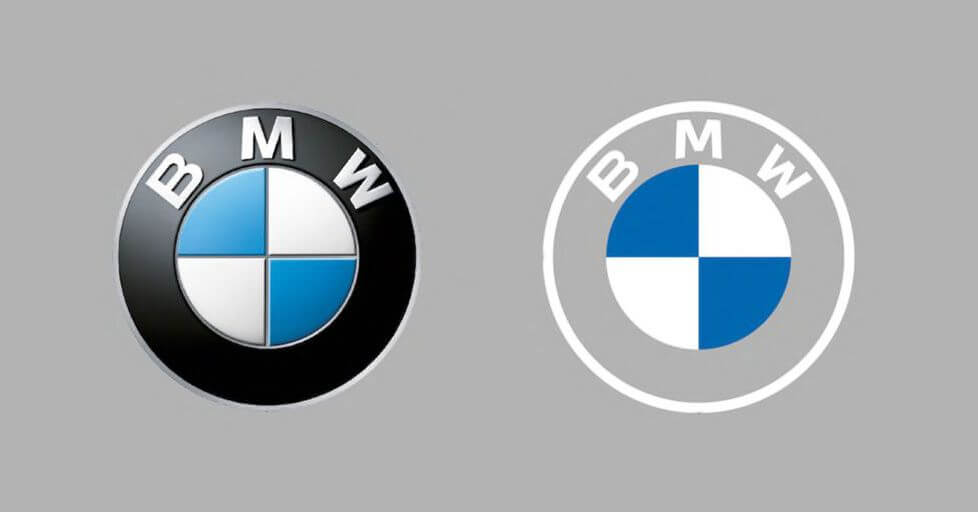
Most businesses logos change over time, so don’t get fixated on your logo having to be the one thing that never changes, EVER for your business. I’ll give you some examples here: http://www.hongkiat.com/blog/logo-evolution/ of some of the biggest companies around and how they have tweaked their logos to suit changing times and business plans. You want your logo to be right of course but don’t panic about it – remember it’s part of a much bigger picture.
[hr]
Other reading
What You Need To Know When You Get A Logo Designed http://www.brandkitchen.co.uk/what-you-need-to-know-when-you-get-a-logo-designed/
Isn’t It The Graphic Designer’s Job To Create My Brand? http://www.brandkitchen.co.uk/isnt-it-the-graphic-designers-job-to-create-my-brand/
What Are Branding Guidelines And Do I Need Them For My Business? http://www.brandkitchen.co.uk/what-are-branding-guidelines-and-do-i-need-them-for-my-business/
Get The Right Artwork: Save Money, Stress And Time http://www.brandkitchen.co.uk/get-the-right-artwork-save-money-stress-and-time/
[hr]
The post Logo Design Tips For Business Owners appeared first on Sophie Jewry – Queen of Brand & Princess of Planners.
This content was originally published here.


