If you’re making a hunting logo, then it’s good to know if there any and what are specific patterns, repetitive elements, and styles in this sphere.
We will also try to highlight how the design crowdsourcing platform 48HoursLogo works showing the simplicity and huge creative potential that are making people love it.
We have analyzed 48HoursLogo Hunting Logos Design Contests and we hope it will be very interesting and useful for both, clients and designers.
So, here are some of the very cool examples and mini case studies of Hunting Logo Design Contests. Learn how to “hunt the designs”. Enjoy!
Oak & Iron Outdoors Logo Design Contest
The client gave specific instructions about the target audience, and explained his business as “a combination of hunting, fishing, and fitness via the website and youtube”.
The design brief pointed out that the logo should resemble toughness, fortitude, physical strength, and old-school hunting/fishing/strongman nostalgia, emphasizing that his business includes areas such as working out / lifting weights for bowhunting, canoeing, and other outdoor endeavors.
It was also stated that the logo, in addition to the website and YouTube channel, will be used for printing on T-shirts and similar things. He also specified the tagline he wants.
The client had a clear idea of what kind of logo he wanted and also determined the color combination: Cranberry Red, Forest Green, and Cream.
A very detailed design brief (with clear instructions and with the addition of design samples) provided the designers with a clear framework of creative thinking. Such design briefs are always welcome because they greatly improve the creative process.
The client received 52 design solutions from our designers, and his satisfaction is evidenced by the fact that in addition to the winning solution, he bought two additional logos that he liked.
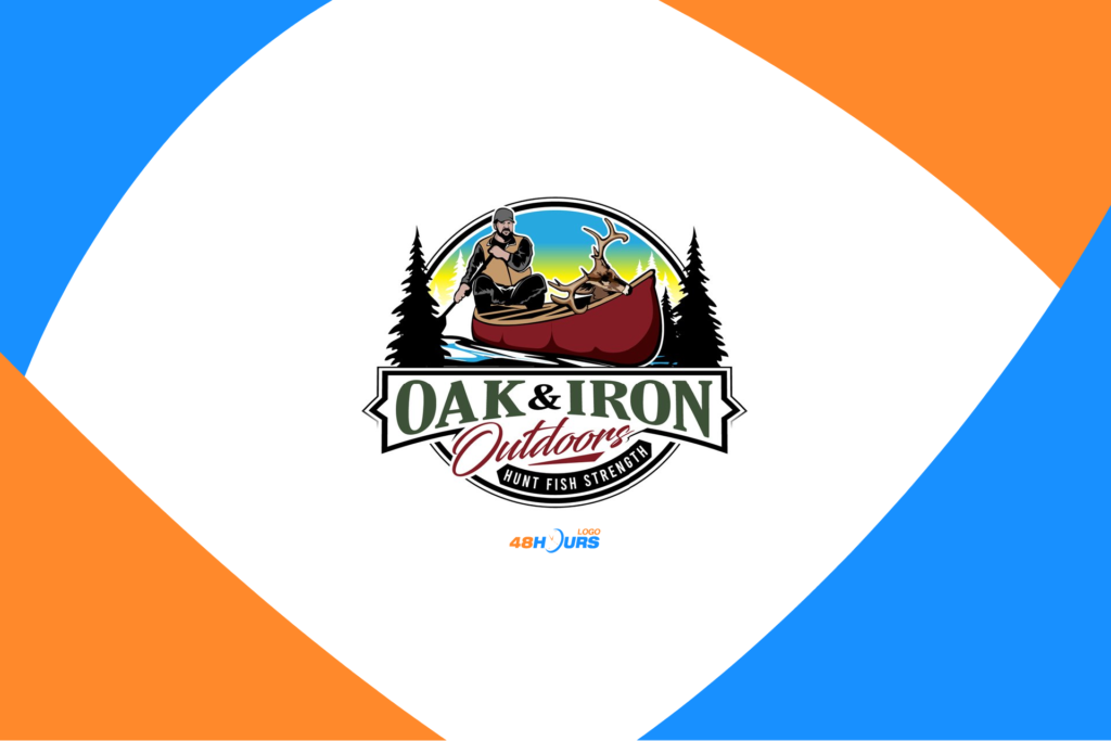
Winning logo design solution
The winner of this design contest was DreamLogoDesign
The designer followed the instructions and made an excellent blend of all the elements listed by the client. He achieved an atmosphere of old-school nostalgia while creating a logo that reflects the strength and spirit of adventure.
He used all the potential of the badge logo form and the desired tagline is done in a stylistically good way.
Great composition of colors, as well as the overall graphics and elements that make up the logo.
The logo has a strong line of “call-to-action” and thus fulfills its purpose in an extraordinary way by communicating directly and strongly with the target group.
Some of the other solutions…
McFadin Outfitters Logo Design Contest
The design brief of McFadin Outfitters was specific about several things, and good instructions are always valuable.
“Everything in black outline! With the font being a cursive font but still easily read and not penciled but not crazy bold either. The logo will be used as a watermark on all hunting trophy pictures with clients, as well as hats, shirts, and merchandise.”, McFadin Outfitters stated in the design brief.
The client described the desired and defined arrangement of elements within the logo, and the option “design samples” was used, which additionally described everything by showing examples of similar logo design solutions.
“McFadin Outfitters” is a hunting guide and outfitter. This client received 103 creative logos to choose from.
Winning logo design solution
Designer daywalker won this logo design contest!
The winning logo contains exactly what the client was looking for. It’s black and outlined with a cursive font.
Two colors, black and dark brown, in a very good “non-aggressive but powerful” combination.
The inscription is simple and communicates strongly. Clear visibility. The energy that includes the adventurous spirit and a serious sports approach, which is great in relation to communication with the target group.
The overall concept reaches the level of recognizability, and that is the goal of every logo. Excellent logo design that is an example of why people love to crowdsource design on the 48HoursLogo platform!
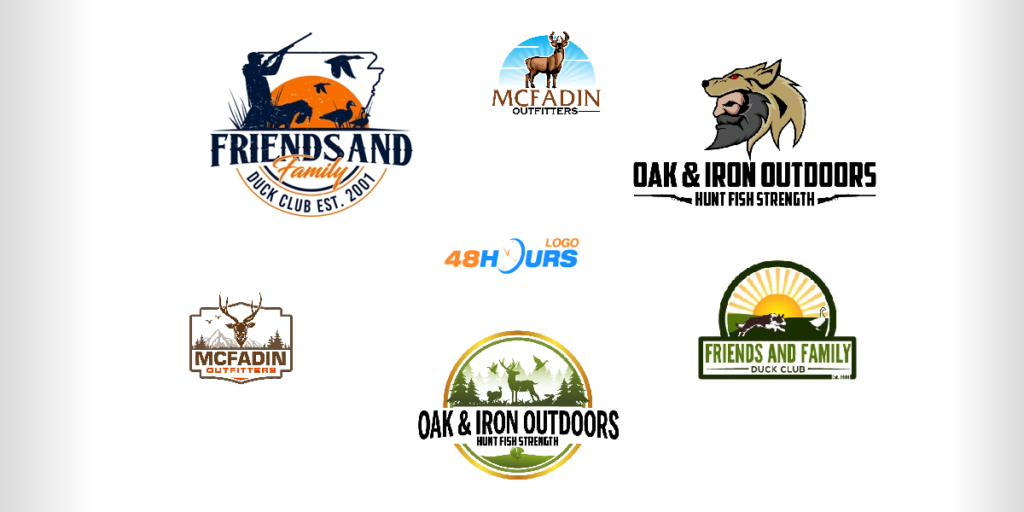
Some of the other solutions…
Friends and Family Duck Club Logo Design Contest
“Friends and Family Duck Club” is a duck and goose hunting club consisting of family and friends in the state of Arkansas.
This design brief was simple, a few sentences. The inscription “Est 2001”, the use of certain elements such as “dog, duck, goose”, and the shape of the state of Arkansas, that’s what the client pointed out.
“Need it easily embroidered or screen printed,” the client noted in the design brief. There were 37 design solutions he received.
This number is smaller than the average number of designs clients usually receive. Clients should pay attention to the fact that more detailed design briefs attract more designers because it gives more precise instructions and a better creative inspiration framework.
Winning logo design solution
The winning designer is rokenrol
By adding orange shades and elements of sunny ambiance, the designer gave a note of “closeness, warm feelings, elements of nature” to the whole concept, which is especially important because of the brand’s focus on the “family and friends” philosophy.
Following the design brief, the designer used the shape of the map of Arkansas and included the other elements that the client mentioned.
A great modern logo that does not lose the spirit of naturalness and sends the message that it is a club with an atmosphere of friendship and good company.
A classic hunting scene, where the hunter targets geese, ie ducks, perfectly blended in black. The composition of both the elements and the colors, and the effect of the communication power and clear message of the brand, is what makes this logo a great design solution.
Some of the other solutions…
With 70,000+ customers and more than 5 million design solutions uploaded, 48HoursLogo is one of the top design crowdsourcing platforms on the Internet. Don’t wait a second more – launch your design contest!
This content was originally published here.

