Logos are an essential part of a company’s public image and presence. Some of the biggest brands in the world like Apple, Nike, and Amazon are such big brands that their logo is recognizable to almost anybody in an instant. In this article we look at How to Create a Striking and Minimalistic Logo.
These logos tend to be sleek and sophisticated looking, yet at the same time, are visually extremely simple. Think about the Nike Swoosh, or Mac’s apple, or even Gucci’s mirrored G insignia; all of these logos capitalize on the simple design to appeal to customers.
It’s amazing how much can be communicated and evoked from a simple graphic. In this article, we’ll be talking about how you can use this concept to create an amazing minimalistic logo for your own company that is visually powerful.
Why Is Logo Design Important?
Logos have been around for hundreds of years, surprisingly. The first logos could realistically be identified as Egyptian and Mesopotamian hieroglyphs.
More mainstream logos came about as far back as the early 1300’s, when shops and pubs in England found it useful to use pictures and images for the uneducated townsfolk who wouldn’t read.
Then, more recently, in the last 70 years, logos became essential for most businesses, and started to become associated with the new idea of “brand identity”.
Logo Design helps customers and consumers associate a certain brand or manufacturer with something as simple as an image. In such a consumer-based society as today, people establish trust with brands and companies they feel produce quality, appealing products.
Nowadays, when walking in a store, in almost an instant, customers are able to recognize which products are quality products, ultimately making a huge influence in what product they decide to buy.
Essentially, good Logo Design associated with a good brand does much of the sales and marketing for the company already. If your brand develops a consistent consumer base because of the quality of your products, think of your Logo as just a targeted ad to draw those consumers to your products, all over the world.
What Makes a Bad Logo?
Most people would say they could tell a good logo from a bad logo in today’s logo saturated environment. Most consumers are smart enough to know a good logo when they see one.
They would most likely recognize a good logo for its simplicity and appeal and a bad logo for it’s cluttered and complicated appeal, and infectivity to communicate anything about the brand identity.
Here are a few examples of Logos that were less than perfect.
Apple Computers, late 1970’s
This was the first Apple Computer Logo that was developed by Steve Jobs and his friends, but was quickly thrown for the Rainbow Apple that would develop into the Logo we see today.
The logo honestly looks like a trademark logo for a book company; it does not communicate the message of sexy, high-tech, sleek products, but rather, old, outdated, and anything but high-quality computers.
Luckily Jobs threw this one to the wayside when they began to grow.
Logo for the London Olympics, 2012
First of all, this is not the logo you’d expect to see for only the most globally impactful sporting event in history. It looks cheap, small, and appears to almost be made by a child.
The jagged edges of cluttered polygons communicate nothing about what the Olympics are based on: honor, pride in your country, diversity, and global communion.
Probably would be a better fit with a Children’s toy company. In some cases, it’s the principle of a good logo that is simply irrelevant.
Components of a Good Logo
After analyzing these flukes, the biggest takeaway should be: How can I create a Good Logo? What are the fundamentals of a timeless Logo for my business that will imprint in the minds of consumers and competitors alike?
Obviously, taking the most popular logos of today, we can conclude that minimalism and design are equally important. You don’t want your logo to look like it was designed on Microdoft Paint, but also, you don’t want your logo to be riddled with text and confusing graphics; you want it to communicate a clear message to the audience.
This, in our opinion, would be the focal point. Before you even begin to design your logo, think about what message you want to communicate to your audience. What values has your company built itself upon? Tradition? Quality, effectiveness, family values, fun and entertainment? How would you verbally categorize your company and what it does?
Brainstorm these messages, and come up with a “power statement”; 3-5 of your most important values and qualities. From there, you can start to think about how you can design your logo to align itself around your power statement.
In House v. Agency Graphic Design
Many large companies have the opportunity and funding to use a Logo Design Specialist; a company fully dedicated to making logos the best in the business. However, some smaller companies might not have the funding and choose to hire someone internally, or use a cheap gig worker, to create a logo for a small fee. The latter has it’s cons, and it really depends on what you are looking for.
With an In-House Graphic Designer, you can trust that this individual can see how your company operates internally. This person will usually see the nuts and bolts of your company from up close, allowing them to build your brand and your logo truthfully.
With a Graphic Design agency or company, there are different factors. While they may have less of an understanding of your brand specifically, they are professionals at creating logos. They often have a logo design portfolio available for clients to see, which helps the client see the designers quality of work.
It’s widely known in the industry that this option is usually more expensive, but often yields a more quality result. Many of these companies also offer consulting in their design package, giving them a better idea of what it is you want and allowing them to deliver a totally unique logo that fits with your brand.
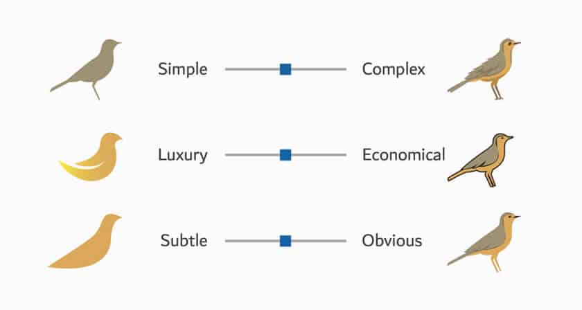
It is entirely up to the business owner to make this choice; sometimes opting for a simple, more economic looking logo will serve the company well, and sometimes it may require something bigger.
There are many options for each pursuit, and we highly recommend a professional logo designer. You can Hire The Logo Creative for your logo design project.
How to choose the Logo for your Brand
So many factors come into play here with the Art of Logo Design; which typography to use, whether or not to use a color scheme or to opt for simple colors, having a call to action involved in the logo…there are many things you can consider.
When creating a minimalistic logo, it’s usually wise to avoid excessive text, or often text at all; your visual is the most important to you. Each visual may vary in different categories.
For example, if you are building a logo for a tech company or education platform, these logos will often be seen more by professional users. It’s best to keep the design simple, to something like a small, equilateral, geometric design that doesn’t use very loud color schemes.
If you are looking for a logo for an art or design company, you would still be wise to keep it simple. With these topics, though, you may begin to think about expanding your color palette to unique and relevant colors; warm color themes for more of a powerful message, and cold colors like blue and purple for a more regal, sophisticated message.
Logos for toy companies and food companies can often be a little bit more relaxed looking, designed to communicate a message of comfort, home, and family. These logos may benefit from a more fun typography, as opposed to sophisticated, clean typography that would be better suited for Tech and Business.
The Best Logo Software
If you’re thinking of producing your logo in-house, you have several options at your disposal for logo design. While more expensive options like Adobe Illustrator might have a higher premium, these are often considered industry standards, and will usually result in a professional looking logo, if designed correctly.
If your a graphic designer and logo design is not your strong point, then we highly recommend learning logo design online with the online masterclass it’s not expensive, and you have life-time access to learn at your own pace.
This makes it possible to learn logo design and create the logo they can budget for, while still striving to keep the logo professional and minimalistic.
We hope this article about How to Create a Striking and Minimalistic Logo has been helpful. We’ve provided you with tons of information; the fun part is now going out and making sense of it!
Each choice and each option is best in a case-by-case situation; while some choices may make sense for some companies, they may not make sense for others.
In the end, it’s important to focus on the power statement; what message do you want to communicate to your customers and competitors? How can you use an image to describe this in the simplest way possible?
When pursuing a response to these questions, we’re sure you’ll find the logo that is perfect for your business, and find the best way to do it for your business. Your logo is the start to your brand identity and brand success; so use it well.
Join The Logo Community
If you would like more personal tips, advice, insights, and access to our community threads and other goodies join me in our community. You can comment directly on posts and have a discussion.
This content was originally published here.


