Why create a minimalist logo?
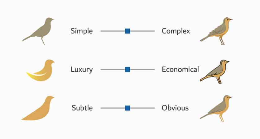
Let’s start at the beginning. What exactly is a minimalist logo? If we check in the dictionary, minimalism is reducing something as much as possible to its essential components. In other words, it is using the most important components when creating a logo, avoiding superfluous details.
As we mentioned above, minimalism and simplicity are important trends when it comes to creating a logo. For a logo to be considered modern, avoid overloading it with different colors, fonts, or visual components. Keep everything as simple as possible. Go back to the basics. This gives a clean and refined look. It is very feasible to show your corporate values while exercising restraint.
As well, it is important to mention the importance of logo flexibility. Nowadays, a logo must be used as much on the web as in print. Your logo should always look good, no matter the medium. A minimalist logo makes things easier for you. By keeping it simple, you increase the chances of having a logo that is flexibility and looks just as good as a profile picture on social media as on a promotional item. Also, there is a good chance that you will need a minimalist version of your logo for a Favicon image as the dimensions are restricted.
What to keep in mind when creating a minimalist logo
If you want to create a minimalist logo for your business, here are some tips to help you get there.
Simplify your logo as much as possible
If you already have a logo and want to redesign it to make it more modern, one way to do this is to simplify it as much as possible. For example, you could change the number of colors from three to two and remove the full name of the company if you have a combined logo.
When removing components, keep in mind that we still need to recognize your company. One way to successfully redesign a logo is to keep important or historical components of your original logo. A good example of this is the car manufacturer Nissan, who kept only the silhouette of the circle of their logo when they redesigned it.
Choose the right type of logo
Next, if you want to create a minimalist logo, know that some types of logos are better than others. Combined logos or badges may have a few too many components for the whole thing to be minimalist. On the contrary, consider a monogram or symbol logo. Obviously, you can use any type of logo when creating your emblem.
The monogram logo is only four letters at most, often initials. If you want to emphasize the name of your company or your own name, this is a good option. Otherwise, the symbol logo, as the name indicates, is only an icon. This type of logo is used mainly by multinational companies that do not need their name in the logo to be recognized.
Bet on a strong color
Colors are important components of your brand image, especially if you want to create a minimalist logo. We recommend you use only one color maximum two to keep it as simple as possible. And since you can’t use many colors, it’s vital to choose the perfect shade to represent your business and its values.
First, you need to choose your main color. In this regard, it would be relevant to take a look at the meaning of colors, as it can be a source of inspiration. Everyone knows that red is the color of love, but did you know that it is also the color associated with anger and prohibitions? Next, once you have an idea of which color to use, consider finding the perfect shade by experimenting. Do you want a very bright red to attract attention or a more rosy-red to show your refinement?
Think about the font
If you choose to create a logo with text, you’ll need to choose a font that will represent you well, even if you only plan to use one letter. Like colors, font types can help you display your corporate values. Since you want to create a minimalist logo, choose a font that fits your branding. This is even more important since you won’t be using a lot of different components to stand out.
There are hundreds of different fonts, including several categories. Among them, there are serif and sans serif fonts. Serif fonts have a traditional and serious side. Sans serif fonts are considered modern, neutral, and accessible. It’s up to you to see what works best with your business. Feel free to try different fonts until you find one that works perfectly with your brand.
In conclusion, there is a good chance that minimalist logos will remain fashionable for several years to come. Therefore, if you want to create a logo or do a redesign, it is important to make sure you have an emblem that is both simple and flexible. An example of a successful minimalist logo is the Apple logo. Over the years, this minimalist logo remains synonymous with luxury. Also, it can easily be displayed on all the company’s products. Enjoy creating!
This content was originally published here.


