Why choose to create a badge logo
Before you start creating your logo, what are the advantages of badge or coat of arms logos? Is this a type of logo still relevant? We believe so.
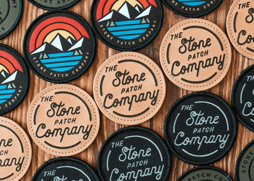
Badge and coat of arms logos have been used for hundreds of years to represent official bodies such as cities, universities or even kingdoms. Therefore, this is an option to consider if you want to give a serious, traditional, and credible touch to your company logo.
The second important advantage of this type of logo is that you can add several different decorative components. In a logo like this, it is not uncommon for the logo to have the name of the company, the date the company was founded and various icons.
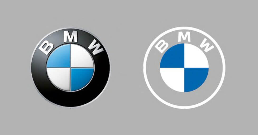
Among the well-known badge or coat of arms logos, is the logo of Starbucks, Harvard University, BMW or UPS, four very different companies.
How to create a badge logo
Now that you know more about this type of logo, it’s time to move on to how to create it. Since it can be more complicated to create a badge logo than a signature logo, here are some steps so that your emblem is a success.
Choose the right shape
The most important component of a badge-type logo is the background, which consists of a shape. It is vital to choose a suitable shape for your logo, as shapes have meaning. Take a moment to imagine what the Starbucks logo would look like if it were square, or the UPS logo were a triangle. It wouldn’t have the same effect, would it? Most of the time, badge and coat of arms logos use a circle or shield as a background, but you can choose other shapes such as a square or diamond.
To sum it all up, the circle is associated with harmony and community, while squares and rectangles represent more order and are considered serious shapes. Otherwise, triangles are closely linked to power and balance.
Select visuals
Now let’s move on to the visual components of your badge logo. We mentioned above that one of the main advantages of using this type of logo is the fact that it is possible to add several different components. That’s true, however, if the latest logo trends are anything to go by, it’s important to keep it simple. Therefore, choose only visual components that bring real value to your logo and branding. You can always start by creating a first version and simplify it later, much like what Starbucks has done over the years.
You can use the date of creation, the symbol of an animal or object, different colors, your slogan, etc. Our advice here would be to use representative components, such as what the German company BMW did. They simply added the colors of the flag of Bavaria and their region of origin as the main component of their badge logo.
Find the right color palette
Just because you want to create a badge logo, it doesn’t mean that colors are not important, on the contrary. When you choose the right color palette, it strengthens your message. Colors are rich in meaning, so it’s important not to choose them at random. Again, we recommended using no more than three different shades to ensure consistency.
Here’s a little trick to help you choose the colors for your logo. Start by defining the color that best represents your brand, and then use it as your primary color. Then, choose a secondary color, a color that will help give a desired look. Finally, opt for an accent color for details or outlines. Let’s consider choosing red as the main color for your badge logo. Depending on the style you want, you could use pink, blue or black as a secondary color. It’s up to you to see what message you want to convey with your logo.
Define the ideal font
Then there is the font. Since there’s a good chance that there will be text on your badge or coat of arms logo, you need to choose a font that works with everything else. You can also put the name of the company, slogan, place, and date of creation directly on the logo.
Before you try thousands of different fonts, take a moment to analyze your message and company values. If you want a traditional or serious style, you should opt for a serif font. On the contrary, if you want something light and modern, try a sans serif font. Also, try different letter layouts or use only uppercase or lowercase. If you create your logo with FreeLogoDesign, know that we have more than 200 fonts available.
In conclusion, there is no doubt that badge and coat of arms logos will remain a popular type of logo for several years to come. Start the process by choosing the shape for the background, and then define the different visual components that will make up your emblem. If you’re looking for ideas, feel free to take a look at our Logo ideas page or FreeLogoDesign’s Pinterest page. Enjoy creating!
This content was originally published here.


