The most important part of your brand is your logo. And one of the most important elements that make a logo stand out from the rest, is the choice of typography. Whenever we design a logo, we pick the font that fits the brief, and overall look of the logo, but sometimes, it comes down to the client’s choice.
Here we break down the factors to help you make that important choice.
1: Identify your brand.
The most important step is understanding who you are as a brand, what personality do you want to emit? Are you a well established law firm, with a serious stance? Or a social media advertising agency, with a younger hip image?
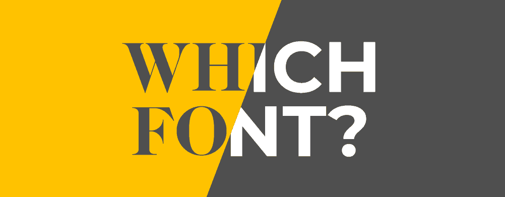
A serif font helps define a serious, high end look. Often used for doctors, lawyers, and classic fashion houses.
A sans serif font caters for a more modern look, and can be used for tech companies, advertising agencies, and others that want a younger vibe.
Understanding the difference between these 2 styles of fonts will help you pick the right path for your brand. So what is the difference?
2: Serif and Sans serif explained.
This is probably easier to show as an image…so here goes:
3: Establish your overall brand look using typography hierarchy.
Now that you have your logo, with the font that you chose, your design should now think about matching fonts to the logo for other design applications, such as websites and social media designs, etc..
A typical typography hierarchy should look something like this:
Take into consideration that fonts cant be similar, ie the use serif fonts across the brand image, or it can be mixed. I personally like the look of a serif mixed with a sans serif, and vice versa.
4: Where to get your fonts.
One of the main things people often miss when searching for fonts, is the license, and its limitations. Some “free” fonts limit you to personal use, and you have to pay a license fee to use it in a logo, or website. So be aware of this.
There are many paid font sites that will include the license fee, but I’m going to go over the more accessible sources.
Dafont. This has a ton of free fonts, and is sorted into various categories, you will be guaranteed to find what you are looking for here. But again, keep an eye on the license.
Adobe typekit. If you have an adobe creative cloud subscription, this is a great resource of free fonts, and the license is included in your subscription, which means you can use it in your logo, and even copyright said logo.
Google fonts. Personally, I feel google fonts is a little limited for use in logos, but, most wordpress themes use google fonts installed and ready to use, so for that, it’s incredibly useful for finding complimenting fonts to use on your website.
So, now that you have this info, you can approach your brand image a little more wisely, and relay your ideas, and font choices to your designer…or us, remember, we specialize in brand design.
How to choose the right typography for your brand. was last modified: March 3rd, 2022 by

This content was originally published here.