Looking at inspiring innovation and entrepreneurship is what the Durban University of Technology strives for amongst its students.
Also, with the institution’s launch of its Envision 2030 Strategic Plan this year, (2020), the aim is to have more people-centred and engaged students, who are innovative and entrepreneurial, essentially being the character of what the University would like to develop.
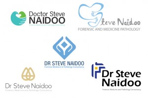 Giving students the opportunity to become more ‘engaged’ students is DUT’s Mthandeni Zama, who is from the Visual Communication Design – Graphic Design department. His second-year students were given the chance to embark on a project in June 2020 for one of the most prominent forensic pathologists in South Africa, Dr Steve R Naidoo. They were asked to create a brand (Logo, visual language and branding material) – for the renowned pathologist.
“Dr Naidoo and his wife Dr Poonith Naidoo, who is a lecturer at Radiography (DUT) were involved in the process of briefing the students online. This month in November 2020, five selected students successfully unpacked their branding ideas to Dr Naidoo, their first real client,” he said.
He added that the five selected students are thrilled to be able to showcase their logos and be in the running of being chosen as the winner of the brand designing logo competition.
 Speaking on his selection, third-year student Tshiamo Molehabangwe said the project was honestly daunting at first because he had no idea what or how he will be able to solve the problem but he knew he just had to do it.
“Apart from the logo being unique in its own right, I believe my logo embodies Dr Steve’s values, moreover, I believe the logo can reach the intended targeted audience and help the brand to further grow,” he said.
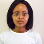 For Sinenhlanhla Maphumulo, he learnt the true meaning of dedication, never giving up and loving one’s work because that’s when one can enjoy it and produce their best work. Hearing that he was in the top five left him astonished.
He relayed that no words can describe how much he appreciates such an opportunity to showcase his talent.
“My logo is something the doctor has never seen before. The icon and font were created by me and that makes it very unique. I believe that this is the kind of logo the doctor needs because it is different which makes it standout and because of the way it looks, it is something that will make his clients feel welcome, at ease and trust that they will find the answers they are looking for,” he said proudly.
Before creating his logo, he had done research on different logos in similar fields and the reason for that was so he could produce something unique for the doctor.
“Creating all these elements took my creativity to another level, it was stressful at the beginning but looking back, it was honestly a great experience. I have so much to take, for my future projects, from this venture alone,” he indicated.
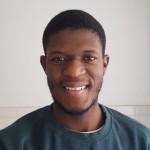 The third selected student is the charismatic 22-year-old Ovuyonke Sotsaka, who was ecstatic and really proud of himself upon hearing of his selection in the top five.
“I feel like my logo should win because of its unique aesthetic, profound meaning behind its creation and because I strongly believe it’s what our client is looking for and will make him stand out,” he said.
Sotsaka said that to reinforce that idea he used two shades of blue because the colour has a calming and relaxing effect on one’s psyche, which makes one feel confident and secure.
“This is something I strongly believe Dr Naidoo would like his clients to feel when interacting with him in person or by coming across his visual identity,” he relayed.
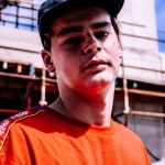 For Brett Caldecott, he was super stoked to be in the top five and even more so that his logo could potentially be Dr Naidoo’s next logo.
“I think my logo should win because it embodies all his key morals and values as a person and I did invest a lot of time into creating it,” he said.
Caldecott said that there were various challenges he had faced, especially with the project being completely virtual as he did find himself going back and forth with ideas and he could not get that face to face and somewhat immediate advice and guidance as he usually would.
“I came up with the idea of using the icon of a dove and a handshake converted into one icon to create the logo,” he said.
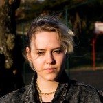 Being chosen in the top five was so rewarding for DUT student Courtney Shelley, who is a South African multi- disciplinary artist and designer.
“To be part of the top five was very rewarding as this brief was extremely challenging and dealt with very serious and sensitive topics that had to be approached in a specific way. Through a lot of research and reflection I managed to strike a balance between the emotional and professional aspects of Dr Steve Naidoo’s profession.
The logo and identity I created was designed with sensitivity and aims to encapsulate Dr Steve Naidoo’s core values while remaining simple and appropriate,” she said.
Normally when she reads a brief, ideas immediately fill her head, however with this brief she had to truly trust the process and give in to not knowing what the outcome would be. With the aid of research, mood boards, styles capes, concept development and exploration she managed to create the final mark.
Speaking more on the hard task ahead of finalising the winner from the top five DUT students was the Forensic Pathologist client, Dr Steve Naidoo.
“As the subject of the students’ efforts, I am awe-struck by the creative originality of all five students whose work was presented. Each and every one has a strikingly unique appeal, whether in form or colour or imagery or the lasting impression and the subtlety of their individual message it expresses. Adjudicating between the winning submissions will be a daunting task, ” he said.
The winning logo announcement will be made on 23 November 2020.
This content was originally published here.
