Take the time to analyze your business
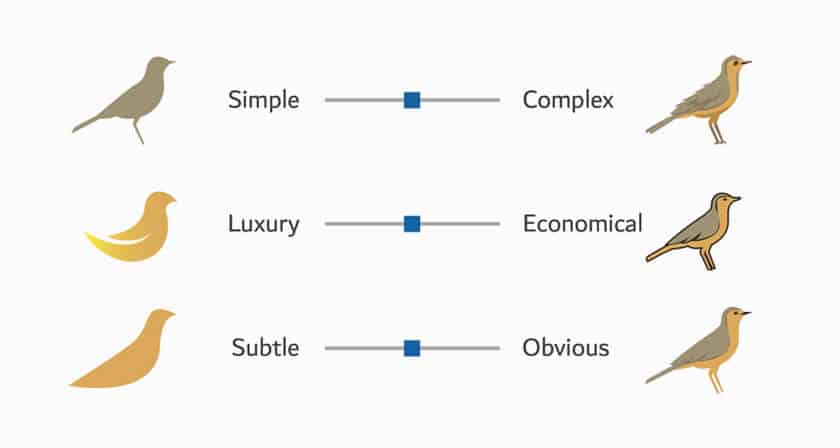
We have mentioned it in several of our articles. Before you even start drawing your logo, you need to take the time to analyze your business and what you want as a brand image. This is the first step in creating a logo. By analyzing your business, your market and your competitors, you will increase your chances of creating an effective logo.
Let’s say you want to open a store. You should answer these questions. Who are your products for? Who is your target audience? How are you different from the competition? What are your values? These questions will help you understand what you want to offer. Consider making a list of adjectives that define your business. These elements will also help you create a logo that will be representative. If you start creating your logo without having thought about what makes you unique, there’s a good chance the end result will be generic and disappointing. A logo is not just a drawing, it must represent something!
Let your imagination run wild
Once you know what you want to represent, it’s time to use your creative side. Write down everything that inspires you whether it’s style, images, color palette, and even fonts. Obviously, your business and products should be your first source of inspiration. Never forget that you need to create a logo for your company and not someone else’s company.
Why not start creating your logo by drawing your ideas on a piece of paper? Whether you’re an artist or not, let your imagination go. And if you need ideas, know that there are many sites that can help you find inspiration for your logo. For example, you could group ideas on Pinterest boards or a mood board. You could even explore different types of logos if you think you need to.
Keep it simple!
Here is one of the most important tips from our experts on creating a logo: keep it simple! We should mention that simplicity and minimalism have been major trends in logo design for several years now. You have probably already noticed that several large companies have simplified their logo during redesigns. So, why should you create a simple logo?
Let’s start with the fact that a simple logo is easier to reproduce, whether on the web or on print. Small details can often become blurry, affecting the quality of the logo. One mistake we often see is that people want to add several different elements to their logo. So, here’s our advice: focus on the most important element and use a color palette and font that will support that element, in turn making a strong and professional brand image.
Have you thought about accessibility?
Now let’s move on to a point that is often forgotten: the accessibility of your logo. In summary, accessibility is the act of creating a logo that can be enjoyed by everyone, even by people who have vision disability. Before saying that this is only a small percentage of the population, tell yourself that these people represent several million potential customers.
Specifically, how can you create a logo that is considered accessible? There are different elements to consider such as colors and font size. To start, some colors can be seen differently by colorblind people. There are also a few color combinations to avoid, such as green and red, green and brown, blue and purple. If necessary, you can use outlines or textures to separate the different parts of your logo. Also remember to have sufficient contrast between the colors of your logo, especially if there is text. There are many online tools that will indicate if the contrast is sufficient and that have filters to see how your logo will be seen by colorblind people.
Make sure you use a good font
In the same vein, when creating your logo, choose a clear readable font. It can be tempting to choose an eccentric decorative font if you work in a rather artistic field. But remember that the most important element here is to be able to read your logo well. If your logo appears small like on a piece of clothing or business card, are we able to read your company name easily?
To convince you, think of the logos of big companies like Google, Apple or Netflix. These companies have chosen fonts that are accessible, modern and easy to read. However, keep in mind that having good readability does not mean that you have to choose a font without character, on the contrary. Whether you prefer a font with or without serifs, you will most certainly find something that will represent the essence of your brand image. Do not hesitate to do several tests to find the right font for your logo.
In conclusion, we just need a little structure and practice to improve. This also applies to creating a logo. We hope these tips will guide you to create a logo you’ll be proud of. If you’re looking for ideas, take a look at what our team of graphic designer created. You will find hundreds of templates on our logo ideas page. Good luck!
This content was originally published here.


