We wrote, “Logo Design—A Critical Element in Making Your Marketing Matter More” a few weeks ago. We identified the many purposes the logo design serves and the reasons for changing a brand’s or organization’s logo. You can find the full article here:http://bdn-intl.com/logo-design-a-critical-element-in-making-your-marketing-matter-more
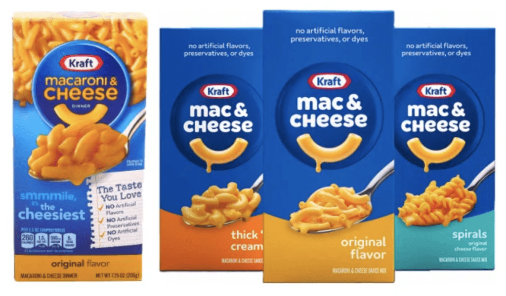
This week we’re sharing a famous brand’s makeover. We’re referring to a brand that is changing not only its name but also its logo and packaging design. That’s a lot of change! So much change that most brands attempting it would confuse their customers. Not this brand. They’re doing it right!
The brand is Kraft Macaroni and Cheese. The box dinner introduced in 1937 during the depression provided dinner for a family of four for just 19 cents. The brand was a smashing success from the start, selling more than 8 million packages in its introductory year.

Today “Macaroni and Cheese” is prepared and consumed primarily as a side dish, accompanying meals. You may even find it on casual restaurant menus as “Mac & Cheese.” Regardless of how it is listed, patrons of these restaurants and in-home consumers will call for “Mac & Cheese.” Kraft is making that identification for their brand.
The new name, Mac & Cheese, not only modernizes the brand but creates a strong brand linkage with Kraft. It’s not Mac & Cheese if it’s not Kraft; sort of like it’s not champagne unless it comes from that wine region in France, approximately 90 miles northeast of Paris. Okay, so maybe this is a stretch. Perhaps, it might be more akin to Band-Aid, Coke, and Kleenex.
The new logo displays a noodle smile on a deep blue background. The smile, in our humble opinion, mirrors the smile consumers make when Mac & Cheese is offered to and prepared for them. They derive comfort from consuming Mac & Cheese, and the smile communicates that feeling of pleasure and comfort. According to Victoria Lee, a Kraft brand manager, the smiling noodle expresses the brand’s cheeky personality.

The noodle smile is dripping with creamy, cheesy goodness. Mmmm. It communicates appetite appeal. The simple dark blue background of the logo allows the new name and noodle to stand out.
The new packaging design is clean and contemporary. It elevates the perception of quality and reassures customers that they’re making the right choice for themselves and their families in choosing Kraft Mac & Cheese.
While the look is new, it is an evolutionary change. It is unmistakably Kraft. Just a better version of its old self.
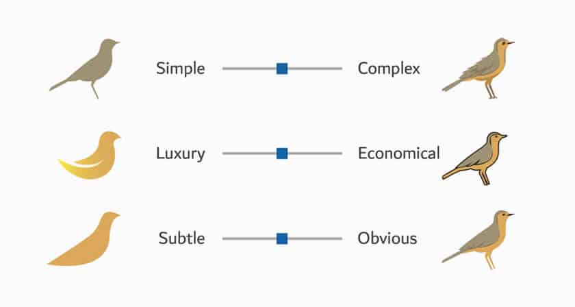
Our earlier article suggested ways to check your logo redesign to make your marketing matter more. Here are our suggested criteria and our take on the Kraft Mac & Cheese redesign:
Stress test your brand name, logo, and packaging design to the above criteria. Whether it is for an established brand, launch brand, or redesign, it doesn’t matter. Use the criteria and do it right!
Make your marketing matter (even) more! Common yet critical, marketing errors can lead to less than stellar or even disastrous results. Read Richard Czerniawski’s most recent book, AVOIDING CRITICAL MARKETING ERRORS: How to Go from Dumb to Smart Marketing. You’ll discover many errors that contribute to sabotaging marketing success. Importantly, you’ll learn what it takes to avoid and fix them. Learn more here: http://bdn-intl.com/avoiding-critical-marketing-errors.
Peace and best wishes,
Richard Czerniawski and Mike Maloney
This content was originally published here.


