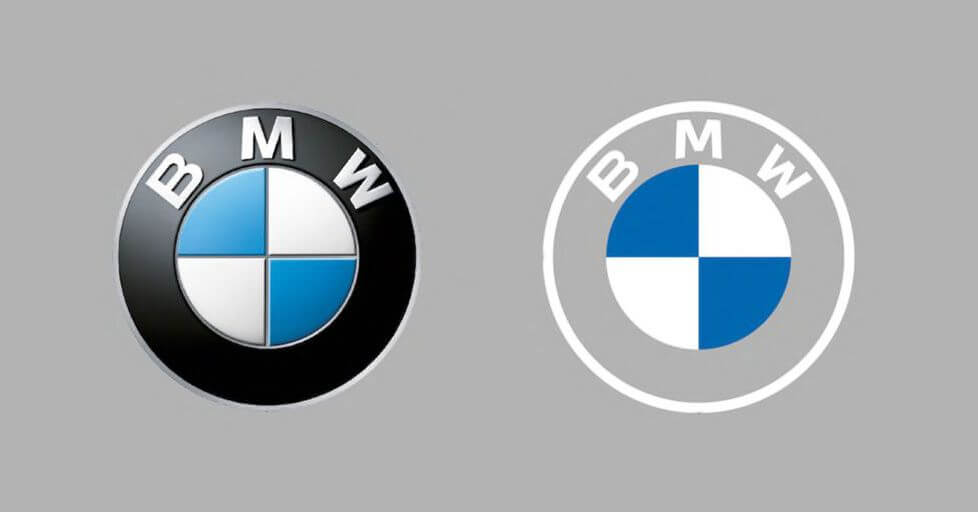
BMW has a new logo, marking the biggest change to the company’s branding since the iconic emblem was introduced in 1917. As with many modern redesigns of logos made to chase today’s trendy aesthetic of a super flat ultra-minimalist style, the new BMW logo sacrifices the company’s well-known identity in favor of presumed modernity.
There are two major changes to the updated logo. The first is largely positive: BMW is reverting back to a flatter design that ditches the very dated 3D effects and shading that were introduced in 1997 with a design that resembles the simpler logo the company has been using since 1963.
The second change is the removal of the black outer ring in favor of a transparent background, which just looks plain bad.
I get that the transparent logo effect is meant to look cool and minimalist. Jens Thiemer, senior vice president of customer and brand, says it was designed to “radiate more openness and clarity,” but the effect is anything but.
Sure, it looks nice on BMW’s bronze-hued electric i4 sedan concept, but what about on a white BMW? Or a letterhead? Or on a sign for a BMW dealership on a highway? The effect is less “clarity” and more like someone on the creative team got sloppy and accidentally deleted the background on the Photoshop file before they exported it.
There’s a reason why we don’t see many transparent backgrounds with white text on them from most companies: a lot of our screens and signs still have plain white backgrounds because that makes it easy to read things. Remove the black ring from the logo, and we’re left with a far less distinctive shape that doesn’t read as “BMW” in the way that the black / white / blue emblem has for years.
Furthermore, the transparent effect makes it harder to parse the logo as a whole from a distance: where you once might have registered the outer ring with the “BMW” lettering and the blue-and-white inner disc as a single unit, making the outside ring transparent means that the company is forced to rely on just that single inner element to stand out.
BMW is, of course, not the only company we’ve seen go down this route in the past few years: GoDaddy, Yahoo, Google, Facebook, Airbnb, Volkswagen, and plenty of other companies have made similar changes that discarded well-known designs in favor of what I like to think of as the “Instagram startup” aesthetic.
BMW hasn’t said when we should expect the new logo to show up on its production cars just yet. But given that it’s already made its way across BMW’s website and social media pages, it’ll only be a matter of time before it adorns the hood of your next sedan.
This content was originally published here.


