Simplicity
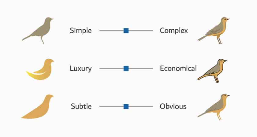
Keep it simple. That’s pretty solid advice for a lot of things, including business Sunshine Coast logo design. If you’re looking to capture the attention of potential customers and remind current ones of your reach, a busy or cluttered logo isn’t going to do your business any favors. Some of the most successful logos have been the simplest. We’re talking about clean, bold lines without a lot of elements to distract the eye or detract from the impact of the message. The “gold scallop” of Shell Oil and the red and white “bullseye” of Target retail stores are excellent examples of simple designs that are bold, identifiable, and evocative of the brand they represent.
Originality
The painter Edouard Manet was unfortunate enough to be a contemporary of the more highly regarded Claude Monet, to the point that Manet was asked to show his work only to learn that the gallery had believed they were contracting with Monet. Ouch! The last thing you want from a company logo is to have it mistaken for that of a competitor. So when considering logo design, it’s important to keep it original. Look at what’s out there and find an opening for something new. When looking to avoid brand confusion, consider the color, shape, symbolism, and flow of your design. The color choices in the Taco Bell logo represent a good example of one way to make a recognizable object stand out as an original brand logo.
Memorability
What do the “running dog” of Greyhound bus lines and the “bitten apple” of Apple computers have in common? They’re memorable. These days the average consumer is flooded with commercial messages. Everything from TV ads and roadside billboards to web banners and pop-up ads on game apps seem to be screaming at us with a sales message. Eventually, amid the high volume of commercial communication, all but the most memorable messages become noise that the brain learns to filter out. So how do you ensure that your logo gets through that mental filter? Choosing a design that’s bold enough to be both memorable and instantly recognizable is one key to success.
Clarity
When selecting a company logo, know your customer audience—both who they are and what they expect from you. Ask yourself what your company logo says about your business. Does it emphasize power, tradition, speed, flexibility, health, fun, or connectivity? Any of these attributes (and many others) can be the central message of an effective design. Ford Motor Company, for example, has maintained its famous “blue oval” for a century—reinforcing the Ford name as an originator in automotive technology. On the other hand, the famous Nike “swoosh” emphasizes speed and forward motion. Six Flags uses a playfully nostalgic mid-century design to remind its audience that childhood memories are made at amusement parks. In each case, the logo evokes a mood—a positive feeling that is linked to the company’s core message.
Brandability
A logo is your company’s public face, so it must be easily transferable to any medium that bears your brand—whether it’s a fleet of trucks, packaging, web ads, or social media, or all of these. An effective logo is easily recognizable at a glance, both in color and in black and white, and in any size. A good logo works as both a highway billboard and a Twitter avatar. If your logo relies on fine Printing, you have a problem. Some examples of company logos that demonstrate brandability in any form are the McDonald’s “golden arches” and the Target “bullseye.” Think about all the formats that you use to connect with customers, and be sure that the logo design you select works well with each.
The post 5 tips for successful business logo design appeared first on Sunshine Coast Graphic Design & Printing.
This content was originally published here.


