The logo is the first thing about your brand people notice. It gets more attention, people remember it for a long. We can’t neglect its importance because it helps you to build your brand. Whereas it is a great opportunity for you to showcase your creativity through your logo, but there are common mistakes that weaken your logo which keep you one step back otherwise your design works well.
The easiest way to understand is, your unique and memorable logo can recognize by people easily either they use your products or not but they know about your brand just because of your logo. A custom logo design is an exclusive sign of a brand.
1. Poor Typography
The biggest mistake you should avoid is typography in your logo, it can destroy the whole design. A logo should be simple yet bold and unique which can be memorized easily. Stop using different fonts and writing styles, it is difficult to read such typography on logos. Make it clear and pay extra attention to spacing and sizing.
2. Poor Font choice
Color scheme plays a huge role in communicating the values and passion. Each color you use in your logo expresses its own story, meaning, and distinctive flavor. Likewise, red color shows passion, yellow shows optimism and youthful, blue shows trust and loyalty. In the logo try to make balance not too much sharpness and not too light colors impact a good image.
3. Indistinct Intention
Well, if your logo does not properly speak what your brand is about and people ask you “what your logo means?” then please understand you need to recreate your logo now. Your logo should explain your company’s emotions and values. It is important for your brand that the brand should reflect the vision and motto of your business visibly.
4. Easy to Memorize
The logo should be memorable and crunchy which people easily can recognize. It represents your brand in all long-lasting way. As you can see some amazing logos such as Nike, Apple, BMW, Amazon, etc.
5. Complicated Design
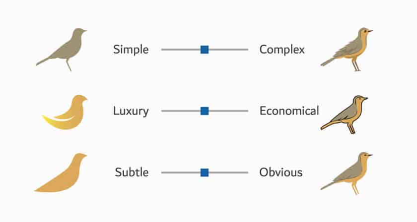
The complicated designs are not versatile. It is understood simple designs are more memorable, it requires less effort to recognition. A unique design lasts long in memory than a complicated design that hard to understand what is the logo is about.
6. Raster images
Your logo should be designed as a vector graphics program in Adobe illustrator because it ensures that your logo can be scaled to any size. A raster image does not measure the logo size on different scales, which means it will be unusable when you use your logo on a large scale.
7. Setting a Monogram
This is considered as the biggest mistake, many immature designers try to create Monogram – starts from the initials of the company name. it is difficult to build reliability and convey a message with just a single initial.
8. Copying Design
It is such a bad idea if you are copying or stealing someone’s idea and design. It does not make its worth, even people don’t support such a business. it feels like this company is not trustworthy and these credibility issues make a bad impact on your image.
9. Don’t follow Trend
Try not to follow the trend likewise if you follow these trends then you can’t make your business into a brand. For that come up with your idea and be creative. Because these trends come and go. A comprehensive and unique design always wins over these trends.
10. Never use designing software
This is a big mess if you use designing Software. Many other freshers and other small business do same, it means it will not get that attention this design would never get famous.
11. Avoid free images
Your logo should be unique, don’t use any downloaded image from google. Using copy writing images can not bring that attention to your brand.
12. Random Information
Avoid using random information on your logo-this looks amateur. Your logo should be unique and bold so that it can appeal to your audience. Of course, your logo speaks a lot it has a vision, story, motto, and goals. Never take it for granted because any random information can destroy your image in the market which you can’t buy again.
The logo is the brand’s identity, understand its importance. It works incredibly in way of getting sensation. It is obvious that people recognize you by your logo, so make it catchy and memorable. Custom logo designs can create a prominent brand face. However, these twelve mistakes should avoid in your logo while designing it.
Author Bio
Alexandra Myers is a wife, mother, and professional writer by choice. She completed her MBA in English literature from the University of Groningen. Currently, she is a permanent contributor to a Get Set Go Web company in the US. She loves pets and can’t live without her beloved cat!
This content was originally published here.

