A company’s logo design can make or destroy its commercial prospects. A well-designed logo can help a firm build a positive rapport with the audience it is attempting to reach. However, an incorrectly created logo fails to communicate a company’s message and ultimately hurts the organization.
It is therefore important to select the best logo maker for your firm such as DesignHill logo maker. They can be intimidating to develop, but they are necessary for any business and serve as the foundation for any substantial business or personal brand.
You want your logo to convey information about who you are and what you do, including why and how you do it.
It will appear on social media posts, presentation decks, marketing materials, and business cards, among other places. Effective communication with potential consumers is critical for modern businesses.
Marketers develop methods to guarantee that a business’s customers may interact with it in several ways. As a result, business owners invest significant sums in developing visual tools that engage and connect with their customers.
Today, a logo serves as more than a corporate symbol used to identify a firm and its products or services; it also aids in the development of a strong brand identity. Even logos created online with a logo creator have the same essence as those created by experienced designers.
In today’s corporate environment, a logo performs a variety of functions. It is capable of conveying the appropriate corporate message to your target audience.
A well-designed logo has the potential to convert visitors into devoted consumers. A well-designed logo may assist a corporation and its business in various ways. To assist you, below are some excellent logo design tips. Logos are critical.

What is the significance of logo design?
To begin, let us review why logo design is critical. Typically, the first piece of branding that a prospective consumer sees is a logo. Additionally, it is typically the element that has the most significant impact and stays with us the longest (assuming it is successful).
A logo can convey a great deal about a brand, including (in some cases) what the brand does and stands for. When consumers form an emotional connection with a logo design, they are frequently more receptive to investing time or money in the company or product.
The following are the top ten logo design tips that every designer should know:
#1. Utilize Colors to Communicate Meaning and Emotion in Your Logo:
Every competent logo designer understands the aesthetic value of color schemes and combinations. However, the most excellent logo designers understand that color plays a much larger function than merely making a brand visually appealing.
Apart from contributing significantly to the aesthetic attractiveness, the colors you choose also contribute significantly to conveying crucial signals and provoking measured emotional responses.
For instance, red is an evocative hue that can convey a message of passion and intensity and evoke emotional responses such as enthusiasm. On the other hand, blue is a considerably more relaxing hue that communicates wisdom and tranquillity.
Depending on the type of organization for which you are developing a logo, you may deliberately employ a variety of colors to express messages and elicit emotional responses that will aid the company in accomplishing its goals.
#2. Learn About the Brand for Which You Are Creating a Logo:
At its core, a logo is a meticulously developed marketing tool designed to assist businesses in achieving their marketing and brand identity objectives. If you are unfamiliar with those objectives, producing a logo that assists your customer in meeting them would be a strict order.
Before you begin designing a logo, please spend some time getting to know the organization for whom you will be developing it.
What products or services do they provide? What type of brand identity are they attempting to establish? What are the most critical messages they want their audience to understand? These questions will help you create a logo that is equally effective as a marketing tool as it is an eye-catching work of art.
#3. Consider the Purpose for Which Your Logo Will Be Used:
Far too many logo designers make the error of expecting their work will always show as a digital thumbnail image on a white background. Unfortunately, designs that work well in this context frequently do not translate well to other applications — and businesses frequently employ their logos in various ways.
For example, a logo you create will almost certainly appear frequently as a thumbnail image on a white background.
Additionally, the company may put your logo design on the packaging of their products, include it into the design of their building, use a black and white version of the logo on their stationery, or even display it on a giant billboard.
Because logos are frequently used in various circumstances, the most delicate logo designs are versatile enough to look excellent in various settings. Consider the several ways your logo design may be used when you create it.
Will your design appear as excellent when blown up to fit on a billboard as it does in a bit of thumbnail image? Will the color scheme remain effective when the logo is displayed on backgrounds other than a white screen? These are critical concerns to consider as you build an adaptable logo.
#4. Utilize Negative Logo Space:
Not every design element in your created logo must direct color. Often, the negative space created by the white background on which the logo is placed is a significant design element in and of itself.
Not every design element in your created logo must direct color. Often, the negative space created by the white background on which the logo is placed is a significant design element in and of itself.
#5. Reflects Your Business’s Nature:
Ascertain that your logo is truly representative of your firm. Your logo’s colors and pictures should be consistent with the type of business you run and the items or services you provide. When a logo is consistent with your business, it helps establish its brand identification in a competitive market.
#6. How to Create a Passive or Active Logo:
Logo designs can be passive or aggressive, and neither is always superior. However, before you begin designing your logo, it’s critical to determine if you’re building a passive or an active logo.
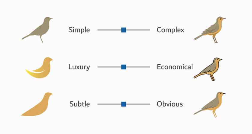
Active logos are representations of moving objects. For instance, an active logo would include a dog in mid-stride. On the other hand, passive logos depict static objects. A dog seated on its haunches is an example of a passive logo.
#7. Consider the Competition:
When accepting a logo design project, one of the first things you should do is investigate logo design concepts and the company’s competition for which you are developing a logo to get a sense of the types of logos they employ.
Suppose you’re designing a logo for a construction company, for example. In that case, you should keep in mind that your logo will be competing with the logos of countless other construction companies, and it’s beneficial to be aware of your competition.
Investigating the logos of competitive businesses is advantageous for a variety of reasons. First, examining the competition may be an excellent source of inspiration and a means to understand better the types of logos utilized in a particular market.
Simultaneously, understanding the logos with which you are competing can assist you in developing a plan for differentiating your logo design from the competition.
#8. Arrange for a Second Opinion:
Often, artists are too emotionally invested in the designs they make to form an objective assessment of their merit.
Even if you believe you can be fair and neutral when evaluating the quality of your ideas, the second set of eyes can be highly beneficial if you have friends who are designers and can go over your work, all the better.
If not, displaying your design to someone you trust to provide honest, constructive comments will help ensure that you do not overlook any apparent flaws in your design.
#9. Create a Memorable Logo:
Above all, successful logo designs must be memorable. The primary purpose is to serve as a recognizable emblem that people identify with a particular company or brand. To build a logo that clients worldwide will know, you must establish an original and memorable logo.
#10. To begin, in black and white:
While it is hard to save a bad idea with an attractive palette, a good idea will remain good regardless of color.
When you visualize a well-known sign, you almost always think of the form first, followed by the palette. The lines, shapes, and concepts matter, whether it is an apple bite, three parallel stripes, four connected circles in a horizontal line, or anything else.
Thus, there you have it! As you can see, a logo is necessary for the development of a successful business and brand. However, creating a professional-looking logo does not have to be difficult. Indeed, the process is simplified with DesignHill logo maker.
To have a logo designed for your brand, all you need to do is provide some information about your firm. Then select the typefaces and colours that best reflect the personality of your brand. After you’ve entered these parameters, the Logo Maker will get to work creating a pixel-perfect logo that exactly matches your brand vision.
About the Author!
Elanie Brown, she is a passionate graphic designer and aspiring blogger. Her interest lies in design, eCommerce, marketing, and love to write about them after in-depth research. She has designed several eye-catching logos with the help of Designhill Logo Maker for a lot of different industries.
The post 10 Logo Design Tips Every Logo Designer Should Know appeared first on iBrandStudio.
This content was originally published here.


