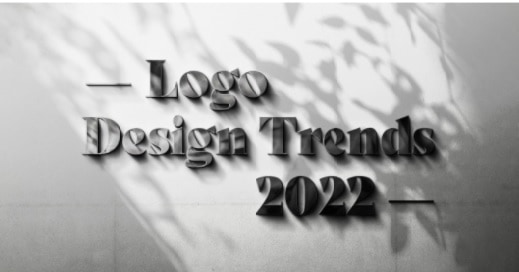
10 Innovative Logo Design Trends to Look Out For in 2022
Technique and trends for logo design are evolving; that’s why your logo needs to be trendy and relevant to stay in the cut-throat competitive market. But unfortunately, there are no standard guidelines that determine which design style will top the trend.
In fact, designers consistently rely on creative trends to identify which design elements to adopt and which to ignore. To stay abreast of the changing design trends and procedures, it is inevitable for designers to be knowledgeable and speed up on brand design concepts. You are not only brushing up your talents and skills but also helping clients achieve their goals/objectives.

But what trend is coming up in 2022?
The best thing you can do is keep a close look at the logo design that is gaining traction and is expected to dominate the logo design industry in 2022. Last year, we saw many logo designs playing with innovative ideas. And we assume that the New Year will witness a bolder, less constrained logo, carving out and defining the impact of the pandemic on human lives. So take a look at some of the innovative logo design trends that can rule in 2022.
Logos created using letters that diverge and merge have long been around. Such logos, in some ways, are perhaps the secure possibility to produce one as it doesn’t require in-depth knowledge about symbols and iconography. However, sincere effort and time need to be put into identifying which font to incorporate to capture the audience’s attention.
Even though typographic logos have less scope for other creative components, designers have discovered a trick to create exciting and engaging wordmarks using schematic wordplays that made it possible to diverge and merge letters in logo design.
Since wordmarks in the logos above are placed in the center of the business name, experts anticipate that this trend will continue to be trendy in years to come.
Shapes are used to create amazing articles for producing texture and patterns. Due to this very reason, they were typically used for decoration purposes. But with the invention of the Olympic flag in 1914, the geometric logo design evolved.
Since then, designers have been using simple geometry in business logo designs. With the introduction of fresh concepts, designers found a method to blend or incorporate geometric forms with specific trends to create something innovative.
Today you can see more motion designs — on websites, digital billboards, mobile apps, etc. With most professionals considering this trend remarkable, the trend is getting traction with time. Static images in your digital ads are no more compelling these days. With the growth of virtual reality and the introduction of new creative digital platforms, businesses find several ways to live online. It has generated a fresh perspective for engaging customers using motion and animation.
But why is motion so prevalent?
According to industry experts, a static image can’t compete with a looping gif because movement establishes identity. That’s why it’s expected a significant surge in ideas to extend brands’ move from online to shelf.
4. Daring Bright Colors
Return of the 90s is a likely possibility as a trend to design logos. The designers have started using bright colors and abstract geometry, which was a distinct identity of graphic designs of that era. In addition, bold fonts will bring back the glamor of the 90s. This trend intends to drive attention by experimenting with colors and fonts.
You can create your free logo design with the help of a free logo maker tool, which is a DIY tool that guides you through designing as per your brief. You can customize the logo with colors and other elements as many times as you like.
5. Use of Negative Space
Negative space is not a new design trend, but the logo designers are now using it frequently. A little ambiguity helps grab viewers’ attention, and it also speaks well for a brand since such logos look aesthetically impressive.
6 Surprising font effects
In their zeal to experiment with letters, the logo designers incorporate text in varied, strange styles. Many logos have a company name in letters of different and uneven heights, while others have a weird mix of thin and thick letters in the same line of text. You can access design templates for a free logo design with font effects.
7. Overlapping design elements
The designers love creating layers over layers of colors, fonts, and other design elements. It helps a logo look unique to grab attention. Plenty of logos with layers of letters, colors, symbols, shapes, and patterns in different combinations have already appeared on the scene. The designers do not follow any set pattern, and instead, they randomly overlap the elements.
8. Smooth Color Transition
Another trend that is picking up fast with logo designers is gradients or color transition. But the gradients are smoother and look delicate. Such transition of colors gives much-needed depth to a logo design. It also makes the design look dynamic and helps designers control the viewers’ attention. You can quickly create a free logo design with varied color transitions with an online design-making tool.
9. Creating Illusion
To create a logo, designers also experiment with illusionary shapes. So, such logos keep viewers glued to the illusions helping in brand engagement. It also adds meaning to the design and interestingly conveys a message. The illusionary effect also adds an element of depth to the design.
10. Hand Drawn logos
Many logo designs look like sketches as they are hand-drawn and look unique. The custom hand-drawn logos bring a human and personal touch to the design. Such logos help better engagement and interaction with the target audience and add brand value.
This content was originally published here.