If you’re looking to design an elegant logo, the right serif font can add some flair, class and sophistication to your designs.
Professional designers usually use serif fonts when they want to convey attributes like: trustworthy, elegant, classic, sophisticated, and perhaps a bit old-school.
Fonts are one of the most important elements of visual language (besides color and shape) that designers use to express the company’s brand personality.

So if you want your brand to appear stylish and graceful (e.g. fashion brands), then you should find an elegant serif font that can help you create that kind of a look.
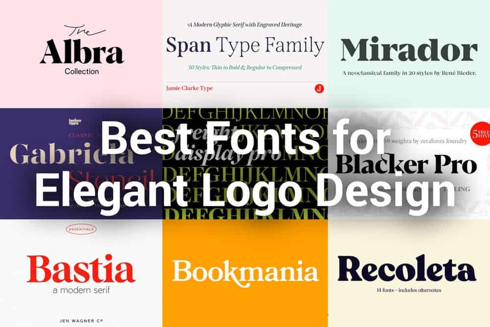
To help you do just that, I prepared a list of the top 10 serif fonts to use when designing a an elegant and sophisticated logo.
Recoleta is a modern serif typeface designed by Jorge Cisterna that takes clues from various popular 1970s fonts.
The designer basically melted together best features of classic serif fonts: Cooper and Windsor to create a fresh, yet familiar look.
The Recoleta typeface comes in a variety of different weights to provide you with a range of choices when working on your project.
Heavier weights are ideal for high impact logos and headlines, while lighter weights can be used for body text in your brand identity system.
There are also available stylistic alternates, to give you a number of different characters in order to create a logo and identity system that looks unique.
Examples of Recoleta font in use:
In a sea of sameness, this font gives you an opportunity to stand out and will certainly make your logo look elegant and unique.
This new bold serif font was designed by Nicky Laatz who mixed both modern and vintage curves to help you create two styles: vintage retro and modern chic.
The designer took inspiration from old-school magazines and retro advertising, then he refined the characters to give them a more contemporary look.
If you want to create vintage retro look, then simply access your OpenType features to select from the large library of letters and ligatures.
You can vary between a light and heavy vintage look, depending on how many letters you alter (how many ligatures).
If you want to create a modern chic look, then just type with regular letters and play with letter spacing to get the look you are after.
Glamour Absolute is a very versatile font that can be used for a wide range project types: from food packaging, to weddings invitations, to cometic brands and so much more.
Blacker Pro is a take on the “evil serif” font trend, designed by Cosimo Lorenzo Pancini and Andrea Tartarelli who got inspired by the fonts from 1970s.
This typeface is meant to be a modern classic font that can be used for bold statements and courageous brands.
The modern proportions and sharp, blade-like triangular serifs make this font look great, particularly when used for headlines and logotypes.
Blacker Pro has two optical subfamilies: the display and text variants.
The display version has tighter tracking, higher contrast and sharper corners for maximum impact at big sizes.
While the text version offers better legibility and screen rendering at smaller sizes, with looser spacing and lower contrast.
in additional, you will find condensed variants and uppercase-only variants of those to subfamilies, each in six weights from light to heavy, with matching italics.
This really large typeface family totals at 69 styles covering everything from editorial to advertising uses.
With its bold personality, Blacker will make your text look great both on paper and on the screens.
Erik Spiekermann worked with other notable typographers to create the serif version of his most famous sans, FF Meta, all from scratch.
FF Meta Seris is ideal for advertising and packaging, book text, editorial and publishing, and of course logo and branding.
FF Meta Serif comes in six weights from light to black (including italics) and covers Latin, Greek and Cyrillic scripts.
This well designed, large family typeface provides advanced typographical support with features such as ligatures, small capitals, multiple figure sets, and a range of arrows and symbols.
Thanks to additional contributors like Ralph du Carrois and Botjo Nikoltchev this font comes with a complete range of figure set options—oldstyle and lining figures, each in tabular and proportional widths.
A solid serif for versatile use in any type of graphic design work.
Examples of FF Meta Serif in use:
This typeface is a member of the extensive FF Meta Super Family, so you can find the right fonts and pair them easily for uniform look.
Designed by Joshua Darden, Freight Display Pro is a beautiful serif font family that will make your designs look fashionable.
This elegant serif font that will add a touch of luxury and style to your branding and logo design projects.
The extreme contrast between thick and thin strokes gives Freight Display Pro a harmonic and stylish look that can convey both: masculine and feminine qualities.
It works really well when used as a stylish text overlay to any background image.
This typeface comes in 12 weights with matching italics and was published by GarageFonts.
Freight Display Pro is perfectly suited for editorial design, branding, magazines, logos, headings and more.
Examples of Freight Display Pro in use:
A great typeface for coffee shops, fashion labels, photographers, beauty products, and other boutique brands.
Mirador is a neoclassical font family designed by René Bieder who wanted to bring the classic serif style to contemporary taste and typesetting needs.
Although Mirador appears to be a display font at first glance, its proportions and design make it also work well in smaller sizes.
And if it works in small sizes, then you know it’s good for logo design and branding.
However, Mirador finds also other various usages—ranging from editorial and corporate design to web, interaction and product design.
Mirador typeface comes in 10 weights (with italics) and is equipped with ligatures, alternative glyphs and other useful opentype features.
The beautiful ligatures and stylistic alternates of Mirador will give your designs an original, yet timeless look.
Perfectly suited for brands that have to do anything with luxury, jewelry, diamonds etc.
Examples of Mirador in use:
This typeface pays great respect for the tradition of reading, but also gives you the opportunity to make an impression.
Designed by Mark Simonson, the Bookmania typeface is a refresh of the traditional elegant serif fonts from the early 1900’s
Thanks to all the swirls and curves, the Bookmania font family has all the features that your logo can benefit from.
This type has over 680 swash characters and 35 optional ligatures (available in all weights) to give you limitless options when designing your logo.
Bookmania takes the best of both: the elegance of the original Bookman Oldstyle of 1901 and the swashy exuberance of the Bookmans of the 1960s.
Taken to the modern era, this traditional typeface has now everything you would look for in a modern digital font family.
The broad range of weights make it great for display use, but thanks to its great proportions it also works well for smaller text.
If you’re working on any type of design that would benefit from this old and classic, yet sophisticated look, Bookmania is your best choice.
Examples of Bookmania in use:
A true typographical gem that can make any logo look iconic.
Designed by Jamie Clarke, Span Type Family bridge the gap between contemporary and traditional.
The strong vertical stress in this font is softened by elegant organic curves, while its compact height brings out the deep serifs.
The family offers five weights, each with three widths and italics plus condensed and compressed versions (more condensed) which make it very versatile.
The condensed styles provide an invaluable advantage when designing something that would hold longer text within narrow spaces.
Span’s italics strike a balance between true italics and traditional oblique letterforms to vary rhythm while preserving its chiseled style.
Span features distinctive triangular (glyphic) terminals, compact vertical proportions, soft curves against rigid stems, long legs, tails and elegant swashes.
So if you want your brand to appear exuberant yet dignified, Span is an extraordinary font family to help you achieve just that.
This typeface was designed primarily for luxurious headlines and titles, but it can also work well for creating distinctive wordmarks.
Gabriela Stencil was designed by Antonio Mejía Lechuga and inspired by the style of the 19th-century Didone typefaces.
The design follows the Didone model (classic serif of late late 18th century), but with the added twist of being a stencil font.
The high contrast and stencil marks make the letterforms disappear in small sizes, so it is best used to add finesse and flair to your designs.
Gabriela Stencil font family is available in six weights with matching italics.
The x-height at about 50% of the cap height, together with short ascenders and descenders make Gabriela Stencil a highly legible font in big sizes.
All of these features combined make it a great choice for headlines, short text, branding and of course logo design.
This is quite unique font on my list—the breaks in the face to give it the appearance of the alphabets used on boxes and crates (stamps)
It also work well for luxury brands such as watchmakers, jewlery etc. where you can engrave the logo.
Examples of Gabriela Stencil in use:
This unique, playful and versatile font family is perfect for branding projects, packaging design, magazine headings, advertising, and much more.
Mixta is a typeface created by Rodrigo Fuenzalida who experimented with mixing diverse styles such as Didone and contemporary faces.
Mixta is a modern serif font family with characteristics and features of some of the finest classic-looking typefaces.
Mixta is a pretty large font family, featuring many weights along with matching Italics, plus other OpenType features such as small caps, different types of figures and plenty of alternates.
You can create unique designs, like logos and headlines, by combining any of the upright weights with matching italics to achieve contemporary look.
Very high contrast between think and thick strokes make this typeface look elegant and chic.
Mixta supports over 200 Latin-based languages, so that it can be successfully used in branding for large multinational corporations.
I would recommend using this typeface for branding, advertising, editorial or any other design that needs to look stylish.
Great font for luxury fashion brands, exclusive restaurants, high-end hotels etc.
Famous luxury brands like Tiffany, Gucci, Rolex, Prada, Dior, Hermes or Cartier all use serif fonts in their logos.
There is a number of well-designed serifs available out there, some of them are big and loud, and other are more subtle and delicate.
However, my list includes a variety of different serif fonts so hopefully you can find something that feels right for your type of design.
I hope you enjoyed my list of stylish and elegant fonts that can take your designs to the next level.
Also check out my other article where I feature best sans serif fonts for logos.
What’s your favorite elegant font for logo design?—Leave a comment below.
This content was originally published here.