A well-designed logo is the polished, professional handshake of your brand. It is often the first impression, and in this increasingly digital world, it is the familiar face that assures your audience that they are in the right place. A logo communicates consistency and the confidence of quality and professionalism. Did you know? We offer logo design and motion logo design for local Vancouver Island businesses and beyond!
Your logo is the foundation of your entire brand. The colours, fonts, and imagery of the logo set the stage from which your story is told. In this blog post, we’re sharing some tips and talking about how we approach designing a logo with and without motion at our design studio in the Cowichan Valley.
We build brands and help you stand apart from the crowd. Are you in the market for a new logo or a logo revamp? Get in touch and let’s chat! Local? Let’s grab a coffee!
Logo Design on Vancouver Island
We design logos that:
– Identify key information about your brand, and convey your brand values;
– Leave a visual impact on your customers, build brand recognition and make your brand memorable;
– Take on more than one form, so that customers can identify your brand wherever you are – online and in person!
The 3 Main Elements of Any Logo:
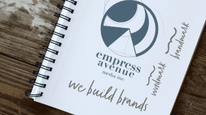
Here is some key language to help translate your vision into a tangible logo. A wordmark or logotype is the typographic representation of your brand, and a brandmark or logomark is the visual representation of your brand. The entirety of the logo may sometimes be referred to as a combination mark.
If you want to talk about the text part of the logo, it’s helpful to know some basics about typography. From a simple monogram to the full name of the business, how much text you have, as well as the typeface you choose, all of these details can bring a lot of background meaning to the logo.
With our logo, we chose Bodoni, a historically meaningful font in the world of graphic design. We hope that the clean, straight lines convey the meticulous attention to detail and pride we take in our work as a media company.
Your logo may have symbols, icons or an image that is representative of your brand. This can be something abstract, employing some simple lines or shapes to accentuate certain features of the text. It can also be the main focal point, telling the story of your brand.
For us, we wanted to emphasize an idea of “home”: the idea of coming home, the parts of a place that make it feel like home, where we are, and how we are a part of and support our local community. It was important to us, in a digital world, to have our logo represent us, real people who work at a real place in the world, and with a path towards it, welcoming you to find and approach us. Later on, this path became an important feature in the animation of our logo.
It may be worthwhile to do a quick search on the colour you wish to use. For example, “the meaning of blue” comes back with this result: “Blue is a serene and calming color that represents intelligence and responsibility. Blue is cool and relaxing. Light baby blue is peaceful, while dark blue can signify depth and power.”
Remember that these connotations are not always set in stone, and there can be more than one way to interpret any image. For example, while red is often associated with danger and debt, most Canadian banks have chosen red logos and branding. The colour red can also represent power, energy, confidence and action. More about colours and their possible meanings.
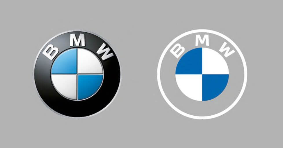
Any of these three elements should be able to exist on their own or in some combination. For example, a good logo would still work in black and white, or in a single colour, and still be as recognizable as it would be in full colour. (Even if the colour version is the ideal version, we should still be able to get the feeling of it without the colour). And the same goes for having the text without the image (if there is an image).
It can be a bit trickier to go without the text, especially as a new brand. If you would like to see your logo with less text, try opting for a monogram or abbreviation. Also ask your designer about placing the text into the image, for example, utilizing a shield, circle or other identifying shape. You might like to search “beverage logos” to find some examples of this strategy.
Motion graphics are becoming increasingly common, even in everyday social media posts, because our eyes are drawn to motion. Utilizing this increasingly ubiquitous technology will help your brand stand out in a crowded marketplace. One of the simplest, most accessible ways to get on board with this is to have a moving logo. You can add this element to almost any online content, and it can help take your images and videos to the next level and capture the attention of your audience that much better.
If you already know that you would like to have your logo animated or go through some motion for video content, it’s helpful to consider that in your logo plans from the beginning. For example, if you are envisioning a spinning type of motion, it may be helpful for symmetry that the logo be contained in a circle.
Chances are high that the motion(s) your logo will eventually take on will be key information for the still logo. And you will definitely want the logo to be recognizable in either form, maybe even with evidence of its motion form in the still version.
Getting Started
We will need a vector form of your logo to get started. This means that your logo will be scalable to any size without sacrificing quality (i.e. without pixelation) – that’s super important when we start moving it around. Was your logo made by us? No sweat, we’ve already got this! Otherwise, if we can grab a vector form from your previous designer, that will work. If that’s not possible, we can vectorize an image file for you as well.
It’s also useful to have each part of your logo on a separate layer, which will allow it to move independently from the other parts. Again, this is something we can help with if you don’t already have it set up.
Motion Logo Design on Vancouver Island
We design motion logos that:
– Convey your brand values PLUS that special something extra!
– Leave a visual impact on your customers, build brand recognition and make your brand memorable. We ensure your brand’s key values are recognizable throughout the motion.
– Are accessible! We want you to use the motion logo as much as possible so you can enjoy the rewards of a flashier logo.
The 3 Main Elements of Any Motion Logo:
Zooming in or out from an object, or playing with the size of the logo (or a part of it) can be one way to introduce motion. If there is one element of the logo that stands out, it can be useful to focus on that, and then zoom out to reveal the entire logo.
The Empress Avenue logo scales up to size subtly in the beginning of this animation as a visual arrival along with the motion of the truck. This supports our core story of coming home.
 There are three axes of position and rotation in motion design. It may be useful to imagine the motion of a camera to understand this element. Camera movements include dolly in, dolly out, pan, tilt, truck (moving left and right), and pedestal (moving the camera up and down). It is often best to use one of these movements at a time, but it depends on the effect you would like to achieve. For example, using a combination of these movements especially in quick succession can give viewers the impression of instability or excitement.
We want to answer the question: what additional information does the motion give to your customer? Although the motion will make your logo more “catchy” on its own, it’s always good to think about more ways to convey key information to your customers. For example, if the colour becomes brighter, this may suggest that your brand or product will literally “brighten” someone’s day or life. If you have several brand colours, transitioning through them can be a good way to make your brand more memorable and recognizable in different contexts or posts.
A similar effect can be achieved through opacity. Fading in allows the logo to become more clear, or come into full vision.
How about transforming an entire scene to show what your logo is all about? One of the most exciting things about motion design is that it is not bound by physical possibilities. Chances are, if you can visualize it, we can bring it to life!
Be Careful of these Common Pitfalls in Logo Design
 We shared some tips about logo design (with and without motion) from our design studio on Vancouver Island. We want to hear from you – what are your questions about logo design?
Don’t feel discouraged if it takes a long time and a lot of back and forth to get your logo to match your vision. It’s an investment to create a good logo, and you want to make sure it is as close to perfect as possible. It’s worthwhile to get it right and your designer is there to help, so if you have any hesitations, do try to let them know right away. In this case, the more information the better!
We’re here to help you stand apart from the crowd. Are you considering animating a new or current logo? Get in touch and let’s chat!
This content was originally published here.


