The creation of Coca-Cola
In May of 1886, in Atlanta, Dr. John Pemberton invented Coca-Cola. He was a pharmacist who had already worked with the ingredient Cola to make an alcoholic beverage. However, because of the prohibition, he never drank nor sold this drink. So, he turned to the development of Coca-Cola. But what is Coca-Cola, and where does this name come from?
At the time, Dr. Pemberton used kola nuts and coca leaves in his recipe. You should know that because of the coca leaves that cocaine was discovered. Of course, today coca leaves are illegal in the United States, and are therefore no longer in the recipe of modern Coca-Cola. You might have guessed it; the name Coca-Cola doesn’t come from nowhere. It comes from the two main ingredients of the original recipe. However, it was Dr. Pemberton’s accountant, Frank Robinson, who came up with the name and decided to change Kola’s “K” to a “C” for advertising purposes. In addition, this drink was not sold in bottles that are so well known. For about twenty years, it was sold only as a fountain drink. It was not until the early 1900s that the bottle was created. Unfortunately, in 1888, Dr. Pemberton was not there to see the rise of his product, he died two years after Coca-Cola was put on the market. Let’s see how the Coca-Cola logo has evolved.
The first Coca-Cola logo

The Coca-Cola logo has seen two real logo changes in the 135 years of the company being in business, and only a few minor changes. The first Coca-Cola logo appeared in 1886, and it would stick around for only a year before it was changed. After that, was a signature logo with Coca-Cola written in black serif capital letters with a dot at the end. This logo was simply basic, nothing exceptional.
The evolution of the Coca-Cola logo
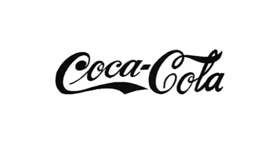
Around 1887-1888, the new Coca-Cola logo was introduced. It was created by Robinson Pemberton’s accountant, who had also come up with the brand name. This logo strongly resembled the one that currently exists, but in black. Robinson agreed that the logo should be in Spencerian script with the first letters of each word in uppercase and the rest in lowercase. This calligraphy was to be used for correspondence in business. Robinson found that this calligraphy gave a dramatic tone to the name, which was what he wanted to represent. The length of each “C” was somewhat in the form of waves, indicating some kind of movement and advancement.
Then, in 1889 and 1890, two more logos were created, but they were seen very few times by the public. On the logo of 1889, we saw that the letters were separated. In other words, they were no longer attached to one another, with diamond shapes under the top of the “C” letters. The tail of the “C” was elongated under each word. A diamond often represents life and exchange. This is the kind of image that Coca-Cola wanted to create. It also reflects the image of a luxury brand with this kind of typography.
The 1890 logo was only around for one year when the typography was changed again. This time, commas resembling musical notes were hung on each “C”. We’re not really sure why this logo was created. It could have been created for the Coca-Cola Cherry or an edition of Coca-Cola for Christmas.
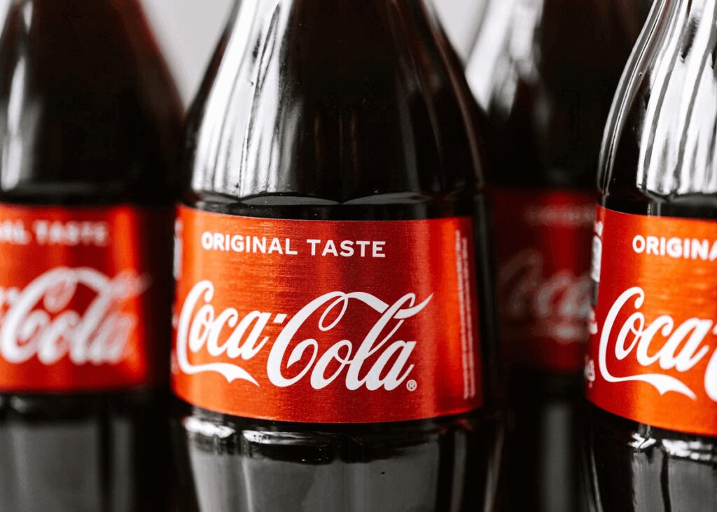
Don’t you think there’s a little something missing from these logos? No? The color red perhaps? And yes, the famous red color of the Coca-Cola logo arrived in 1891. Red is often used in logos to represent passion or love. Coca-Cola wanted you to feel their passion and that you share your Coca-Cola with others. As you can see, this logo is almost a carbon copy of the current logo, but the letters are slightly larger and straighter.
In the following years, this logo underwent slight modifications. The phrase “at the drinking fountains” disappeared, and “trademark” appeared. The words Coca-Cola were white to appear on a red background.
In 1969, the Coca-Cola “wave” appeared. It was a white wave that passed under the brand name and became a distinct aspect of the brand. In the digital age, it appeared in motion during broadcast advertising. The motto or slogan became “Enjoy”.
And so, in 2023, the Coca-Cola logo was almost the same as when it was created. There were now some color derivatives depending on whether you got a Coca-Cola Zero, Diet or Cherry, but the font remained the same.
How do you get inspiration from the Coca-Cola logo for your logo?
As you can see, keep it simple! Do not try to complicate things, because you will not necessarily find a better result. For a signature logo, you just need your brand name. Feel free to write your brand name in different ways on a piece of paper. We often search for the complicated fonts that are on the internet, but why not use your own handwriting? Coca-Cola is the perfect example of a timeless logo that didn’t need to follow trends to keep its power.
Now you know everything you need to know about the Coca-Cola logo. Do you know which other company has a timeless logo? Playboy! Which is good because we wrote an article about their bunny logo!
This content was originally published here.