And why it’s necessary for effective feedback
For many clients, design is a mystery. The designer waves a magic wand and — pop! — a logo (something akin to a majestic unicorn) spontaneously comes into being. And as fun as it is to be seen as a design magician, this notion can be a problem come feedback-time.
It’s much easier to diagnose a problem if the person describing the problem has the right vocabulary. Instead of logos as unicorns, I prefer to think of logos as being like cars — a functional thing that can be tinkered with to change how it works and how it looks.

So take a peek behind the curtain and see how a logo actually gets made.
First up — building a logo
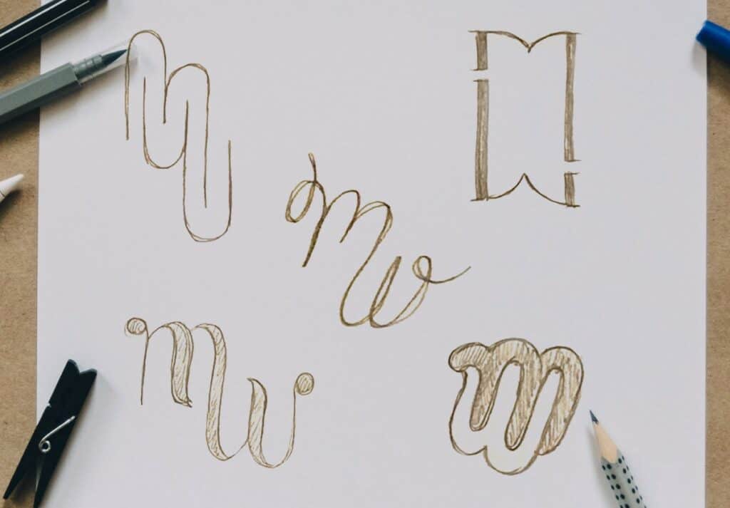
For every branding brief, literally thousands of different logos could be created in response.
How does a designer choose what font and colour to use? Whether it’s typographic or has an icon? For every decision a designer makes, it needs to be considered alongside these four questions:
- What does the client want?
- What best represents the brand?
- What will work on the intended mediums?
- What will appeal to the intended audience?
The first two should be covered by a good brief, and the second two will be informed by the designer’s experience. But designers also don’t know everything (such as a client’s aversion to fushia pink thanks to an 80’s prom that will never be mentioned again). So getting to a final signed-off logo will always require a collaboration — a mix of the expertise of the client and the experience of the designer.
Once the designer has ‘built’ the logo, the client will generally have feedback. The feedback can be loosely broken into two areas:
- The message (like the mechanics of a car),
- The style (like the car’s body)
By thinking of these as distinct elements, it’s easier to understand what can be changed — and how.
The message (aka the mechanics)
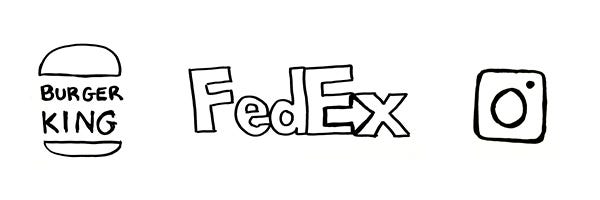
This is really the foundation of the logo. A logo tells the audience something about the function and personality of the brand: Burger King makes burgers. FedEx delivers things. Instagram is a way to share photos.
A clear message can be conveyed in a rough sketch on the back of an envelope — it doesn’t need the fancy bells and whistles to make sense. The message is a ‘concept’ rather than a ‘look’.
I think of the message as being like the mechanics of a car. Your car won’t function without a working engine — no amount of paint is going to make it go. If the logo’s message doesn’t make sense, it may be time to chuck it out and start again.
The style (aka the body)
How the logo is styled is what creates a feeling in the audience. The style crosses over with the message, but one message can be expressed in several different styles.
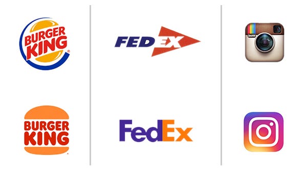
The style adds another layer to the message: Burger King is nostalgic and makes burgers. FedEx is reliable and delivers things. Instagram is a fun way to share photos.
If a logo has typography, then the font used will be a big part of the style. If it has a graphic, the style could be influenced by it being heavy or light-weight, whether it’s organic or geometric, has depth or is flat. And the colour will of course impact the style.
These choices create feelings like ‘professional’, ‘modern’, ‘reliable’, or ‘innovative’. They can also suggest which industry the brand is part of.
The style is like the body of the car: It’s the bit that people are most likely to notice (flame-job anyone?). You can make changes to the body of a car without fundamentally changing its function — just like you can change the style without fundamentally changing the message. You could think of a new font as being the car-equivalent of putting chrome rims on the wheels.
As you can see in the examples above, the same message can be expressed in different ways. A new look changes the feeling of the logo without changing the concept behind it.
You can’t change the paint job with a spanner
Designers are often tasked with ‘fixing’ an existing logo when a business decides to rebrand. More often than not they keep the same logo concept but update the style for a new audience. This comes from knowing that the brand’s function hasn’t changed (unless the business has) only the feeling has.
Defining the message and style as different elements of a logo clarifies which areas need work. A logo could have a really strong concept but the font is creating the wrong feeling. Or it might look flashy but not have much meaning behind it.
If you know where the problem is, it’s much easier to find the right tools to fix it — meaning happier clients and designers, and better logos.
Separating message from style in logo design was originally published in Muzli – Design Inspiration on Medium, where people are continuing the conversation by highlighting and responding to this story.
This content was originally published here.