New Google logo design finds visual harmony using the Golden Ratio.
Google’s design follows in the footsteps of Leonardo da Vinci and other masters
When Luca Pacioli published “The Divine Proportion” in 1509 (with illustrations by Leonardo da Vinci), he described his work on this “golden ratio” of 1.618 as a “very delicate, subtle and admirable teaching” that would “delight in diverse questions touching on a very secret science.” Johannes Kepler later called it “a precious jewel” of geometry. The designers at Google have apparently found its value too, as we see when we study and appreciate the underlying design of Google’s new logo, iconic G, the microphone icon and even the layout of the Google search page.
This is the kind of thoughtful design work that follows in the footsteps of Leonardo, Michelangelo, Raphael, Botticelli, Seurat, Le Corbusier and other masters of design, and that would make Pacioli proud.
Here’s a version without the arrows for a clearer view:

There’s a good chance you’ve used Google to search the Internet lately, maybe even in getting to this site. With over a billion people visiting per month, Google obviously puts in a lot of thought to create the best possible experience in using their search page. As simple as it is, the design of the logo and its search page has evolved considerably over the years. Consider how Google looked in 1998:
Logos and trademarks are critically important to a company’s image and brand recognition. On September 1, 2015, Google announced the new design for its logo and other trademarks. Their ongoing refinements of the logo and related design elements have led to the use the Golden Ratio (GR) in its design.
Golden ratios in the new logo and symbol are revealed by graphic analysis
For those not familiar with the golden ratio, it’s a simple as this:
The grid lines shown on logos in this article represent the golden ratio(s) of the height or width shown by the grid:
Let’s now see how the Golden Ratio appears in this new design, aided by the pixel-level accuracy of PhiMatrix design and analysis software:
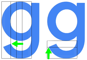
Next, take the height of the letters from the top of the upper case “G” to the bottom loop of the lower case “g”. Note alignment with the golden ratio lines at:
The new Google G symbol
The new Google “G” symbol also closely aligns with the Golden Ratio in it’s design:
The new Google microphone symbol
My analysis reveals that new Google microphone symbol has a surprising number of golden ratios that were taken into account in its simple but very elegant design:
These are quite intricate design decisions for such a small icon. Think though how it ever so subtly relates it to the logo above it. It creates visual harmony by using same proportions for the design of all the elements of the composition. These same techniques appear in the composition of paintings and buildings by recognized masters of design, back to the Renaissance and before.
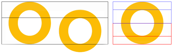
Golden Ratios throughout the new font created for letters in the logo
We also find the golden ratio in use in the width of the letters and other fine detail of the new font that Google calls Product Sans. Look at the width of the letters in relationship to each other.
![]()
![]()
The PhiMatrix grids used above make this kind of design easy to do. For those just itching for a little math at this point, here’s how this works:
It’s the unique mathematical properties of the Golden Ratio that makes this relationship happen … again and again and again …, and why it is so useful in achieving visual harmonies in design.
Google Search Page design layout
Google didn’t stop there. Look at the proportions of the Google logo and search bar:
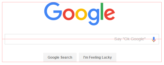
And where are the letters positioned within the search box and buttons? At this point, it probably wouldn’t surprise you to see:
The Google logo is positioned very closely to golden ratios of the distance from the top of the browser window to the various components of the search box:
Graphic analysis and composition with pixel-level accuracy
The above analysis was done with PhiMatrix analysis software, which makes it easy to identify and apply Golden Ratios in design and composition with pixel-level accuracy. Golden ratios allow proportions to be kept in consistent visual and mathematical harmony, unlike any other ratio. Beyond its unique mathematical properties, the appearance of the golden ratio in nature and the human face leads most people to find it natural and pleasing.
This importance of this is highlighted by Darrin Crescenzi in his excellent article, “Why the Golden Ratio matters. In defense of using visual harmonies in Design.” Darrin is Design Director of Innovation at Interbrand New York, frequently quoted in FastCo Design as an authority on design and one of Fast Company magazine’s 100 Most Creative People in Business.
Google used the Golden Ratio in its previous logo design and search page layout
This is not the first time that Google has used the Golden Ratio in its design. The website design they just replaced had GR in both the logo and the layout of the page. In the previous logo:
The width of the crossbar of the upper case “G” is a golden ratio of the width of the “G”.
![]()
![]()
The lower portion of the lower case “g” is a golden ratio of the height of the lower case letter as well!
The design of the Google Search Engine page layout embodied the Golden Ratio
The previous Google search engine home page also based its layout on the golden ratio in a slightly different way, as shown in the images below.
From the top of the browser window to the top of the logo to the top of the search box:
From the top of the logo to top of the search box to the bottom of the buttons:![]() From the top of the search box to top of the buttons to the button of the buttons:
From the top of the search box to top of the buttons to the button of the buttons:![]()
It may be just a tool, but the Golden Ratio has broad appeal and application
No matter what kind of design you do, the golden ratio offers a reliable way to achieve a natural balance and aesthetically pleasing appearance in design. It’s much more than just a more natural and accurate alternative to the rule of thirds. It’s a mathematically unique system of ratios within ratios that can keep an entire composition in visual harmony. See many other examples of the golden ratio in design of art, architecture, logos and products.
It’s just one of many tools that good designers use to achieve great composition, but no designer should be without a knowledge of its concepts and application. At least that’s what the graphic design team at Google seems to think, and more than a few great masters of design through the centuries.
Author background
Since the 1990’s, Gary Meisner has been researching the appearances of the golden ratio in the beauty and nature, and its application in the design arts. He created www.goldennumber.net in 2001, which reaches 1 million people per year and shares contributions from dozens of others from a variety of backgrounds. He is the developer of PhiMatrix Golden Ratio Design and Analysis software, which is used in over 70 countries. He has connected with thousands of other people with common interests in the topic, sharing with them and learning from them. His interviews on the topic have included the LA Times, a TV educational documentary and radio.
This content was originally published here.