“The logo has become an established fixture in all aspects of human activity,” writes designer and author Jens Müller, who’s no stranger to the history of graphic design. “These days, it is almost impossible to imagine a university, band, medical practice, community initiative, or app without a custom-designed source identifier composed of shapes and letters.”
In Logo Beginnings, which is published by Taschen, Müller looks back in time to the roots of logo mania. According to him, the first registered example in the US was an eagle holding a paintbrush against the skyline of Chicago – created for paint manufacturer Averill in 1870. Europe joined the US in 1875, with a red triangle for the English Bass Brewery – a mark that’s surprisingly minimal and modern in appearance.
Müller notes that logos first emerged as a result of trademark law, used as a way of setting products apart from competitors. And according to the author, these early logos established the convention for years to come.
“Even at the beginning of this development, various and sometimes contrary design concepts for logos emerged, including wordmarks, acronym marks, figurative drawings, and abstract forms,” he writes, noting how many of these still work well today, despite a completely different media landscape.
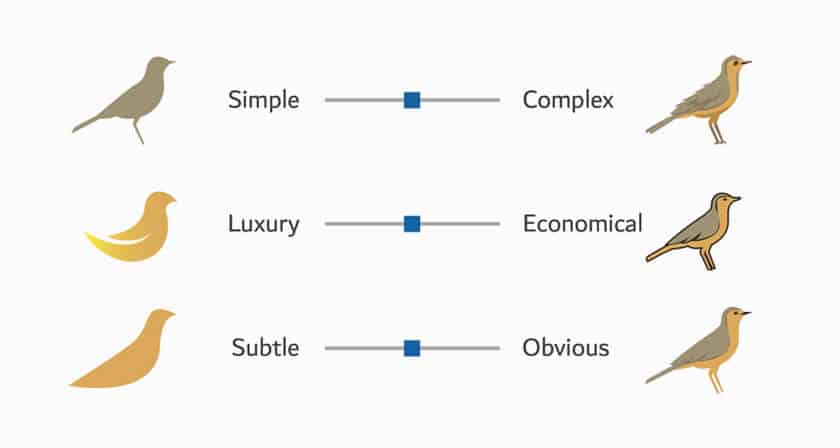
Logo Beginnings examines some of these earliest efforts, with pages chock-a-block with chronologically arranged historic examples, divided into themes – for example, symbols featuring people or landscapes, or geometric shapes. It’s interesting to follow the gradual simplification of design over time, moving from complex illustrated marks to the more simplified forms we expect to see today.
The book also features some of the now-defunct logos of well-known companies, for example a Paul Rand-designed Esquire Magazine logo, featuring a huge, googly-eyed face, or an illustrated Michelin design from 1898, showing the character clasping a martini and a cigar.
Müller makes stopping off points at particular companies, for example French production company Pathé, which has changed its logo many times since 1898, although never quite abandoning the rooster.
There’s also entertainment company Universal Pictures, which has been wedded to the globe symbol since 1912; insurance brand Prudential, with its varying depictions of the Rock of Gibraltar; and oil company Shell, which has retained its scallop seashell for over 120 years.
It’s a fascinating book to dip in and out of, and a reminder of the hold symbolism can have over business and popular culture. “It is impossible to predict exactly what marks will look like in the future,” writes Müller in the book’s introduction. “What is certain, however, is that the original fundamental principles used in such a variety of ways over 100 years ago will continue to play a role.”
Logo Beginnings is published by Taschen; taschen.com
This content was originally published here.


