Have you ever looked carefully and appreciated how the right minimalist logo design looks? We predict a greater focus on minimalist logo design in the future. The power of a good logo design is undeniable; outsource it to a professional designer, and you’ll be glad you did! That said, it’s time to consider the future of logo design! and answer the question: Is Minimalism the Future of Logo Design?
What’s the purpose of the logo? To captivate your audience, of course. It should be appropriate, modern, and adaptable and elevate your business or brand. In a bid to make your logo attractive, it is easy to overcomplicate things and make a mess of everything.
Add too many images or colors to your logo, and you may need to start explaining what your logo stands for to your customers. It has never been good and will never be.
It’s akin to trying to explain a joke after you said it. It feels weird, right?
While designing a logo, your best bet would be to focus on the bare essentials and consider creating a minimalist logo. Consider creating a logo you wouldn’t have to start explaining to the world – one that its meaning and impact lays bare to the eyes of every beholder.
That aside, you need to focus on creating a simple logo that has a greater impact than every other one out there.
We asked Andrew, the founder of The Logo Creative, and he explained,
“It’s not about what you can add to the design, but what you can take away, a logo does not need to explain its soul purpose is to identify in its purest and simplest form while being appropriate and memorable for years to come”
But before you can create such a type of logo, you need to understand what minimalism is and how best to apply it to your brand and business.
This article will walk you through all these and even show you some of the top minimalist logos just in case you need some inspiration. So, are you ready to deep dive into the world of minimalism? Let’s do it!
What is Minimalism?
Generally, minimalism describes a style or design in painting and sculpture where the fewest and simplest elements are used to bring about a maximum effect.
The origin of minimalism is traceable to the arts – where artworks began to feature only a few colors, simple lines, and a careful arrangement and placement of those colors and lines.
What is Minimalist Design?
A minimal design follows a “less is more” approach to bring about a cool and attractive design approach. It refers to a clean aesthetic and is a creative recipe where fancy embellishments are non-existent.
We have seen extreme acts of logo minimalist actions from companies such as Mastercard, whose circular icon has become so well identified it decides to remove all wording from their logo.
Another case was with Dunkin Doughnuts, who removed their icon and the word donuts, stating they are making the move to become better friends with its customers.
Stating in a tweet:
“After 68 years of America running on Dunkin’, we’re moving on to a first-name basis. Excited to be #BFFstatus with you all,
It’s official: We’re going by Dunkin’ now. ? After 68 years of America running on Dunkin’, we’re moving on to a first-name basis. ? Excited to be #BFFstatus with you all ?☕️? #firstnamebasis #besties pic.twitter.com/hmzd2Bamlm
Although the company will continue to produce doughnuts, the name change is one of the parts of a large-scale makeover for the company that Dunkin’ Brands’ CEO and U.S. President David Hoffmann said in a statement he believes “will keep our brand relevant for generations to come” as it continues to move toward a “beverage-led” retailer.
In 2013, Dunkin’ Donuts began moving away from a doughnut-based identity, declaring itself a “beverage company,” when beverage sales reached 58 percent. According to the New York Times, that figure has gone up slightly to 60 percent.
“Our new branding is one of many things we are doing as part of our blueprint for growth to modernize the Dunkin’ experience for our customers,” Hoffmann said.
As you can see this design type bids farewell to complicated layouts while favoring simple, bold, and clean compositions with a few colors, say one or two.
If used well, a minimalist design can create a hypnotic effect on many who set their eyes on it, birthing adopters and advocates of your brand and business.
Now here’s the thing: our brains instantly fall in love with minimalist designs because these designs are so easy to process and recall.
Similarly, we are creatures of habits because habits reduce the stress on the brain and make everything fall in place almost automatically.
With a minimalist design, your brain will no longer need to expend mental energy, trying to decipher color wars and convoluted images.
In addition, minimalist designs make it very easy for the world to understand what your logo is trying to say.
How to Use Minimalism in Logo Design
Ages ago, logo creators delighted in creating logos with many hidden meanings and messages to pass across. Logos were unbelievably complex, with complicated nuances and the need to decipher hidden messages.
The trend, however, is no longer complex designs. Consumers want simplicity in every meaning of the word.
But why the change in logo design needs and expectations? Well, it is no news that we are in an age where we are bombarded with information left, right, and center.
Notifications here, a pile of emails waiting to be opened there, and an always-online mentality. So, the modern-day audience only has so much energy, attention span, and time to read new information and retain them before something “urgent” calls for their attention.
In a nutshell, the attention spans of humans are getting shorter and shorter by the day.
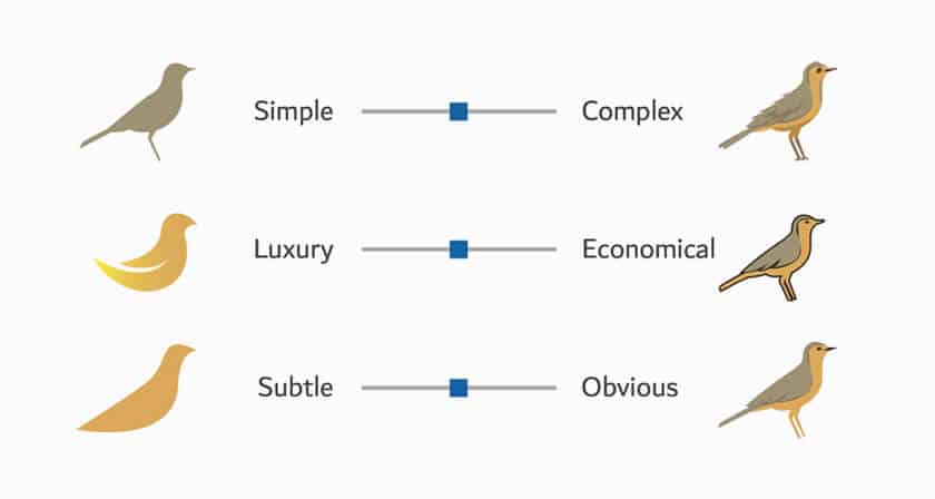
So, rather than trying to cram a bunch of different elements together (such as colors, shapes, fonts, etc.), a minimalist logo will avoid all these extras. Instead, a minimalist design logo will embody a fundamental design concept that fits all media and backgrounds seamlessly.
A very common minimalist design example is the flat logo design. Most famous brands slap flat logo designs as their brands – think of how Apple, Nike, Uber, and so on use minimalist logo designs to drive home their point.
What will Logo designs Look Like in the future?
So, what will logos look like in the future? Looking at how successful simple and minimalist logos have been over the years, it’s safe to say that minimalism has a future in the logo design industry.
Logos are now becoming more important and powerful than ever. And even though the design trends are rapidly evolving, companies must still distinguish themselves from their competition.
One of the strongest logo design trends is minimalism.
The new logo trend affects old companies and new companies alike. Companies are at crossroads when they have to change their former logo design to keep up with the trendy appeal of emerging logo trends.
But the decision is not one that is entirely difficult to make. So, minimalism has placed a strong foot in the design world and is fixed on staying.
Popular Companies and the Minimalist Logo Trend
“Back to basics” is a very popular phrase used by people worldwide. Usually, people choose to go back to the basics when they discover that their lives have become super complicated and feel they are missing out on the good things of life.
This is similar to what companies do. They try out many innovative things but still come back to basics in the end. Several brands changed their logo designs to fit the minimalist space, and it worked.
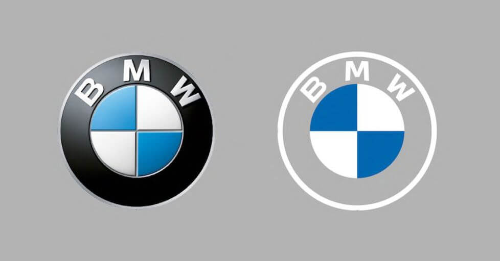
Of these brands, some of the most popular brands include Facebook, Google, Airbnb, BMW, McDonald’s, and the list goes on.
The most common minimalist design trend is the simplification of logos. A simple design is the glory of a brand’s expression. Often, the simplest logo designs catch the eye because not only are they practical, but they also show a high sense of purpose.
This is because they get straight to the point, customers and clients are not overwhelmed. That’s why companies such as Spotify have changed their designs to a flat, simple design in recent years.
So, while complex designs have done wonderfully well in the past, stripped back minimalist logo designs are the future.
Why Are Minimalist Logos Trending?
Current logo design trends navigate towards minimalism for a reason. Apart from following the mantra of less is more, there are many reasons why minimalist logo designs are trending.
Minimalist logos have a lasting impact on the public for a reason. Besides the fact that minimalist logos are memorable, eye-catching, and easy to process, they can easily fit mobile screens.
Many consumers are on their mobile devices these days, so it’s a no-brainer that your logo should fit on there. So, the chances that your audience is consuming most adverts and messages on their smartphones are pretty high.
If a company needs a logo design that will resonate with a tier audience, then a minimalist design is the best path to follow.
How to Rebrand Your Company’s Logo with Minimalism
As most companies have chosen to stick with the minimalist logo design, it is expected that more companies will follow that path. But minimalist design is not all about churning out basic designs.
There are many factors to consider. However, you do not necessarily need to consider every one of them. To create an appropriate minimalist logo, you may want to implement most of them.
Are you ready to go simple on your logo designs? Here’s how to go about it!
Other Logo Design Concepts
Other logo design concepts have a future in the design world. This includes logos that utilize negative space and motion graphic logos. Take a brief look at each of these design concepts.
1. Logo Designs Utilizing Negative Space
Negative space logos have been around for a long time its not a new style of logo design, but the concept of using negative space is becoming more and more popular among designers, and its not going away anytime soon and i believe it will always have its place in the logo design industry.
A classic example of this type of logo design would probably be the iconic FedEx logo (shown above). There is a subtle arrow symbol within the negative space between the letters “E” and “X” in the logo.
Negative spaces give consumers the luxury of interacting with the brand, especially when they finally realize the hidden image in the negative space. One would expect the use of negative space in logo designs to become a thing of the future.
And it’s a double kill if the design is both simple and uses a negative design concept. Not only is this minimalistic design, it’s also a clever design!
2. Motion Graphics Logo Designs
Motion graphics is a design concept that has not really become a major thing yet. But thanks to the significant advancement in technology, it is becoming quite popular.
Spotify and FedEx both have motion animated versions of their logos
Although not all of these are official to the companies they are representing, designers have taken the time to create them for companies such as Giant Owl, LinkedIn, Amazon, Ebay, PayPal, Twitter, Apple, Lego, KFC, Burger King, Starbucks and lots more exist.
It’s no surprise that animated logos will be on the rise because our eyes gravitate towards moving things.
This is why animated logos are solely becoming eye-catching logo design trends, although not appropriate in all situations they are nice to look at in the right situations.
People spend a lot of time on the internet, so it is easy to notice when you place these types of logos online.
However, the key is still to keep things simple, as only a few people would follow very complex logo animations.
So, rather than using a static logo, you can give your logo life by allowing your logos to move and change. With this, you can give your brand the freedom to express itself and spark conversations beyond its logo.
Final Thoughts
In conclusion, there is no hard and fast rule about how you should go about your logo design. For example, Google uses minimalist design as well as graphics animation on their website.
A minimalist design that uses negative space and includes some animation is not so bad after all. If you can nail something like that, then why not? So what do you think? Is minimalism the future of logo design?
Join The Logo Community
We hope this article has helped you with How Much Should You Charge for Logo Design. If you would like more personal tips, advice, insights, and access to our community threads and other goodies, join me in our community. You can comment directly on posts and have a discussion.
*TIP – We recommend to Learn Logo Design with an online masterclass.
Author Bio
This article was contributed by freelance writer Olivia Smith, who works for Domyhomework123.com.
This content was originally published here.


