Brand Design for Jill Langer
I don’t know if you agree with this or not, but I believe everyone can learn to draw. So does Jill Langer. In fact, she believes it so strongly that she helps teams and individuals learn how to draw so they can create happier workplaces, more creative solutions, and stronger team collaborations.
Through a hands-on visualization technique called bikablo® and LEGO® play (yes, you read that right!), her clients learn how to approach work challenges with curiosity and fun. No more boring team meetings. They’re excited to come to work and problem-solve in innovative, engaging ways.

I had the pleasure of participating in one of Jill’s online workshops this summer, and it was amazing to see how simple lines and shading can help communicate important concepts and ideas.
Come take a look behind the scenes at Jill’s fun, engaging brand!
1 | Brand Strategy
As expected, Jill’s brand is all about fun and play, but there’s also a very strategic purpose to this play. The goal is to get her clients thinking and strategizing “outside the box.” This allows them to build better solutions for their own company and the benefit of their clients. This is the premise behind the big idea for her brand: Play with Purpose.
Our keywords for Jill are playful, engaging, and refreshing. The color psychology of turquoise is refreshing and creative, like jumping into a crystal-clear pool on a hot, sunny day, and papaya and lemon are cheerful, warm, and energizing. The color palette feels inspiring and playful, exactly how her clients feel in her workshops.
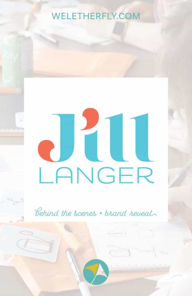
2 | Logo Design
After tweaking and finalizing her Brand Strategy, I developed Jill’s logo. The overall style is clean and professional while still unique and fun. While customizing the letter forms, I highlighted the quotation mark shapes to emphasize the way Jill creates more meaningful conversations in her teams through her unconventional approach.
3 | Brand Board
The logo and additional pieces come together in the Brand Board with a variety of logo marks for multiple applications, on-brand fonts, specific colors, and a custom pattern.
4 | Collateral & Social Media
I also designed a handout template for her workshops and website banners for her updated site. Because Jill also works in Adobe Creative Cloud, I built her final files in InDesign and Photoshop so she can always create new files as needed. I love being able to build for clients in Adobe because there are so many more options for easy tweaks without the limitations of Canva.
This brand design is a great example of my Signature Brand Package which includes all the elements you need to take your brand to the next level, just like Jill did.
How does Jill feel about the final result?
“Before hiring Michelle, I wasted so much time and energy changing fonts and colors and still felt frustrated with my DIY brand. I really wanted to do more business promotion but this uncertainty held me back from putting my work and ideas out there.
Michelle understood what I was trying to achieve and was extremely detailed and responsive. Her process helped me gain a deeper understanding of my own business and future direction.
I love the overall brand—it feels more like me and has lots of variations of logos and graphics. Now, I can build a brand that’s cohesive without being boring. Having a more professional brand has enabled me to confidently share my work and easily create new marketing and communication materials.”
– Jill Langer, Learning Experience Designer, Jill Langer Consulting
How about you?
If Jill has inspired you, you can book a free consultation and explore what new branding could look like for your business.
This content was originally published here.