“Hey! Everybody is using polka dots in their logo these days. Let’s do that with mine too.”
This is a kind of sentence two out of every three designers hear from their clients. Just because they see a particular ‘trend’ going around, they want you to replicate it for them as well. The hardest part is to reason with them and convince that they are wrong.
Trends in any industry are a good source of learning and inspiration. However, they shouldn’t be treated as a foundation for brand identity creation. They can never be a substitute for creative and unique work. The problem with trends is that they only last for an interim period while originality is everlasting. That is why each year we see a different set of trends prevailing in the industry. The old ones disappear making way for newer trends to take the limelight.
As with every year, 2014 will also witness the fall of several cliché trends that have overstayed their existence in the logo design business. Here are 7 logo trends that have been excessively used and are destined to fade away in 2014:
Wordy Logos

Back in the old days, brand identities used to be nothing but merely names of the company. Extremely lengthy and verbose logos were a common trend. But the past is history now. We are living in the era where simple is better. The wordier the logo, harder will it be for the audience to recognize it. We are already witnessing many brands abridge their visual identities to make them more effective and one can surely anticipate that this trend will fade away by next year.
This logo for a realty company is a perfect example of why the trend of wordy logos is destined to perish. The logo could have done perfectly well without the addition of superfluous words ‘REALTY’ and ‘LLC’. Instead, it makes the identity boring and difficult to memorize.
Black and White

Until a few years ago, black and white was a trendy theme in logo designing. But as major brands head towards the digital media, black and white isn’t the catchphrase anymore. People want more color and vibrancy in everything. Even though monochrome logos (using just a single color) will still remain, the use of black and white for logos will gradually fade away in 2014.
A couple of years ago, tech giant Microsoft finally decided to redesign its 25-year-old black and white logo. The company finally realized that some color needs to be added in their brand identity to make it more exciting and appealing.

“What’s that shiny effect called? Yeah I want that in my logo too.”
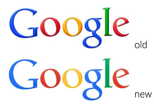
This is another one of the statements that designers have to bear from their clients. The gradient effect used to be very popular a few years back and was used to add a shady effect in logos. However, brands have started realizing that even though the gradient effect may look ‘pretty’, it can cause trouble in reproducing on all mediums. Corporations are now shifting towards flatter logos that have solid colors rather than flashy ones.
Case in point is Google’s logo that was revamped after dropping the gradient effect. The Search Engine giant finally decided to roll out a flatter version of its logo that it had already been using internally and externally for printing purposes and publishing white papers.
Complex Logos

Creativity in logo design is admirable till the time it becomes so complex that the real meaning is lost. You cannot put in everything in a logo at once and expect it to work. Long gone are the days when a logo design was meticulously observed like a Picasso artwork. In this fast paced world, people don’t have the time to interpret the complexity behind a logo. Fast and simple logos are the talk of the town.
Remember the London 2012 Olympics logo? It is a perfect example of why complex logos aren’t really popular anymore. The design was such a complex mess that it failed to communicate the real message of the Olympics.

Next year will most certainly be the end of the Helvetica trend. Let’s face it guys. Simply typing the name of a company in a pretty font doesn’t make it a logo design. No doubt Helvetica is a great typeface to use, but it shouldn’t be taken for granted. The font has been excessively overused so much that it is about time that this trend fades away.
Let me recall the Gap logo fiasco that exhibits my point accurately. The clothing brand gambled on changing its decades old identity with a Helvetica typeface. What happened? It got badly criticized for employing such a casual approach to its logo makeover.

Transparency in logo design is another trend that will meet similar fate as gradients in the year 2014. Much like the gradient effect, transparency also creates several issues for new digital mediums. For instance when embedded on a website, it can lose its visibility in the background. As more brands shift towards new media channels, the transparency trend will eventually fade away.
An ideal example is the logo redesign for the World Trade Center Memorial Foundation. As clearly evident, the redesigned logo is extremely hard on the eyes and one can imagine what troubles it might cause when used on various platforms.
Circular Script

Believe it or not, there are still some designers out there who will draw a circle, write the name of their client’s company inside and pass it off as a logo design with the pretext that it is the ‘in thing’. The problem with circular script trend is that it has been done so many times, it has become a cliché. Tons of brands have followed this suit and it is about time that the circular script is given a break. Volkswagen, Ford, General Electric, WordPress, StumbleUpon you name it…even people use this trend on their personal website logos.
Whenever I see the WordPress logo, it always reminds me of the Volkswagen logo. Call it a coincidence, but the resemblance is uncanny and is mainly due to the circular script trend being followed. The point here being…it kills the uniqueness of the logo. 2014 should really see an end to this overused trend.
We can only predict without certainty as to what might happen next year. But one thing is for sure…trends are temporary and shouldn’t be followed religiously. Which other logo design trends do you think will lose their way in 2014?
This content was originally published here.


