As authors become more adept at marketing, promoting, and growing their author businesses, personal branding and logo design has become vital. Use the tips and ideas in this guest post by Andre Oentoro, the founder of Breadnbeyond, to help you stand out and make your work and brand much more memorable.
In the past, it was mainly companies and celebrities that had personal brands. It was the famous and influential who used personal branding to improve their careers and maintain the public’s attention.
But, many things have changed over the last several years. Today anyone can build a personal brand and benefit from it.
And it’s possible for you to establish your brand and elevate your author business.
Personal branding is similar to a corporate brand, except that you communicate your unique value, expertise, and identity instead of a company’s.
If you’re an author, personal branding is crucial to level up your career. People can identify your books (and determine if they are right for them) based on how they see your brand. Your branding affects the way readers interpret your writing.

Building a personal brand is ongoing. You need to be consistent in what you show to the public and continue to build your author brand for the duration of your writing career. This means you can’t fake your personality or professional identity to get validation from readers. Being authentic is the key to success over the long term.
There are many ways to showcase your brand that will nudge readers to instantly remember you. Using a logo to encapsulate your author brand is an excellent way to broaden your exposure among your target audience. So, when they see your logo, it should make a strong first impression, differentiate you from other authors (particularly in your genre), and remind them of you and the books you’ve written.
The Importance of a Logo for Authors
Think of your logo as a strategic marketing asset. Even your name itself can be a logo and used to help identify your work to potential readers.
A unique font combined with your name can enable people to immediately differentiate you from other authors, as can a unique design or symbol. So let’s look at some of the benefits of developing a simple, but powerful, logo.
Name recognition
Your author logo helps you get recognized among readers and the literary community. When people see your logo, they will be reminded of the book or publication you’ve authored. The logo can – and should – make a strong first impression, pique readers’ interest, and leave them with a memorable feeling for your books and brand.
Marketing tool
You can incorporate multiple marketing strategies to capture the attention of your readers like pricing your book effectively, building a launch team, creating explainer videos for YouTube, building a website, or growing your email list. But in all your promotional options, having a personalized logo will help you market yourself much more effectively. You can insert your logo in marketing videos, in your emails, on your author website, as well as any other online or offline campaigns to help readers recognize your brand. Your logo can increase awareness and grow your online presence, allowing your audience to identify and appreciate your work.
Professional approach
What do you want to be known for? Your logo can help establish your reputation and influence in the writing community. If you’re serious about marketing yourself as an author, having a logo will give a professional appearance, and provide clarity as to where your writing “fits”. As for potential readers, they’ll see that your logo represents your commitment to your writing and the experience you hope to provide. Combined with your brand, your logo helps you stand out in your genre or niche.
Five Ways to Improve Your Logo Design
1. Keep it simple
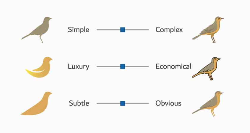
“Simple” does not necessarily equal plain or boring. There’s been a dramatic shift to simple design in the past decade.
The reason for this change, in part, is the advent of mobile devices. Since most people use their phones on a daily basis, having a simple, but eye-catching logo design can leave a great impression of your brand.
Complex or elaborate logos don’t work as well when reduced in size. With the proliferation of digital devices, having intricate logos can slow the process of grasping a brand message and a smaller screen can make it difficult for people to see your logo.
2. Choose the right color palette
“Color psychology” is the study of hues and their influence on human behavior. Every color has its positive and negative connotations. Therefore, determining the color or colors for your logo is an essential aspect of your design. It represents your brand’s personality and adds another layer to showcase your authority to book buyers.
In general, your logo should look good in both black and white as well as your brand colors. Cooler colors like blue and silver tend to give off a sense of trust and confidence, whereas bright and warm colors identify more with creativity.
It’s best to use a color palette that represents you and your brand the most. For example, take a look at some of Stephen King’s books below.
As you can see, King has a different color palette logotype on each of his books. He uses two to three color choices (red, black, and grey) with a specific font to represent his brand.
King’s logotype and colors coordinate with the cover and accentuate what the book delivers. It is also representative of the genre. His name, logo, and brand are so powerfully intertwined with the horror genre, that people can immediately recognize his books.
3. Be consistent with your font
Fonts also play an essential role in creating logo designs. It too, represents your brand’s personality that people can recognize at a glance.
However, if you use fonts that don’t fit well with your brand personality or the genre you write in, they can turn off your potential readers. Make sure that your font truly reflects what you do and who you are.
Consistent fonts will help your readers and the literary community to recognize your work in an instant. If you change your fonts often, you simply don’t establish personal branding to the fullest.
Let’s get back to Stephen King’s logotype.
Throughout the years, King didn’t make a major change to his original fonts. He capitalized all the words and arranged his name with the KING below his first name. This arrangement became widely popular and engraved in everyone’s mind.
Now, let’s see another example from detective novelist: Agatha Christie.
If you’re a fan of Christie, you know very well how consistent her logotype is in her books. Christie has two signature fonts that have decorated her publications over the past decade. The curly one is so unique that people can easily recognize from afar that the book is a Christie mystery.
4. Tell a story
Your logo design should be informed by your brand story.
A brand story grabs attention, elicits emotion, and engages people—and that goes for storytelling across all mediums. When you’re invested in a good story, your brain physically responds to it.
People also love hidden messages and logos that leave them to wonder. They enjoy interpreting mysterious symbols as a part of understanding your book.
Here’s an example of a brilliant and creative logo from J.R.R Tolkien.
You can clearly see the initials from Tolkien’s full name in his logo. This logo also has undefined details for the reader to interpret.
Many agree that the symbol contains the One Ring, the tree of Valinor, and the stars of the House of Feanor. Those are some detailed components that are derived from his books.
So, if you see Tolkien’s logo (not the logotype), you can associate it with his brand, his books, and the emotion he wants to portray with his writing.
Having a thoughtful logo design that breeds discussion also helps build community and interest in your writing. Your attention to even small details in your logo shows your commitment to your work, your brand, and to the people you hope to reach.
5. Include your brand name
Whether you choose your own name or a pseudonym, it is important for your authority, exposure, and recognition to incorporate your brand name into your logo.

If you have a long name, using your initials can be an option – some successful examples include J.K. Rowling, J.R.R. Tolkiens, C.S. Lewis, George R.R. Martin (GRRM), and many more.
Or you can include your full name, like Sir Arthur Conan Dyle, Hans Christian Andersen, Edgar Allan Poe, etc.
Make sure to consider what any symbols or names that you incorporate mean to most people. If you will be selling your books internationally, be careful of cultural differences and interpretations.
Also keep in mind that your author brand will evolve over time, so the logo you choose needs to be flexible enough to adapt to changes you may make in your author career.
Is there potential to add other genres to your author brand? Will you develop new courses, workshops, or services? How well will the logo you design today represent your writing and author business going forward?
Takeaway
Today, it has become essential for authors to develop their personal brand in order to market themselves and their work most effectively. Differentiating themselves from other writers and grabbing the attention of potential readers is critical for long-term success in the industry.
Logo designs are an important component to help define an author’s brand. They are the embodiment of the author’s personality, the work that they create, and the audience they hope to reach.
Follow the tips above to boost your personal branding as an author through logo design. Good luck!
BIO:
Andre Oentoro is the founder of Breadnbeyond, an award-winning explainer video company. He helps businesses increase conversion rates, close more sales, and get positive ROI from explainer videos (in that order).
The post 5 Logo Design Tips to Improve Personal Branding for Authors appeared first on Your Writer Platform.
This content was originally published here.


