Logo creation is an integral part of the brand-building process. From including key shapes to selecting the perfect colors, your logo should speak to who you are as a brand while also serving as a memorable symbol of your identity.
The most successful logos are the ones that embrace versatility and work in several spaces. The process of logo creation can be time-consuming and frustrating, though. From fresh startups to seasoned designers, everyone can benefit from learning logo design tips. Remember, the act of logo design is about exploring the possibilities of everything your brand can be, as a logo is a visual representation of your brand. Getting that logo to its ultimate destination can take time, patience and significant effort.

So whether you’re creating a logo for the first time, you’re already deep in the design process or you’re looking to revise an existing logo, these logo design tips will help your logo be it’s very best.
1. Know what you’re working with
—
First things first: identify the goals of this logo design project and get a solid grasp on the task at hand. Identify exactly what you want to achieve with this logo, then determine what it’s going to take to get there. Remember: branding and a logo are two different things. Branding is the nuanced art of shaping your brand, while a logo serves as a visual representation of the brand itself. Both are important, but they’re not the same. Ultimately, both are incredibly important for the sustainability of your business.
When designing your logo, begin with a logo design brief so that you can cover the necessary information. And while you are writing up your logo design brief, make sure to consider how much your logo should cost as it’ll give you an idea of what design options are available within your budget. That’s not all though, getting a good grasp on the psychology of logo design can help you take your logo design to the next level. Once you have the right knowledge and resources, you’ll be good as gold.
2. Visualize on paper, then render digitally
—
In a world where we tend to hop right into some digital software like Adobe Creative Cloud to get the job done, we tend to forget about the power of a paper sketch. A paper sketch doesn’t have to be perfect, but it can help get your wheels churning. Logo sketching helps you visualize, develop shapes and get initial thoughts out there.
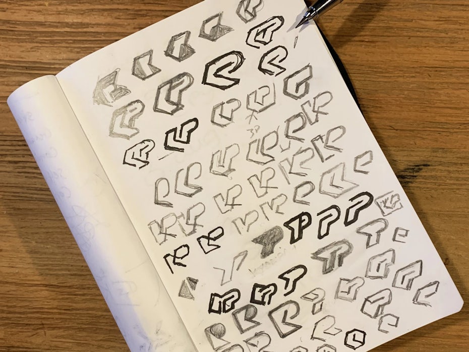
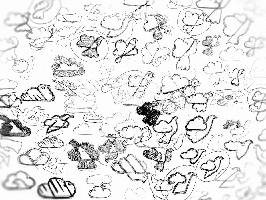
You don’t have to be the next Picasso to be able to communicate through a paper sketch. Even if you’re not the one doing the designing firsthand, it’s a great way to quickly share your thoughts with others. Tangible visualizations like a paper sketch can also help you swiftly identify your likes and dislikes in a logo aesthetic.
For small and quick ideas, visualizing on paper is often quicker than working digitally. It may sound a bit old school, but seriously: a doodle can go a long way. Grabbing a pen and paper is an integral part of the creative process.
3. Tell a story
—
Developing a logo gives you the opportunity to tell a story. To influence the plot of your story, establish brand-defining keywords that speak to who you are as a brand, then weave them into your logo. These keywords will bring meaning and purpose to your logo.
Meaning within a logo doesn’t have to be inherently obvious, but it should serve as a conversation piece. Every person remembers the feeling of surprise that they felt when they first noticed the arrow in the FedEx logo. Look closely at the Tour De France logo and you’ll see a cyclist in action.
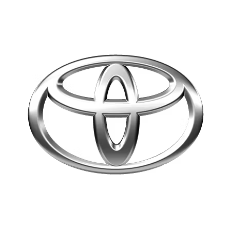
The Baskin Robbins logo incorporates its signature number of flavors. And we can’t forget about the Toyota logo, which, upon close inspection, displays every letter of the brand’s name. All of these logos tell a story, and yours should too.
4. Begin with black and white (the color can come later)
—
While colors are indeed important to your brand identity, they can also be subjective. Designing a logo in color can interfere with creative brainstorming. Keep this in mind: at some point in time, all logos end up being black and white somewhere, somehow. So, it never hurts to start off in black and white.
With a black-and-white logo to start, you can focus on important shapes and themes. It’s a great way to hone in on what matters most. Once you’re comfortable and satisfied with the monochromatic version of your logo, take a stab at a color version.
5. Keep it simple
—
A successful logo should be easily digestible and not overly complex. Simplicity is key, as it helps ensure that your logo is easy to remember. Additionally, simple logos tend to be the most versatile and useful.
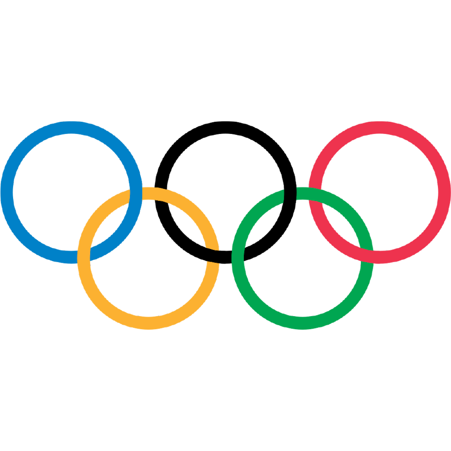
Sometimes, less is more, and this couldn’t be more true for logo design. A logo doesn’t need to be busy or overstimulating. In fact, negative space helps keep a logo clean. Many of the most famous global brands have extremely simple logos (Apple, Chanel, the Olympic Games and Spotify, for example).
6. Use letters and shapes strategically
—
Be smart about how and when you utilize letters and shapes in a logo. Your logo should be memorable, nimble and unique to you—it doesn’t have to be an intricate display of characters and curves.
Think of it this way: Lululemon Athletica, Nike, Pepsi and Twitter have proven that a logo can be successful with no letters at all. Meanwhile, brands like Sony, Google, Panasonic and Victoria’s Secret have shown us that a logo can be successful without any shapes or symbols. And, some logos do need a harmony of words and shapes in order to thrive. Examples include National Geographic, Microsoft, Ford, and Levi’s.

There isn’t necessarily a right or wrong answer when it comes to letters and shapes. Be wise and choose the path that best fits your brand.
7. Size matters
—
A logo needs to be scalable. Ideally, it looks good in many sizes and places, providing you with optimum versatility. To achieve the perfect, scalable logo, imagine your logo in different locations, both big and small. Think in extremes. For example, can it work on both a billboard and a business card?
During the designing and brainstorming process, put your printer to work in order to clearly see the scalability of your logo. Print out your logo in various sizes to see how it translates. Having a tangible version in various sizes, it’ll help you get a better sense of how your logo displays its message in various settings.
8. Position your logo horizontally and vertically
—
Most brands end up needing multiple logos, and that’s okay. Not every logo works in every space, and that’s when logo variations come in handy.
Establish a primary and secondary logo to ensure that you’re able to use your logo in both horizontal and vertical spaces. Typically, a primary logo is more horizontal and a secondary logo is more vertical. Your primary logo will be your most complete and complex logo, while your secondary logo can serve as a useful companion piece.

9. Make sure your logo is yours and only yours
—
Your logo should be just that: yours, and nobody else’s. Authenticity, originality and ownership are all crucial parts of the creative process. Plus, being unique is a key part of effective brand positioning. When designing your logo, ask yourself: Have you seen this anywhere before?

We’ve learned a lot from the Airbnb logo controversy, where the company did a total 180 with its logo aesthetic in 2014 and ended up with results shockingly similar to existing startup, Automation Anywhere. Later on in 2017, a similar situation arose in the Paypal versus Pandora lawsuit, where Pandora was seeking a refresh and ended up with a logo that looked too similar to the PayPal logo.
The moral of the story is that stealing is wrong, and logo design is no exception to that principle. To avoid any potential issues and gain some peace of mind, do a reverse google image search with your logo idea.
10. Don’t be afraid to let your logo evolve
—
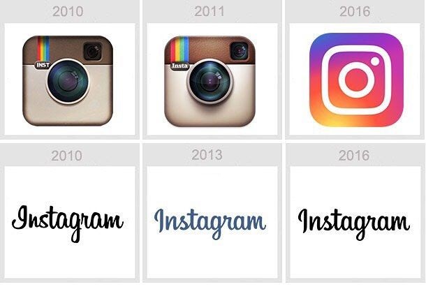
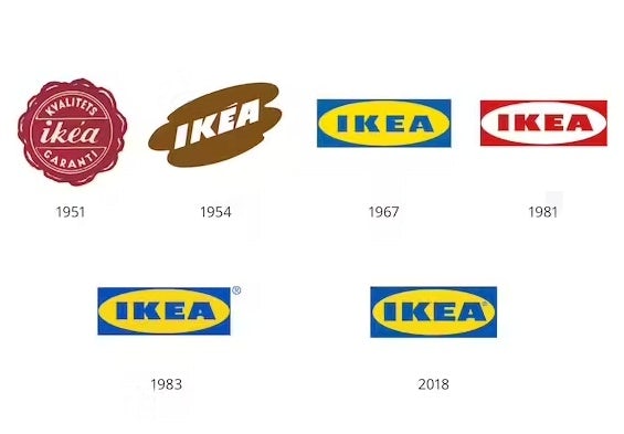
Your brand can evolve with time, and so can a logo. A logo doesn’t have to last for eternity, and it’s okay to revamp. Plenty of the world’s most famous logos have changed over time. Instagram, Firefox, IKEA, McDonald’s and Starbucks have all refreshed their logos to reflect modern aesthetics.
If you do end up revamping your logo, try not to stray too far from the original. Retain certain characteristics rather than doing a full makeover. That way, your existing followers won’t stray far.
Let your creative juices flow
—
Knowing these 10 tips for logo design can help you take your logo to the next level, whether you are designing from scratch or want to revisit your logo. So let the wheels turn and boost your brand with a compelling, captivating logo.
Want to get the perfect logo for your business?
Work with our talented designers to make it happen
This content was originally published here.